 Let's start by revising the lesson from yesterday's post. You have raw data with which you want to convey a message (your point). There are many mediums to do that. You can use tables, you can simply type out the data on the slide, you can use an infographic or you can use a chart. Chart is just a medium to convey the message. You should use it prudently.
After you have decided to use a chart, the next question which needs a strong consideration is "Which type of chart should you use?"The answer is not as easy as it looks. Very often we see charts which complicate more than simplify. You might not choose a wrong chart but you choose a sub-optimal chart. Which means another chart will do a better job than the one you are using correctly.
These are the popular chart types at your disposal:
1. Bar Graphs (Horizontal & Vertical)
2. Line & Area Graphs
3. Pie Charts
4. Scatter Plots
5. Special Charts (Bubbles, Radar, etc)
Which chart type to use depends on what you are trying to do with your data.So what all can you do with your data? Here is the answer. You do the following with data:
1. Compare data
2. Break data into smaller parts to see what it is composed of
3. View data over time
4. Discover correlation between two sets of data
Because correlation is an advanced usage and is used very rarely, we shall ignore it in this post. So we have three main usage of data. Now look at the image below.
 Throughout this post, we shall work with this framework. So look at the image carefully. We basically are going to study 6 types of uses a data can be out into. We already covered 3 above. We will give each one a symbol.
A - Compare data
B - Break up data into parts
C - See data over time
Now, there can be an interplay between A, B and C. From this interplay we get 3 more cases.
D - Break data into parts and compare the sub-parts (D=A+B)
E - Comparing data over time (E=A+C)
F - Breaking down parts of data and seeing it over time (F=B+C)
Do not get worried by six cases. We shall deal with them one at a time and with enough examples.
A. Compare Data
When you are comparing data, you are pitching one data point against the other to see which is better or higher. The chart you should use is Bar Graph. Bar Graphs are of two kinds; vertical (called column graphs) and horizontal. You can use either of them as they serve the same purpose. Cone and cylinders are also bar graphs.
Some examples of comparing data are:
i. Comparing population of various countries
ii. Comparing capacity utilization of various factories in a company
Example A1: Taken from Hindustan Unilever's investor presentation 2009.
 The Indian Shampoo market offers a huge opportunity for growth. This is the key message which has been supported by raw data. The slide compares the per capita consumption of shampoos in India, China & Indonesia. He concludes that India's consumption is bound to go up. If Indonesia is at 1.1 India will also catch up sooner or later. The graph used is a vertical bar graph.
Use bar graph when you want to compare data. The same chart can also be presented with a horizontal bar graph. It is better to choose a vertical bar because vertical differences are easier to view than a horizontal one.
 B. Break Data Into Parts
When you break down data to analyze what it is comprised of then you can use pie charts, stacked bar graphs and normal bar graphs. However a Pie Chart is the most preferred medium. Some examples of what it means to break data into parts:
i. How much sales of your brand comes from North, South, East & West India?
ii. What are the market shares of various soap brands in the US?
Example B1: Shareholding Pattern as of June 30, 2009 of Infosys taken from their website.
 This data shows the breakup of how equity shares in Infosys is owned by various entities. Indian public owns 16% of its shares while the promoters hold another 16%. Pie charts are a good way of depicting this information. But we can try out other mediums too. Let us see how Stacked Bar Charts & Bar Graphs look.
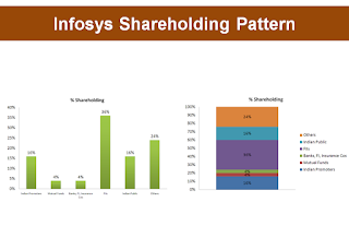 The chart on the left is your normal vertical bar graph. The chart on the right is a stacked bar graph. While a normal bar graph looks fine, the stacked one is very bad aesthetically. I advise you to stick to pie charts. Switch to bar graphs only if there are too many pie charts in your presentation.
C. See Data Over Time
When we see data overtime it is called time series data. One data is plotted against time. For time series you can use line graphs, area graphs and bar charts. Examples where we compare data over time are:
i. Share price for last 12 months
ii. Sales & profits of a company over time
iii. Number of employees in an organization over time
Example C1: You want to invest in the shares of Reliance Industries. You want to know if the share is trading at a high in the last three months or not. Here are two ways you can present your chart.
 The area graphs and the line charts serve the same purpose here. The area graph makes it easier to see the data movements. You could also present the same data through bar graphs.
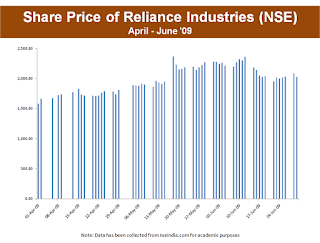 Just because you can, does not mean you should, use a bar graph in the case of time series. In the above graph, so many bars just confuse the audience. Had the data points been less bar graphs would have done a much better job.
What we have learnt till now is summarized in the image below:
 A, B and C were simple graphs. Our complications begin with D.
D. Break data into parts and compare the sub-parts (Compare + Break Data into parts)
Example D1: In example B1 we saw how to break down the shareholding pattern into its sub-parts and present. I now ask you to compare the shareholding patterns of Infosys with Wipro & Polaris (as of June 30, 2009). How would you present this chart?
Because we are breaking down equity ownership into its sub-divisions, we should use pie charts. Going by the old logic of using pie chart when breaking down data our slide looks like this:
 Suddenly, the pie is complicating things. First we need more space for 3 charts and second, it is tougher to understand and compare. Look now at the right way of presenting:
  This Stacked Bar Chart looks so much better. Remember you have done two things here. One, you broke up each company's shareholding pattern. Second, you compared the smaller chunks with each other. The analysis here could be that Wipro is far more closely held (high promoter holding) than Polaris and Wipro. To do any meaningful analysis you need to understand it first. Stacked Bar Chart helps you understand better.
E. Comparing data over time (Compare + See Data Over Time)
When we compare two or more pieces of data across many time periods we can use Bar Graph or Line Graph. Let us look at an example.
Example E1: You have sales and profits data of your company for the past 17 years. How do you present this data? See the example below:
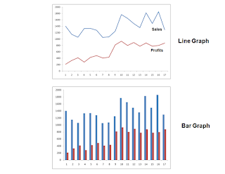 The line chart and the bar graph both can be used. However, as the number of data points go up, you should prefer line over bar graph. Having 15-20 vertical bars make slide cluttered. In the above case, with so many bars, the view gets clouded.
Another daily life example of comparing data over time is when you compare share prices versus the benchmark sensex (NIFTY / NASDAQ) or against another share. Under these cases, line charts must take precedence over bar graphs because when we compare share prices we are talking of atleast 1 month of three months data. Imagine having 100 bars on the slide! Avoid bar as soon as the number of data points cross 15.
F. Breaking down parts of data and seeing it over time
When you have to break down data into parts and then see how the parts shape up over a period of time what should you use? You can use both these charts; stacked bar graph and stacked area graphs.
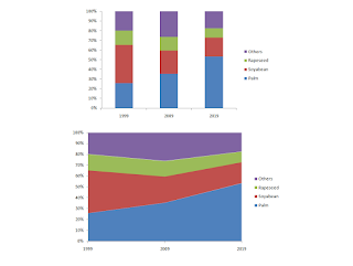
Example F1: You are studying world's consumption of cooking oil over time. This is the data you have (it is hypothetical not exact data).
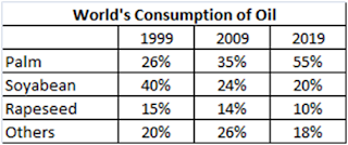 How do you present this information?
If you look closely, we have broken down world consumption into four oil sub-types. Then we are looking at how the sub-types change over time. You should present this data using either a stacked bar chart or a stacked area graph.
 To summarize, you should remember these six cases or six treatments which your data can go through. Here is a ready reckoner to remind you of which chart to use when.
I suggest you click on the ready reckoner and download it. Share it with your friends and colleagues.
G. Special Charts
If you remember, I had talked about one more type of chart; Special Charts like Bubbles, Radars, Doughnuts, etc. I would strongly advise you to stay away from these charts. These charts are used very rarely (except by consultants who seem to use it in every analysis). We would deal with these charts some other time.
The next time you have to choose a chart type refer to the framework above. You can be faced with some situations where this framework has to be applied with some modification. The rules will never change but the application certainly can. You must know that no rule should be applied blindly.
Real life will throw situations at you where you have to pack many pieces of data into one single chart. I give you a real life problem taken from an annual report (I have modifies the numbers though).
Home Work 1
SpaceTel is a telecom provider in India. You have the following data for the company and you have to present this data in one chart to be put in the annual report. Which chart type will you use and how will you make this chart?
 You can leave the answer as a comment here.
So, how did you find this post? Does it make your life simpler in terms of choosing the right chart type. How often have you made mistakes of choosing the wrong (or not the best) chart type? Am eager to listen to you. See you tomorrow with another exciting post.
--
Disclaimer: Data used in this series of posts are for academic purpose and not meant to comment on the performance of the respective organizations.
Vivek - not bad, except for a couple of things:
ReplyDelete1) Pie charts are the junk food of the chart world - they seem delicious but actually have no nutritional value... Pie charts may look good and seem appropriate to people who don't know any better, but the people who've put in the work to truly understand data visualization know that there is ALWAYS a better alternative - see Tufte, Few, even Wikipedia.
2) The area graph (C1) is not appropriate because the axis doesn't start at zero - if the goal is to make it easier to see the data movements, make the trend line thicker/darker and add some very subtle horizontal gridlines.
@Anonymous
ReplyDeleteI agree that Pie Charts are overused but there are situations where it can be used. There is no reason to discard them all together.
I totally agree that graphs should start from 0. The graph is C1 is only for the purpose of showing how Area Graphs look. As far as axis is concerned, I too believe it should start at 0. If not, for whatever reason, then it should be informed to the audience. Otherwise the differences get accentuated, which is not right. I have made this point in the 8th Tip of the series.
http://www.allaboutpresentations.com/2009/09/14-charting-tips-tip-8-chart-axis.html