 There are three most important decisions you take when you present charts:
1. When should you make a chart?
2. How do you choose a chart type? and3. How do you present your key message?
Having covered the first and the second in my earlier posts, we shall nail down the third today.
The Key Message
The key message, as you would have guessed, is the point you are trying to make with your chart. You are not supposed to present charts after charts mindlessly. Are you? Every presentation has an objective. Say you are a sales manager and your are presenting to your sales head for your annual review. The objective of your presentation could be 'convincing' the sales head that you have worked well over the last year and delivered solid growth amidst the recession.
In such a case, every slide of yours will have a point to make and your charts will be used to prove that point. Each and every chart makes a small contribution to the overall objective that you have managed the sales well. Hence, each slide has to say something that adds to the bigger picture.
How do you arrive at your key message?
The key message is the point you are trying to make or prove. The key message comes first and the chart later, only to support or prove it. How you arrive at the key message is beyond the purview of this post. You should know what you want to say. Eg. Your key message in the above case can be that although you have grown at just 10% over last year, you have outgrown the other managers whose average growth is just 3%. You are the best judge of how to build your argument. We are discussing how to 'present' the key message. How we arrive at the key message is simply out of scope.
How should you present your charts' key message?
Here is what you need to do when you present charts:
1. Know what your key message is. Know what point you are trying to make/prove/disprove with the help of your chart
2. Write down the key message on the slide in 1 complete sentence. Don't eat words and make it small. Don't be verbose and make it long.
3. You should write down the key message on your slide header. You can also write it in a box near the chart. Make sure it is clearly visible and readable.
Examples
One very good way to understand how to present charts is visiting company websites and checking out their investor presentation. Visit the websites of some top companies. Go to their investor section and look for investor presentations.
I did the same over the last few days and browsed through scores of annual reports and investor presentations. What follows is 4 charts which I have culled out from such annual reports and presentations.
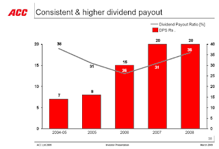
Example 1: Here is a chart taken from an investor presentation available on the website of ACC, a large cement manufacturer in India.
 I should give you some context first. Compared to 2007, ACC's sales are up marginally but profit is down. Inspite of this they have maintained consistent and higher dividend. This is their key message. Also note that the key message appears in the slide header. Makes it easy for the audience to glance through the presentation. Reading only the key message and seeing the chart to be convinced of it. Rating: Ok.
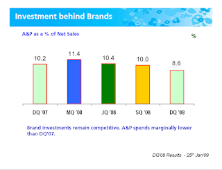
Example 2: Hindustan Unilever's presentation for the Quarter Sept-Dec '08
 HUL's spend on advertising and promotion (A&P) has gone down in this quarter. Being the biggest spender in India on advertising, their investors might be worried seeing this chart. So they have added a key message below the chart. They say, even though they are spending less yet they remain competitive in their spends on brand building. Nothing to worry dear investors. Rating: Very Good.
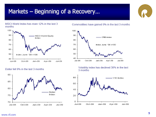
Example 3: Reliance Industries Ltd., India's biggest business house.
 This presentation was made on July 24, 2009. Recession had left no company untouched. But their argument is that the tide is turning. Recovery is on. They justify their point with this chart. Don't worry about what MSCI and CRB mean. The point is, they are taking actual data from four different markets and trying to prove their point that recovery is on. Above every chart, the key message is placed in 1 complete sentence. Because there are four charts, the slide header has been used to make the bigger argument that recovery is on. Within that argument every chart has a key message which proves the argument right. Rating: Very Good.
Exception to the Rule: When you need not worry about key messages
Where there is rule, there is an exception. It is possible that you are merely sharing information and not building your argument. In that case, a chart need not have a key message which adds up to the larger argument. It need not prove a point, it merely states a fact.
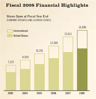
This chart in the annual report of Starbucks is doing something similar.
 Starbucks is sharing Financial Highlights and this is one of the charts they have put. This chart merely tells you that the number of stores is on the rise.
Suppose, your company is thinking of launching a new soap. A fairness soap for men. There is no such soap in the market. You being the product manager is making a final presentation recommending that your company should go ahead with the launch. But when you start your presentation you talk about the overall soap market and how it is growing in the country. There is not argument here. It is merely information sharing. There is no key message here. At max you will write "The soap market is worth $2bn and it is growing at 5%." You don't launch a new soap because the soap market is growing at 5%.
To Summarize
Know what your key message is and display it prominently on the slide header. To learn more about making charts visit company websites and check out their investor presentations and annual reports.
Tomorrow, we will master another element of presenting charts. Have a good day. See you tomorrow.
Hi Vivek
ReplyDeleteI think your emphasis on having a key message for every chart you show is great. I have a couple of questions that I use to help people arrive at their key message:
1. If your audience only remembered one thing from this presentation/chart what would you want it to be?
2. If you only had 5 seconds to express the point you want to make - what would you say?
Look forward to the rest of your chart series.
Olivia
This is a great way of looking at key messages. Thanks Olivia for sharing this.
ReplyDeleteIf a presenter thinks about these two questions before putting each chart on his/her slide, the charts will have much more impact.