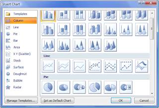
 By reading this post you will know how to choose the right chart type for your data. You will know which charts you can use and which you cannot for a given situation at hand.
In my last article on www.24Point0.com (a website I write for) I have written about 'How to select the right chart/graph for your data?'
If you have been reading my blog you will remember that in September I ran a 14 post series on making charts. Read it here: Recap of 14 Tips to Present Awesome Charts
In the 2nd post of the series I shared my methodology of how to go about choosing the right chart.
Then why one more post on the same topic?
In the new post I have presented 3 methodologies to you.
1. My methodology
2. Andrew Abela's method
3. Chandoo's method
Andrew Abela is a popular presentations blogger and Chandoo is an expert in MS Excel. Going through these 3 methods (which do share some similarities) you will get a complete picture of which charts can be used when you have a data to present.
No comments :
Post a Comment