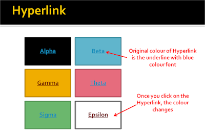
Once we create a hyperlink, the colour of the font changes to blue (with an underline). This tells the viewer that it is a hyperlink and he needs to click it. But this hyperlink creates a lot of problems.
 Have a look at the slide above. If you have shapes or smartart on which you write text and create a hyperlink, your contrast can go for a toss. Look at the font on the green or the blue shape. Once you click on the link, the colour changes and remains that way after that.
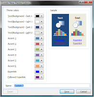
But there is a solution to this. We can choose what colour the hyperlink should have and what colour a clicked hyperlink should have. This is how:
In PowerPoint 2007
 Go to Design Tab -> Colours -> Create New Theme Colours -> Hyperlink & Followed Hyperlink -> Choose the colours of your choice
In PowerPoint 2003
Go to Format -> Slide Design -> Colour Schemes -> Edit Colour Schemes -> Custom tab -> Under Scheme Colours -> Accent & Hyperlink -> Change colour. Accent & Followed Hyperlink -> Change colour.
What it does is that it changes the hyperlink colour and followed hyperlink colour to a new colour of your choice.
No comments :
Post a Comment