Assume Samsung is explaining this to its research agency. It can do the standard way; which is to write it all down as bullet points. Something like this:
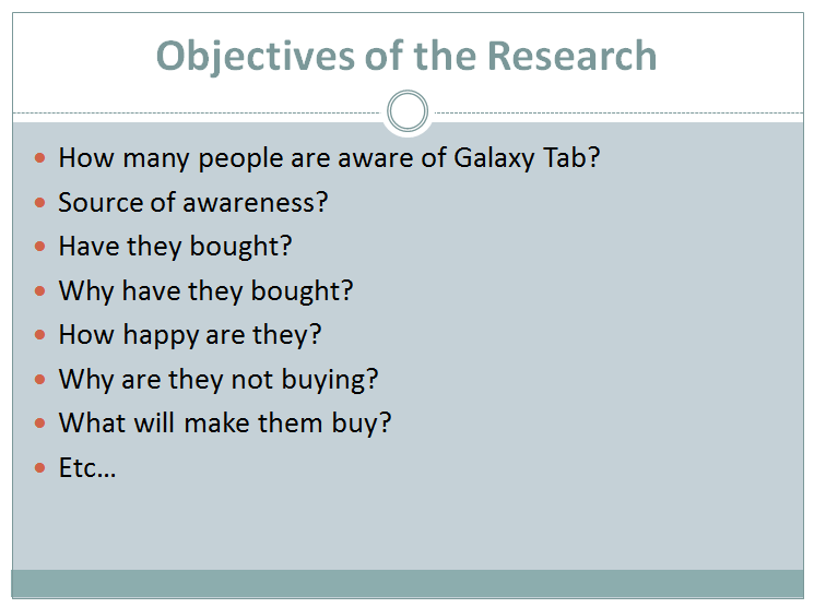
They give this list and ask the agency to go ahead and conduct the survey.
There is however another way, which brings clarity to their thinking and also helps the agency understand the work better. I am talking about converting text to graphics. Penning down your thoughts in the form of a flow chart. Something like this:
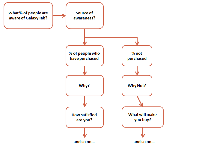
In my experience, this comes out a clear winner. Provides a lot of clarity to you and helps your audience understand the work faster and easier.
No comments :
Post a Comment