The text to the right of the model is your main text. This main text is known as body copy in advertising. The text (both at the bottom and the top) is aligned to the LEFT.
But why is the text aligned to the left? Why not right, center or justify?
In this version, the body copy has been aligned CENTER. It does look quite odd, doesn't it?
Here is a quick refresher which shows you the four types of text alignment. By default, when you type body copy in PowerPoint your text gets aligned to the LEFT.
Let us now JUSTIFY the body copy and see how the ad looks.
This does not look very different from the LEFT alignment because of less text and separate paragraphs. If we have lots of text, the justified output will be different. Here is a better example of how lots of text looks when JUSTIFIED.
Take a look at all the four variants of the IndoStar ad again. Which one do you like better? Why did the designer choose to ALIGN LEFT? In my view, left align suits the ad. It is aligned to the upright model on the left.
How do you decide about text alignment?
English, and most other languages, is written from left to right. When you write your diary, you align text to the left margin. Left align is the most natural style of writing and that is also why the default alignment in PowerPoint for body copy is left. When in doubt, align LEFT.#1. ALIGN YOUR TEXT IN SYNC WITH THE IMAGE ON YOUR SLIDE
Take a look at this ad. The body copy will only look good when the text is aligned to the LEFT. All the body copy is aligned to the left and together they form an invisible line which runs parallel to the model's hand (the model is Kalki Koechlin).In the next ad, the text is aligned CENTER and it looks good. Why? Because the main image of the Google Pixel phone is also in the middle of the design.
Usually CENTER align does not look good. But here is an ad where it makes sense. Again, as you will see, the text has been aligned in sync with the image. The image of Dr. Kurien is in the middle and hence the entire body copy is aligned matching the image.
#2 ALIGN YOUR TEXT DEPENDING ON WHERE YOU PLACE THE TEXT
As a thumb rule, if you place your text to the extreme left of your slide, align it to the left. As you can see in the next ad. The text is on the left and left align makes sense.Look at the next ad. The entire text is placed in the center and it aligns itself to the logo (which is centrally aligned).
Which text alignment is most common?
I have analyzed 281 ads so far and the most common form of alignments are LEFT and CENTER. It is very rare to see RIGHT alignment and JUSTIFY.Summary
When you align your text on a slide, think about two things:- What else is there on the slide?
- Where are you placing the text on the slide?
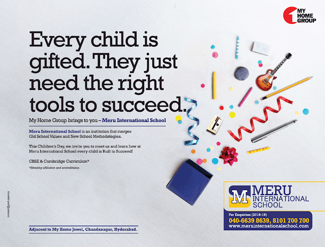
The headline should have been aligned to the center. That would have synced well with the large image in the middle. The body copy at the bottom has been aligned well. It has been aligned in sync with the image next to it. The aligned text forms an invisible line parallel to the rectangular image next to it.
In the end, let us see two ads from the same brand. These ads are similar in a lot of ways. Can you spot the major difference? Focus on the headline in white font.
You must have noticed that the designer has gone for center alignment in one ad and right alignment in the other. Why? Which one do you like more?
There are no easy answers in design and many a times it is the overall feel of the design that matters. When you align the text, think about where are you placing the text, what else is there on the slide and how does the overall design look.
Read more:
5 Tips to use Colours in presentations [Design secret #1]How to use FONTS to design better presentations? [Design secret #2]


No comments :
Post a Comment