Deliver More Impact With These Presentation Trends [Guest Post]
This is a guest post by Julián Magnone, Director at SlideModel.com
About as old as the oldest millennial, PowerPoint still leads the pack when it comes to presenting ideas to an audience and remains an excellent platform for telling a story. But if you think you can get away with the presentation deck you’ve been using for a countless number of seasons, you won’t.
About as old as the oldest millennial, PowerPoint still leads the pack when it comes to presenting ideas to an audience and remains an excellent platform for telling a story. But if you think you can get away with the presentation deck you’ve been using for a countless number of seasons, you won’t.
The presentation scene has changed. Audiences have wisened up. And you’ll perish as a presenter if you stay put.
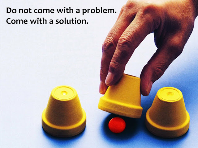
DON’T even dare play that dusty old slide show.
Fortunately, PowerPoint has evolved over the years, nimbly weathering jeers from a bored portion of the corporate world as well as the entry of flashy new industry players. The software’s latest version, PowerPoint 2016 has all the features it needs (cloud-based access, mobility, collaboration, strong design capabilities, etc.) to keep its status as the industry standard for years to come. Meanwhile, the ecosystem spawned by Microsoft’s venerable app continues to flourish and counts providers of various stuff ranging from tips to PowerPoint templates, most aiming to help presenters become better at informing, mesmerizing, or persuading their audiences.
The art of presenting has matured and so did the main tool for getting it done. But to get ahead of the game, you need to know the trends that matter to your audience as well as the technologies that make it easier to engage them. To give you a headstart, we’ve scoured the presentation universe to identify which trends are currently making a buzz and which you should adopt to become more effective at communicating your message:
Design Elements
- Flat Visuals. Flat design celebrates simplicity and uses minimalist elements to build a UI or to convey a message. Microsoft’s Metro, Apple’s user interface for iO7, and Google’s Material Design are excellent examples of flat design philosophy at work. Flat design also figures prominently in contemporary presentation decks. The Metro-inspired template below is a good example.

- Full-screen Images. Communication design experts advise the use of more visuals and less text, arguing that people react more empathically to images than they do to mere words. As a result, many effective presentations allocate a disproportionate amount of slide space for immersive or evocative photos and graphics.
- Creative illustrations. Blame popular sites such as Instagram and Pinterest for nudging people’s aesthetic leanings towards custom illustrations, retro-look, hand-drawn images, and other visual elements that shout “creative.” Here’s a SWOT analysis template that enlivens the technical side of SWOT analysis with the use of hand-drawn visuals.

- Fresh Use of Typography. Typography plays a major role in Apple’s success and it is fairly well-known that Steve Jobs championed — then introduced — the use of beautiful fonts in early Macs. Years later, Google deployed a free directory that allows web developers to use a wide range of fonts. It’s important to stick to a limited number of fonts for your deck to avoid diluting your message with inconsistent/inappropriate typography. But that doesn’t mean you’re not allowed to use custom fonts to communicate your message.
- Smart Color Usage. Color can either enhance your story or confuse your audience. Keep in mind that coherence and consistency are the keys to an effective presentation color scheme. To help you make trendy color choices, Pantone — the world’s authority on colors — recently published their top color recommendations for 2016, with Rose Quartz (a pinkish hue) and Serenity (a light shade of blue) topping the list. Of course, you can still explore other colors for your slides, such as what our professional designers did for this NOISE Analysis template.

- Video/Auto-Animations. Video is fast becoming the medium of choice for online marketers. Fortunately, you can always insert videos in a PowerPoint slide or even upload an entire deck as a video on channels such as Vimeo and YouTube. But before you do, you might want to consider seeking the help of digital creatives who know how to unleash PowerPoint’s rich media capabilities. There’s also the option of using auto-animations, especially for infographics and statistical data.
PowerPoint Features
- Share/Deck Authoring. With more and more teams relying on the cloud for creating, storing, co-authoring and editing documents, Microsoft bolsters its collaboration support for applications in its Office 2016 bundle. To enable friends or colleagues to view and edit your PowerPoint deck, just 1) click the Share button on the ribbon bar; 2) save the deck in a shared or a public folder in your OneDrive account; 3) invite people to collaborate on the document; and 4) configure their editing rights.
- Designer. If you want to test your mettle as a deck creator, you can try Designer, an aptly named PowerPoint feature introduced in late 2015 to help regular folks create professional-looking slides.
- Morph. Also launched in 2015, the Morph PowerPoint feature will help you include captivating motion effects and smart animations in your presentation deck.
Technique/Behavioral Aspects
- Storytelling. Audiences will find your message more meaningful if you tell it through a story. That means you should consider your slides as pages from which a clear and compelling narrative emerges.
- One Idea Per Slide. The tenets of minimalism extend to your presentation deck. While bullet points may be necessary in some cases, the trend is to stick to just one main thought per slide and not use your deck as a teleprompter (read: minimal text usage).
- Audience Connection. Presentations don’t necessarily have to be a one-way street, wherein you are the sole active player sending a message to your audience. Sometimes, it can be the other way around. Provide channels by which your audience can become more active participants in a conversation about your message. You can do this through live polls, surveys, tweets, or other interfaces that allow your audience to express their thoughts or feelings.
- Sharing. Unless you are dealing with classified information, you should consider sharing the decks you’ve spent tremendous time and effort on. Let your message reach more people by uploading your presentations on SlideShare, YouTube, and other content-sharing sites. However, be sure that your presentations have excellent quality before you do. Bad presentations everyone can access online can seriously damage your brand. Check out quality providers to learn more about well-designed presentation decks.
Staying Relevant Means Staying Fresh
Changes in technology as well as audience behavior directly influences the presentation landscape. For you as a presenter, this requires keeping abreast of presentation design and execution trends that matter to your audience. In planning your presentation, remember to integrate different elements that will help keep audiences focused on your story and favorably inclined towards its message.


You're right about everything here. Using the modern UI and design elements is extremely important. One should also focus on putting the right content in the slides, which is short, simple, and to-the-point. Finally, colors play a major role in attracting the user's attention but it's not that easy to master. :)
ReplyDelete