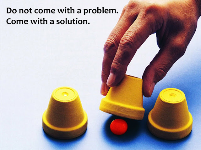
What makes some Visuals more Exciting than others?
Molly Bang's book Picture This is an interesting book which talks about how pictures work and how they affect our emotions. Molly says we do not see pictures as pictures, but we see them as reality. We feel what the picture wants to make us feel. In this post, I have listed down 8 lessons I have drawn from this interesting book.
1. Bigger shapes are more important than smaller shapes. If you make two shapes of the same size, they would be treated as equally important by your audience.
2. Colours play the biggest role in a picture. In the same example as #1 above, even if both the objects are of the same shape and size, the one in a brighter colour would be seen as more important.

3. If you want to create a feeling of depth (or space) in your image, do not place multiple shapes of the same size. Reduce the size gradually and place them higher and higher up on your slide (or image).

Notice how the image on the right creates the space... the triangles keep going farther. In real life, the mountain that is farther is also the smaller.
4. Two objects of the same colour implies that they are connected in some way. Use colours carefully in your pictures and presentations.

The image on the right does a better job than the one on the left. You can get the connect easily.
5. Every picture has two halves. People view pictures as if there is an imaginary line cutting it into two halves; top and bottom. The objects in the top half feel more important than the one in the bottom.

The top half is 'happier' and the bottom one is 'sadder'. If you want to evoke an impression of loneliness and depression, place your subject in the bottom half (and one one corner).
6. The center of the slide is also the center of attraction. Our eyes naturally go there. If you want to create a dynamic feel (a sense of movement), place your objects slightly away from the center.
 The top image does the usual thing. Place the market size bang in the middle. The image on the right does a better job. Moreover the circle does not even fit the slide. This makes the user feel the market size is that big!
7. Our eyes look for repetitive patterns. We want to quickly make sense of the world around us. This is why presentations have a template. But there is a flip side to all this. Excess repetition is monotonous and cold. The balance is in between; repeat but break the monotony as well.

Here are 9 random slides taken from a premium template sold online. Observe the use of colours. The same four colours are used in most slides. This repetition with colours creates a sense of calm and assurance. The audience knows what is coming next.
8. We notice contrast. Contrast helps us see. This contrast can be created by colour, shape, size or placement of the object.


Look at the two slides. The simple use of the orange colour tells the audience that 29 is the most important number. The eyes start from the largest circle on the left but quickly move to the right. The gradually reducing size creates the sense of movement.
Recap of the 8 Lessons
1. Bigger shapes are more important than smaller shapes. If you make two shapes of the same size, they would be treated as equally important by your audience.
2. Colours play the biggest role in a picture. In the same example as #1 above, even if both the objects are of the same shape and size, the one in a brighter colour would be seen as more important.

3. If you want to create a feeling of depth (or space) in your image, do not place multiple shapes of the same size. Reduce the size gradually and place them higher and higher up on your slide (or image).

Notice how the image on the right creates the space... the triangles keep going farther. In real life, the mountain that is farther is also the smaller.
4. Two objects of the same colour implies that they are connected in some way. Use colours carefully in your pictures and presentations.

The image on the right does a better job than the one on the left. You can get the connect easily.
5. Every picture has two halves. People view pictures as if there is an imaginary line cutting it into two halves; top and bottom. The objects in the top half feel more important than the one in the bottom.

The top half is 'happier' and the bottom one is 'sadder'. If you want to evoke an impression of loneliness and depression, place your subject in the bottom half (and one one corner).
6. The center of the slide is also the center of attraction. Our eyes naturally go there. If you want to create a dynamic feel (a sense of movement), place your objects slightly away from the center.

7. Our eyes look for repetitive patterns. We want to quickly make sense of the world around us. This is why presentations have a template. But there is a flip side to all this. Excess repetition is monotonous and cold. The balance is in between; repeat but break the monotony as well.

Here are 9 random slides taken from a premium template sold online. Observe the use of colours. The same four colours are used in most slides. This repetition with colours creates a sense of calm and assurance. The audience knows what is coming next.
8. We notice contrast. Contrast helps us see. This contrast can be created by colour, shape, size or placement of the object.


Look at the two slides. The simple use of the orange colour tells the audience that 29 is the most important number. The eyes start from the largest circle on the left but quickly move to the right. The gradually reducing size creates the sense of movement.
Recap of the 8 Lessons
- Bigger shapes are more important than smaller shapes.
- Colours play the biggest role in a picture.
- If you want to create depth, place objects further away (and make them smaller).
- Two objects of the same colour mean they are connected in some way.
- The object in the top half of an image (or slide) is more important than the one in the bottom half.
- If you want to create a dynamic feel, place your objects slightly away from the center.
- Our eyes look for repetitive patterns but excess repetition is monotonous. Strike a balance.
- Use contrast. Create contrast using colour, shape, size or placement of the object.


Comments
Post a Comment