It matters because a font serves the following purpose:
1. Makes the text easy to read, and
2. Differentiates your presentation from others (imparts style and appeal)
In business presentations you should not worry about differentiation much. Focus on your content and choose a good legible font. But there are many circumstances where you are presenting something entertaining or something creative. Having a not-so-common font will help. It will make your presentation stand out and you can use this font across all your non-formal presentations.
Which font is better?
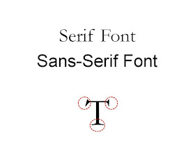
Before you can answer that question you should know the difference between serif and sans-serif fonts. Have a look at the diagram below.
 Serif fonts have 'serifs' (those ticks on the edges). Sans-serif are sans (without) them. Serif font is easier to read in printed format whereas sans-serif is better to read on computer screens. That's why most books follow serif and most websites follow sans-serif. Almost all the blogs use sans-serif (Problogger, Presentation Zen, Slide:ology, Lifehacker, Mashable, etc). What you are reading now is sans-serif (this is Arial font).
 Conclusion: It is better to choose a sans-serif font for your presentation.
When there is too much text and font size is small 'serif font' does a better job. But your presentation should never have small fonts and hence you will not face this problem.
Which sans-serif font should you use?
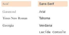
Among sans-serif fonts you have a lot of choice. Arial, Tahoma, Verdana are the most popular fonts. You can also try Calibri. Use any of these sans-serif fonts depending on which one appeals to you more.
As long as your presentation is legible, it will not matter which font you have used (unless its a different kind of a presentation). For example, Advertising people present creative stuff and so they should use a distinct, unique font. Their audience will love it. In conclusions I would say, use a font which suits the situation. In formal presentations just use a legible sans-serif font you like. For informal presentations play around with something different. Own a unique font and get known by it!
If you are going in for a non-standard font (downloaded from internet) then remember to embed the fonts in the presentation before emailing or passing it on a USB drive.
Read more: Garr Reynolds says, "Use the same font set throughout your entire slide presentation, and use no more than two complementary fonts (e.g., Arial and Arial Bold).... regardless of what font you choose, make sure the text can be read from the back of the room."
Amit Agarwal of Labnol.org has compiled advice of various experts here.
Which font do you use while making presentations? Do you keep trying new fonts or you are scared of trying something new? Leave a comment.
No comments:
Post a Comment