 If you are a regular reader of my blog you know that I have recruited 24 interns and they are working on a project. They have been divided into 4 teams namely Victory, Superstar, Nawabs and Prince. Every week I review their performance and I present to them, among other things, their cumulative team scores.
 While preparing one of my review presentations, I noticed that the Prince team had done really well and came up from the last position to the second position. So after showing them the score charts I wanted highlight this very point. So what did I do?
I could have just put up the slide and told them "Look how the prince have come up so fast, from the last position to second place." But, this is what everyone does and I wanted to do something different. I wanted to bring this fact (of Prince coming up so fast) to life. So I relied on Motion Paths.
 Step - 1
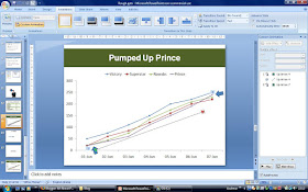
I drew an arrow and animated it 'Entrance + Fade (On Click)' and placed it where the Prince line chart started
Step - 2
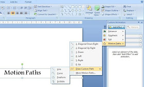
I selected the arrow -> Add Effects -> Motion Paths -> Diagonal Up Right
Step - 3
I adjusted the path to suit my exact direction of movement (just below the Price chart). Then I animated it 'On Click' and set the speed to slow.
Step - 4
Put another arrow at the last stage of Prince, where they are at the No. 2 position. Animated it 'Entrance Fade (On Click)'.
All of it in just two minutes!
I presented it thus:
After putting up the chart I said "Let us look at how Team Prince has been doing over the past few days". (1st Click - You see the arrow appearing. Indicating that Prince were at last place). They were at the bottom at the initial stages. (2nd Click - The arrow starts to move underneath the Prince line chart) Look how they continued to be in the last place as the week progressed. Last all the time. And now... (3rd Click - Another arrow appears where the chart is ending). They are No. 2. Pumped Up Prince indeed."
This is a better way of presenting this kind of information. It brings your data to life and brings immense amount of clarity and drama to your presentation. There is however a word of caution. Motion Path is animation. And you should know when and how to use it. Use animation sparingly and use it to highlight something very important.
Have you used motion paths ever? Can you think of a situation where you could have used this technique in your last presentation?
I have the pleasure to brief you on our Data Visualization software "Trend Compass".
ReplyDeleteTC is a new concept in viewing statistics and trends in an animated way by displaying in one chart 5 axis (X, Y, Time, Bubble size & Bubble color) instead of just the traditional X and Y axis. It could be used in analysis, research, presentation etc. In different business sectors, to name a few we have Deutsche Bank Asset Management in NY, NBC Universal, RIM, Vanguard Institutional Investor, Princeton University as our clients.
The following link is for our new Geographical Trend Compass:
http://epicsyst.com/test/map/
Link on UK Master Card vs Visa performance :
http://www.epicsyst.com/test/v2/mastercard_vs_visa/
Links on Funds:
http://www.epicsyst.com/test/v2/best_exchange_traded_funds/
http://www.epicsyst.com/test/v2/us_insurance_funds/
http://www.epicsyst.com/test/v2/aaim_fund_performance/
Link on other KPIs :
http://www.epicsyst.com/test/v2/hospital_performance/
http://www.epicsyst.com/test/v2/international_insurance/
Link on Chile's Earthquake (27/02/2010):
http://www.epicsyst.com/test/v2/EarthQuakeinChile/
This a link on weather data :
http://www.epicsyst.com/test/v2/aims/
This is a bank link to compare Deposits, Withdrawals and numbers of Customers for different branches over time ( all in 1 Chart) :
http://www.epicsyst.com/test/v2/bank-trx/
Misc Examples :
http://www.epicsyst.com/test/v2/airline/
http://www.epicsyst.com/test/v2/airline2/
http://www.epicsyst.com/test/v2/stockmarket1/
http://www.epicsyst.com/test/v2/tax/
http://www.epicsyst.com/test/v2/football/
http://www.epicsyst.com/test/v2/swinefludaily/
http://www.epicsyst.com/test/v2/flu/
http://www.epicsyst.com/test/v2/babyboomers/
http://www.epicsyst.com/test/v2/advertising/
This is a project we did with Princeton University on US unemployment :
http://www.epicsyst.com/main3.swf
A 3 minutes video presentation of above by Professor Alan Krueger Bendheim Professor of Economics and Public Affairs at Princeton University and currently Chief Economist at the US Treasury using Trend Compass :
http://epicsyst.com/trendcompass/princeton.aspx?home=1
I hope you could evaluate it and give me your comments. So many ideas are there.
You can download a trial version. It has a feature to export EXE,PPS,HTML and AVI files. The most impressive is the AVI since you can record Audio/Video for the charts you create.
http://epicsyst.com/trendcompass/FreeVersion/TrendCompassv1.2_DotNet.zip
All the best.