 I am delighted to share with you that the blog has crossed 100 posts. From September 3 (that is today), I am starting a Century Special Series on the blog to celebrate this milestone. This journey of seven and a half months has been awesome.
So, what I am going to do is to write 1 post every day for 14 days under the title '14 Tips to Present Awesome Charts'. I will share with you tips on how you can present charts better. Why charts? Because you make it all the time and there is a lot to be learnt about them. I look forward to your contribution. Share your experiences, email charts you have presented and discuss with me through a comment.
It might seem ironical to many, but I want to start this series on making charts by questioning the need for charts. Do you really need them? Before you make any chart, ask yourself this question: "Why are you making this chart?"
Chart (or Graph) is a visual representation of data which serve many purposes:
1. It makes data easy to understand
2. It reveals relationships between data
3. It amplifies the impact of the data
4. It converts raw data into useful information for managerial decision making
When data becomes easy to understand, the reader can remember the data better and act upon it in the future. The data will have more impact. When we establish a relationship between data points, we deduce new information which was not possible by just looking at raw data.
Lesson 1: Use charts only when you have more than one data point
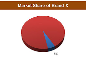
Example 1: You conducted a research and found that your brand's market share is 5%. It makes no sense to put up this pie chart and show this 5% graphically.
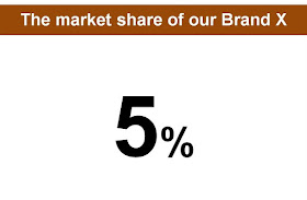
 What value is this pie chart adding? How is it different from just typing out 5% on a slide.
 No different. Actually the second slide looks better! Do not present such data through charts. You can do better if you add a relevant image with the second option, an image which brings out what 5% means to the company and to you.
Lesson 2: Make charts to enhance audience understanding and add value
How do you know if your chart is adding any value? Type out your raw data on a slide. On the next slide, put the chart you have made from the same data. If your chart gives you some more information which is not available by looking at raw data then your chart is adding some value.
Example 2: Your organization has grown leaps and bounds in the last 30 years. You have this raw data with you.
 If you present it like this, do you think it will make much impact. If you present it in the form of vertical bar graph, there is an amplifier effect.
 The understanding goes up and so does the impact. The data now becomes much more impressive. You can improve the same further. I had explained it in one of my earlier post. You must read it here.
Example 3: Why are historical share prices depicted through line graphs? Because if I presented you with 365 data points (one years data) in a table, then by looking at them you would not be able to make any sense. The same data with line graphs reveals trends which you can never decipher otherwise. Charts form the basis of technical analysis in the stock markets.
So the question you need to ask the next time you are tempted to make a chart is: "What value do I add when I present this raw data in form of a chart (or graph)?" If the answer is nothing, then do not make the chart. Find out other ways to present the data. Look at the next example to see what you can do when you have one data point and you are not using a chart.
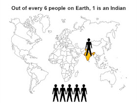
Example 4: You want to show how large India has become in terms of population. This is your core message (your point). So, what do you do? You can make a pie-chart and show that 17% of world population comes from India. But by now you understand there is no sense in presenting one data point in isolation. Your chart will add no value to the raw data. Now look at this infographic:
 Does it not drive the same point home in a much better fashion. It does.
To summarize:
1. Do not make a chart if you have only 1 data point. Charts are best used when there is a comparison.
2. Before creating your next chart ask yourself this question: "What if I don't present make this chart? What do I lose? What value do I add by making the chart?"
3. There is a point you want make with your data. That point can be made in multiple ways; you can make a chart, just type out the data, use an infographic or present a table. You should only choose a chart when that point (core message) can be presented better with the help of a chart. Remember chart is just a medium of presenting raw data to convey the desired message. In example 4, the message is 'India has a very large population'. The data you have is 17% and the medium we have chosen in an infographic.
When using charts you should remember that your chart has to either:
1. Enhance the understanding,
2. Reveal relationships in data,
3. Add impact to the data, or
4. Convert raw data into useful information
In the next post of the series '14 Tips to Present Awesome Charts' I will discuss how you should choose the right type of chart.
So, what has been your experience with charts? Have you come across useless charts? Do you make useless charts to follow the norm in your workplace? Am eager to listen to your experiences. See you tomorrow!
No comments:
Post a Comment