May 31, 2009

Be a Charts Champion

Charts or Graphs are visual display of information. No presentation is complete without these. There are a lot of decisions you need to make while using charts on your slides. Some of the questions are:
  • Which chart to use?
  • How to make changes in a chart?
  • How to generate complicated charts (bubbles, radars)?
  • How to make it look good?


To answer these question and much more, I am starting a series 'Charts Champion'. If you have a query or a tip/experience to share shoot them to me at vivek [at] jazz factory [dot] in.
May 28, 2009

How to cheat with PowerPoint?

Arvind, a sales manager, has to make a 20 minute presentation in his office and his boss has put a upper cap of 5 slides. Arvind does not feel that he can put all the content in just 5 slides. What should he do? How can he put 10 slides' matter into 5? How can he circumvent the law without breaking it?

This was the question I had asked in my May 14 post. A reader Riz Mathani had also given a good reply. In today's post I present one more solution to this problem.


How do you cheat with PowerPoint and present the matter of two slides in one?
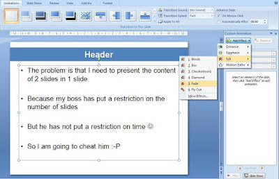
The answer is actually very simple. Use animation.


Step - 1 Create the first slide in the normal way. Then animate the placeholder (body).
Animation -> Custom Animation -> Add Effect -> Exit -> Fade (in 2007)
Under Effect Options -> Text Animation -> As One object
You need to do this otherwise each bullet point will fade one after the other.
Step - 2 Copy the second slides text onto the first slide. Then animate the placeholder (body).
Custom Animation -> Add Effect -> Entrance -> Fade

Result: In slideshow mode, content of slide 1 comes first. On a mouse click, the content fades and on another click slide 2's content appears.

How do you use this trick?
You might never have to use it this way, putting content of two slides onto one. But knowing how to animate text, make them appear disappear helps you do a lot of tricks with PowerPoint.

In what all situations would you like to try out this trick? Leave a comment.

May 26, 2009

Giving the same presentation again and again

Last week was interesting. I was on a small recruitment spree. We are offering summer projects to MBA 1st year students. Hence I went to 4 colleges and gave a 30 minute talk everyday from Monday to Thursday.

I had some 15 slides divided into four areas:


Introducing the organization

Why a summer project?

Summer project details

What's in it for you?


The first day went well. It was the first presentation. Full of enthusiasm and energy. But before Day 2 I wondered, am I going to present the same thing? This question came back to me before the third and fourth presentation as well.
How do you keep your enthusiasm and interest level constant when you are presenting the same thing again and again?

I had a recipe ready.

I used to change/add one slide everyday.


Out of the four parts in my presentation, the most interactive were 'Why a summer project?' and 'What's in it for you?'. To engage the students, I used to ask a lot of questions. Make them think. Also making them write down a few things. Play some games.

On the one hand I changed/added some interesting content everyday and on the other I altered my questions that I used to ask to make the presentation interactive. I was asking 50% of the standard questions and 50% new questions everyday. For example, when I talk of brand awareness I ask them to name some brands for categories like Soaps, Detergents, etc. Everyday I was asking them to name different categories so that it does not become boring to me.

The new slide I added was removing the monotony from my presentation. The new questions I was asking everyday was also giving to an opportunity to think and give new answers everyday.

Have you ever given the same presentation multiple times? Did you feel bored? Did you try to re-invent your presentation? Leave a thought.

May 23, 2009

What is the ideal font size for a presentation?

Recently I put up a poll on the blog asking readers "What font size they mostly use in ppts?" The answers were very surprising: 40% readers use a font size of 11 to 15, another 28% use 16 to 20. 76% of the readers use a font size of 20 and below. Is 20 and below the ideal font size?
What's ideal depends on your medium of delivery: whether you are emailing your presentation or you are going to physically deliver it.
If you are emailing, do not go below font size 18 for body text and 26 for header. Remember, the bigger the font the easier it is to read the presentation.

If you are delivering the presentation personally on a projector then I advise a minimum font size of 24 for
body and 34 for header.

What is the role of font size in your presentation?

It makes the text easy to read.
Remember, the audience member on the back should be able to read the slides without any problem.

Knowing how large is your audience will help you decide your font size better.
The larger the audience size, the bigger will be the venue and the larger the font you would need.

Is there a better way to figure out the ideal font size?

There is. If you know your venue you can actually figure this out easily. When I was making presentations in
my college classroom, the minimum font size which was visible from the last bench was around 24. I figured this out by actually going to the classroom earlier one day, putting up my slides and going to the last bench.

If you are familiar to with the venue, its your conference room or classroom, then try this out. Go to the venue, project your slides and see what font size is clearly visible from the last row.
If you are unfamiliar to the venue then think about the size of the audience. When in doubt, always go for a bigger font.

Remember, size does matter.

What font size are you currently using while delivering presentations to clients or in the classroom? If you are using a font smaller than 24, then I would like to know why? How did you decide on your font size? Leave a comment.

May 19, 2009

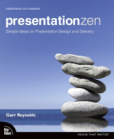
Presentation Zen: Your Road to Presentation Nirvana

If there was ever a book I wanted to read on the art of presentations, it was Garr Reynolds Presentation Zen. Before sharing with you what Presentation Zen is, I would like to tell you what Presentation Zen is not.
  • It is not a book on MS PowerPoint tips and tricks
  • It is not going to make you a better presenter in 30 days
  • It is not a short-cut to presentation stardom
What is Presentation Zen then?
It is a new approach to the art of presentations. It is a collection of Garr's wisdom gathered over time. It starts with a realization that something is wrong with presentations today. And after having realized that, you improve by investing time and effort.

During my journey through its 225 pages I gathered a lot of wisdom. Some of it I am sharing with you today. If you want more, I strongly recommend you to buy Presentation Zen. Like any great book, the essence of Presentation Zen cannot be drawn from a single reading. Everytime you read it, you will learn something new.

The Starting Point
The very reason you are reading the book is that you want to become a better presenter. You can only become better if you realize that there is something wrong with your presentation style today. Everyone else is also on the same page and hence to become better you should be ready to take your own path. Be ready to break the rules! Go against the norm.

The Zen Approach
Presentation Zen uses the learnings of Zen to the art of presentations. Staying in Japan Garr has been immensely influenced by the teachings of Zen. Zen teaches us restraint, simplicity and naturalness. Applying it to presentations they teach:

"Restraint in preparation, simplicity in design and naturalness in delivery."

Preparation
When you are preparing for your presentation you should decide on your presentation objective and work towards achieving it through appropriate content, design and delivery. Presentations are not made to impress others. However they are great opportunities to differentiate yourself and your organization and increase your business success.

Before you open you PowerPoint slides take a step back, look at the overall objectives and think about the parameters within which you are operating. How much time do you have? Where is the venue? Who is your audience? What are their expectations? What do you want to share with them and Why should they listen to you at all?

Once you have figured out your core message, you start planning on a whiteboard or with paper (analog mode). It helps you get the bigger picture and plan out the flow properly. Only after you have everything planned out should you open the slides and start typing.

Design

"By stripping down an image to essential meaning, an artist can amplify that meaning..." - Scott McCloud

What do we mean by design? Garr belives that design is not decoration. Simplicity in design implies removing any non-value adding elements from the slide and the presentation. Choosing images which take your point further. Taking care of the aesthetics of the slides. Aiming for simplicity in everything we choose in our presentation; from the kind of template to the use of charts and graphs. The simpler the design the more is the understanding.

Delivery

"Be here now. Be someplace else later. Is that so complicated?" - David Bader

Naturalness in delivery teaches us to be our true self and present in the present. Forget the past mistakes you might have committed, forget the future (whether you will fail or succeed). Be lost in the moment just like an artist while playing music. Presentation is an art and you are the artist.

The Journey

"The journey of a thousand miles begins with a single step." - Lao-tzu

Where the book ends, your journey begins. Not many will begin their journey after reading Presentation Zen. Many who start will lose focus on the way. The one who works hard will make it to the end.

-----
"All this worldly wisdom was once the unamiable heresy of some wise man." - Henry David Thoreau

May 16, 2009

Role of Images in Your Presentation

In my May 7 post I talked about the importance of choosing an image which merges with the background color. Today I will talk about the role of images in presentations. You cannot deny that images are being used in most of the presentation today. Be it formal or informal. But why?

Why do you use images in your presentations?
Think for a second before you read on.

1. To make your presentation look better
2. To break the monotony of text heavy slides
3. Because you like a particular image so you want to put it

4. Because it helps you explain the message better
5. To add humor into the presentation
6. Because you should use images in presentations
7. Because everybody else does it

An image is a visual representation (of an object or scene or person or abstraction) produced on a surface (source). Every slide has a story and every slide should talk about one thing.

Given this background, what is the role of an image in your slide?

To make it easier for the audience to get the key message. The image along with your text and speech conveys the message clearly and powerfully.


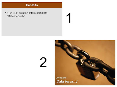
Take a look at two slides and see for yourself which one is better.
Slide 2 is better. As soon as we see the 'key and chain' the feeling of security is strengthened in our minds. Use images which take advantage of these associations in the minds of people. Lock with security, Fire with danger, Dove with peace and so on.

Remember: Your message is more important than your image.
Let the image not take over the idea. Do not use an image because it is beautiful and you like it. The test of an image is whether it adds to the message and drives it in the minds of the audience.

The next time you make a slide with an image ask: "If I remove this image from the slide, will I take away something from the presentation or not?" If not, then remove the image.

Recall the last presentation you made and the images you used. How did you go about choosing images? Did the images add any value to your slides or they were just there? Leave a comment.

May 14, 2009

How many slides for a 30 minute presentation?

I have already answered this question in one of my previous post here (How many slides should your presentation have?). Then why am I writing on it again? In the last one month I have seen umpteen number of Google searches for this. There are scores of people out there who are facing this question and so I thought I will nail this issue once and for all.

The Question: How many slides for a 30/20/10 or 5 minute presentation?
The Answer: It does not matter. Have the right content, say one thing per slide and finish before the allotted time. Do not worry how many slides your presentation runs into.

Even if you realize that there is no ideal number there are various reasons which will make you worry about the original question. This is something I want to discuss in today's post. The reasons why you are forced to think on the number of slides?

Concern #1: Printing handouts. Lesser number of slides means lesser number of prints.
Concern #2: Time management. If I have more slides I will exceed the time

Answer #1: If you are going to present more slides then you need more prints. This might make your handout bulky and will have lesser content on each page. Looks like waste of space right? Wrong! You should never print slides and give it as handouts in the first place. A handout should be prepared separately and should capture the main points of your presentation. Why print something which cannot stand alone without your presence. Read more on handouts: Pick of the Week: Why do you need Handouts?

Answer #2: Time management is the main concern why people want to know how many slides is right. You can manage time by planning like this: If you have three sections in your presentation and 30 minutes, then first decide on how many minutes should you spend behind each section. If you allocate 10 minutes for section 1 then ask yourself, "How much content should I share with my audience so that i finish within 10 minutes?".

The presentation content is your input (leading indicator) and the no. of slides is your output (lagging indicator). To manage time, focus on the input that goes into the presentation and not the output.

Once you have zeroed-in on the right content it all depends on your presentation style. If you present visuals and want small bits of information per slide then you might run into many slides. If you are putting up complex information (a table for example) and want to elaborate on it, then just 2/3 slides might take up 10 minutes.

The bottom line is, do not worry on the number of slides. Know how much time you have and decide on how much information can you share within that time. How does it matter if your presentation has 10 slides or 20?

It's not over yet. To end today's post let me ask you something. Arvind, a sales manager, has to make a 20 minute presentation in his office and his boss has put a upper cap of 5 slides. Arvind does not feel that he can 'put' all the content in just 5 slides. What should he do? How can he put 10 slides' matter into 5? How can he circumvent the law without breaking it?


Update (Sept 2013)
I have written a new post about it.
Presentation FAQs: #1 How many slides in my presentation?

May 12, 2009

What Print Ads can teach us about Slide Design?

If you like 'designing' your slides, giving them a creative touch, this post will be helpful. Today I will take you through an understanding of how Print Ads get designed and how this understanding will help you design your slides better. This insight is based on my interaction last week with some creative people at RKSwamy BBDO.

This post will help you create good visual slides. Visual slides are slides which have a visual appeal and are not the normal text heavy slides. A visual slide mostly has an image with some text. But it can be a text only slide as well. You can make text to look like images.


Here is a print ad of Tata Nano (source: agencyfaqs.com). Have a look.


I am not getting into whether this is a great ad or not. That's not our objective. Let us analyze this ad from a design perspective. This ad has got 3 'elements'; The image of the car, the words "Can you change the way... Now you can." and the block of words "Bookings Close Tomorrow. Nano."


Visual Elements

A good ad should have no more than 3 elements. The lesser the elements the better it is. The amount of time the reader has exposure to an ad is limited. Hence
the ad needs to catch attention and convey the meaning very fast. An element can be a text or an image or a combination of both. The image of Nano is one element whereas the the sentences 'Bookings Close Tomorrow' and 'Nano' are one element because they are placed together.

Lesson for Slide Design:
While creating a visual slide, decide on the number of elements you should have. Have no more than 3 elements. If there is more text, bringing two related sentences together can reduce the number of visual elements on the slide.

Eye Movement

When an ad is made the designer has to decide on how will people see the ad. What should they see first and what next. In this ad, you would have seen the car first, and then the words "Can you change the way you travel... Now you can." Only after this will your eyes move to "Bookings Close Tomorrow. Nano."

Lesson for Slide Design: While creating your visual slide, you should be clear how the audience will see the slide. What will they see first and what will they see next and so on. How do you ensure this? You ensure this by adjusting the attributes of the elements.

Adjusting the Attributes of Elements
A visual element dominates or becomes more prominent over other elements by virtue of its size, color, style and other attributes. If the Nano car image gets shrunk by 50%, chances are that you will not see it first. As a rule, our eyes always go to the image first. But the colors and the size matter a lot.

Imagine that the font size of "Can you change the way... Now you can." is made much smaller than "Booking Close..." chances are that after the image of Nano your eyes will fall on "Bookings..." and not on "Can you change..."


Have a look at the new ad now. I have edited this in Photoshop. The car has become 25% of its earlier size and everything else remains the same. Notice that the ad doesnt look so nice. The eyes first go to the text and then to the car. The plot is gone.

Lesson for Slide Design:
If there are visual elements in your slide then you need to decide the order in which they should be seen.
If you want one sentence to dominate over other try increasing its font size or making it bold or changing its color. It is not as hard as it may seem now. Once you have become aware of 'elements and attributes' it will not be a tough task to implement.

To Summarize What We Have Learnt
1. Decide on how many visual elements you want in the slide
2. Arrange the elements on the slide. To reduce the number of elements, merge two related elements
3. Decide the eye movement of the audience by adjusting the attributes of the elements like size, color, etc.

Every slide has a story and there is a way the story needs to be told. In Nano's case, the image has to come first and then only will the story make sense and appeal to people.
Know your story and say it well!

May 9, 2009

Plan well for your Presentation: The Input - Output Method

Well begun is half done!

This might not be true for the game of cricket (where nothing can be said till the last bowl is bowled) but it surely holds true when it comes to presentations. The fate of your presentation depends on how well you prepare for it. This post is all about preparing the content of your presentation. This stage as 'the Planning stage' of your presentation.

As you read the next paragraphs think of the last important presentation you made.
How did you prepare then and how you could have done better?

Tools: A whiteboard and some color markers

Avoid planning your presentation directly in PowerPoint. It will kill time and will never help you plan out the flow well. When I started out as a presenter I used to boast that I get ideas when I sit before the PowerPoint. Later I realized that a whiteboard is more useful for planning. It gives you the big picture and allows greater clarity. Some people use pen and paper for planning. Planning this way might run into multiple pages, hence it is better to use a whiteboard. In its absence you may use a paper.

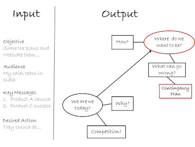
Input - Output Method

Divide the whiteboard vertically into two areas. The 25% of area on the left is for 'Input' and the remaining is for the 'Output'. It is the Output that we are interested in. That is what you will put on the slides. Input items will be your guide when you are planning.
Input Items

Before you can start figuring out what to write on the slides you ought to know your objective, your audience and other details like the duration. This checklist can be of great help when you are planning your presentation. Write down the following on the input side:


Objective of your presentation
Target audience
Key messages
Most important message you want the audience to remember
Duration
Audience expectation from your presentation
What action should the audience take post your presentation?


The reason I suggest you write these down is that you will not forget them. When you want to edit (or trim) your presentation these input anchors will help you determine what to retain and what to chop off.

Output

Once you are clear of your input, you can start asking logical questions and charting out the flow of your presentation. The sales manager sharing the coming years volumes plan with his team can start by asking 'Where are we today?' and have a slide on that. Then logically he asks 'Why are we here?''. He goes to the next logical step and wonders 'Where do we want to be?' and 'How are we going to get there?' and so on...

You start writing down these key headers as your output items. These are the things you want to talk about. You need not write down the answers to these questions on the whiteboard. The answers will be typed on the slides directly. It is the logical flow and the overall clarity which we get from planning on the whiteboard. Don't fill it with unnecessary text.

It does not mean you keep the board clean. Fill it with arrows, circles, boxes, stars. Use a variety of colors and make the process of planning enjoyable. Preferably plan along with a friend/colleague. You get ideas when you talk to someone. If you are alone, talk aloud to yourself and fill the whiteboard.

You can number the points in the order you want to put them on the slides. Slide # 1 could be 'Where are we today?' and Slide #2 can actually be 'Where is the competition?'. Then Slide #3 can answer 'Why is that so?'

Try out this Input-Output method of planning when you are going to make your next important presentation. Half an hour spent here can saves two hours on the PowerPoint. Remember, 'well begun is half done'.

Do you like this method? Leave a comment. Try it out the next time you are presenting? Leave a comment to clarify any doubts?

May 7, 2009

How to use Images in PowerPoint?

Using images in PowerPoint is a popular thing. Images add life to the content and help the audience visualize the key message. But images come with their own problems.

Over the next few weeks I would provide you with simple and effective tips on how to use images in PowerPoint better.
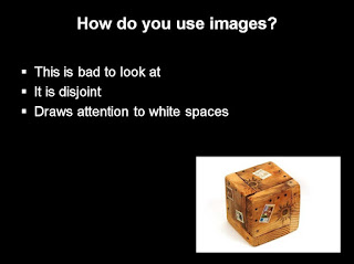
Today I will talk of 'Merger'. The image should not be disjoint from the background. You should, as much as possible, merge the image in the background. Why should we do this? Because it looks better.

There are multiple ways of 'merging' the image with the background. I share two such tips today.


Method #1: Choose the right image
If you have a white background then choose an image with a white background. Searching for one might take some more time but the results will be outstanding. See it for yourself.


The image above looks out of place because the background of the image is white whereas the slide has a black background.


This image is a big improvement on the earlier one. The only reason being; the image gels seamlessly into the background. So, the next time you are using an image, spend some time and choose an image which gels well with the background.

Method #2: Image Adjustment
You have followed the advice and chosen the right image. For a white background you choose an image which had a white backdrop.

Yet something is missing. Is it perfect? No. You can see grey color shades on the edges of the image. Now what?

The solution is simple. Select the image and increase the brightness by a few percentages (in this case I increased it by 10%).

Go to Picture Tools -> Format -> Brightness (in MS PowerPoint 2007). This simple adjustment leads to a drastic improvement in the image as it completely merges with the background.

Do you use a lot of images in PowerPoint? What are the challenges you face? How do you tackle them? Drop in a comment.

Images from freedigitalphotos.net

May 5, 2009

Make Good Consult Presentations - Part III

This is the third and final post on "Making Good Consulting Presentations". As part of the series I have interviewed consultants who are working with large consult companies in India. Young consultants should find these posts really helpful.

In today's post I interview Mr. Peri Vishwanath, an IIM Ahmedabad graduate who has worked for 8 years as a Management Consultant. Let us begin.

AAP: What is the most important thing in a consult presentation?

Peri: Communicate your message sharply. If you are in the early stages of the project and are presenting the problem as you see it, do not go and say "The problem is that sales are low." After having figured out the problem go ahead and define it as sharply as possible. Clarity and sharpness of the message holds the key.

AAP: How do you prepare the presentation slides? Do you start by opening the software and typing straight into it?

Peri: It is better to prepare on paper first. Most people do this initial stage on PowerPoint and end up losing time and also the bigger picture. If you are presenting as a team it becomes even more important to sit, brainstorm and decide the flow and key messages/headlines on paper. Once you are clear on the flow, the rest is easy.

AAP: Time management is always a challenge. How should one manage time during slide preparation?

Peri: If you prepare the structure on paper that will save a lot of time for you. Sticking to a template is a second way to save lots of time. A lot of time can get wasted in deciding on font, color scheme and template design. To thwart this every consult company has a basic guideline which makes the job easier. One should also avoid spending too much time jazzing up the presentation.

AAP: What should one do at the start of the presentation?

Peri: You should state the purpose of the meeting in clear terms. Also mention the expectations from that meeting/discussion so that the client and you are on the same page. Many presenters start by cracking a joke to lighten the mood and establish a connect. You should try out what suits your style and how well you know your client.

AAP: How should one use Charts & Graphs in a presentation?

Peri: Charts and graphs are an indispensable part of every presentation. While using charts and graphs take note of the following:

1. Give an explanatory title
2. Mention the source of data
3. State the period (monthly/annual data)
4. Font in the chart should be legible
5. Capture the key message of the chart in a text box on the slide

AAP: What would be your final words of advice to young consultants?

Peri: Just be clear on the 'storyline' and remember that every presentation is a sales pitch. You are out there to sell your ideas.

May 2, 2009

Presentation Blogs: A Snapshot

Blogging on presentations is on the rise. Two years back there were only a few blogs on presentations. Today there are many. Year 2008 has seen a surge in the number of blogs on presentations. Out of 15 blogs on my blog roll 8 were started in 2008! Year 2009 looks to continue from where 2008 left.

This post has been written with two objectives in mind.

1. To provide you with a list of good blogs on presentations

2. To share with you what each blog talks about

Here is the list of 16 blogs on presentations. These are the blogs I follow regularly and this list is by no means exhaustive.

These blogs have been arranged in descending order of their age (in months). In column 4 you will find the frequency with which these blogs get updated. If we plot age on horizontal axis and frequency on the vertical axis, this is how the blogs look like:
We can clearly group these blogs into three clusters.

A. High Frequency New Blogs
B. Medium Frequency New Blogs
C. Medium/Low Frequency Old Blogs

The general trend which one would expect is for blogs to start at a high frequency and then slow down as they age. To avoid this
I follow a simple policy of having three posts a week. All About Presentations thus gets regularly updated. Blogs like Ethos 3, Presentation Zen and Ellen Finkelstein's PowerPoint Tips blog should be complemented for constantly blogging for more than two three years now.

Blog Introductions (arranged in order of frequency)
Group A (Frequency High, Age New)


Talking Points (5.38/week): Joey Asher describes his blog in these words, "Talking Points is a blog about how to give business and sales presentations that connect with listeners, sell ideas, and win business."

Slides that Stick (5.31/week): Jan Schultink is a former McKinsey strategy consultant now working in his own boutique consulting firm. In his own words, "Slides that stick is about ideas for better presentation design, often taking inspiration from places far away from the PowerPoint slide edit screen."
ReThink Presentations (4.62 posts/week): The author Oliver Adria says, "ReThink Presentations discusses issues on presentation design, content and delivery. The blog has a conversational nature and discusses effective presentation ideas in a simple and easy manner."

All About Presentations (3.15 posts/week): At All About Presentations we discuss conceptualization, design and delivery of presentations. It is a practical blog containing simple and useful articles on how you can improve your presentation skills. Managers and executives should find this blog especially useful.

-----
Group B (Frequency Medium, Age New)


Slide:ology (1.62/week): Duarte Design's Slide:ology is a popular blog. The blog's content, mostly written by multiple authors covers what's happening in the world of presentations.
Speaking about Presenting (1.46/week): Olivia Mitchell is a very active blogger and this is what she said when I asked for an introduction. "The Speaking about Presenting blog is for people who have to give presentations as part of their work. I provides in-depth tips and techniques to help you plan an effective presentation and deliver it with confidence."
PowerPoint Ninja (1.46/week): Brent Dykes, the author of PowerPoint Ninja puts it in these words, "My blog is about practical or pragmatic tips and tricks for PowerPoint and business presentations. I focus on all three areas of planning, design, and delivery of business presentations."

Presenting Your Point (0.92/week): M.J. Plebon is the author of this blog. He stays in Canada. Lets hear what he has to say about his blog. "PresentingYouPoint is all about presentations from the initial conceptual thinking to the final delivery. I take a 30,000 ft view on presentations, the challenges, the issues and potential solutions. Every once in a while I will drop from the 30,000 ft overview and focus in on a specific area. If you are preparing a presentation for sales, raising venture capital, reporting to your department, superiors or colleagues, you can find some useful advice here."

Six Minutes (0.46/week): Andrew Dlugan, the author, focuses on public speaking and lists good articles from across the world every once in a while.
Apollo Ideas (0.31/week): When I asked him Jeff Brenman about his blog this is what he said, "Musings on presentation design and delivery from the Apollo Ideas team."


-----
Group C (Frequency Medium/Low, Age Old)
Ethos 3 (1.62/week): "At Ethos3 we are all about empowering presenters. Our blog contains all the tips, tricks, and resources we know about to help you - the presenter." This is how author Scott Schwertly puts it. He has also started another website called SlideMagnet very recently. "SlideMagnet is for both the novice and expert presenter. You will find that SlideMagnet is the best online resource to find anything you want about presentations and public speaking." - Scott adds
Presentation Zen (1.54/week): Presentation Zen is the most popular presentations blog. Now-a-days Garr Reynolds writes about real life presentation experiences.

Ellen Finkelstein's PowerPoint Tips Blog (1.54/week):
Ellen Finkelstein started her blog in early 2005 and this makes her blog one of the oldest. She introduces her blog in these words. "Ellen Finkelstein’s PowerPoint Tips Blog offers tips, techniques, tutorials, articles, resources, and more on all aspects of PowerPoint and presenting."
Dave Paradi's PowerPoint blog (1.38/week): Dave Paradi is a senior blogger and writes on diverse topics and offers useful tips on presentations.
Create Your Communications Experience (1.00/week): Bert Decker now-a-days analyzes political and other public figures and comments on their presentation style. His blog covers public speaking & presentations.
The You Blog (0.23/week): John Windsor started out in October 2006. He introduces his as, "Practical ideas on presentations, persuasion, selling, and communications."

-----
Every blog is aimed at helping you become a better presenter. The style and content vary. What is said and how it is said vary widely. Read what catches your fancy and suits your style.

How did you like this post? What presentation blogs/sites do you follow? Leave a comment.

May 1, 2009

Best of the Month: April '09

All About Presentations has crossed another milestone. Yesterday's post was the 50th post on this blog.

Talking of last month let me tell you that I make my own template for every presentation and to encourage you I wrote a post on 'How to create your own template'. Once you start creating your template, you will be able to differentiate your presentation from 90% of others who use dull and boring standard templates.

I also started a three part series last month aimed at helping young consultants. Consultants make presentations all the time and this is their output after months of hard work. How they present determines their success/failure as a consultant. The Consult Presentation Series is all about tips and tricks to improve consultancy presentations.

There are moments when in real life presentations you might be required to forget the slides and go alone. In those moments you should be willing to do that. My post on April 25 stemmed from a real life case where the presenter made his case and then went on presenting the same because he had those slides coming next. He should have just skipped the slides and moved on.

The three most popular posts of April were:

How to create your own template
Making Good Consult Presentations Part - I
Create videos in PowerPoint

The three most widely read posts on the blog till date are:

Making Sponsorship Proposals
Checklist for Presentations
What Dr. Stephen Covey can teach us about Presentations?

Subscribe!
If you wish to subscribe to the blog you can do so by email or through RSS feed.

I welcome you to share your personal experience as a presenter. What do you dislike about presenting and what are the new things you try? How has your experience been as a presenter? If you have any questions on presentation shoot them to me at vivek [at] allaboutpresentations.com.