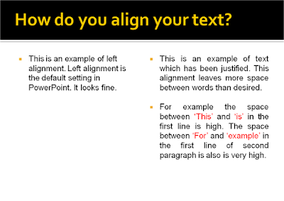
 The text on your left has been left aligned (which is the default setting in PowerPoint). The text on your right has been justified. Which is your preferred option? Which one do you think looks good?
I feel the left aligned text is better. The problem with justification is that it leaves a lot of space between words. At times, this space reaches abnormal proportions and words get placed very far away from each other. It does not look natural any more.
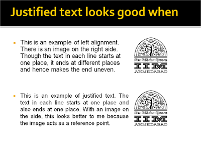
However, there is one instance where I prefer justifying my text. This is a tip my wife gave me once and I have been following it ever since. If you have noticed, all my blog posts are left aligned. However, when I put an image on the right side, I always justify my text. Here is an example.
 In the example above, I have used the logo of my institute to show how the text looks when seen in the context of the image. The justified text looks better.
How do you justify the text? Click inside the text box (it is called a placeholder), select all text (CTRL+A) then CTRL+J (press CTRL and J together). Press CTRL+L for left alignment.
This was about myself. I would like to hear about your choice? Do you leave the text 'left aligned' or you 'justify' your text?
You have saved me with CTRL + J for Power Point :). I have to make a presentation for a job interview and I didn't have a clue where the justified button was.
ReplyDeleteThanks!