Step-1 There are three stages of making a presentation. Preparation -> Design -> Delivery. Spend time on each step. Prepare properly before you create slides. Rehearse before you finally deliver your presentation.
Step - 2 Challenge the status quo. Before you start working on your next presentation, you need to accept that something is wrong with the way most presentations are made today. They bore people and no one likes to sit through them. Hence you need to change. You will take risks and do something new. You cannot become better than others, by just doing what everybody else does. You need to try something new.
Preparation (Preparing the content)
Step - 3 Start with a beginner's mind. Think like this is your first presentation. There are no right and wrong ways of doing stuff. You can present the way you want. There are no boundaries. Do not think what people will say if I do this. Just start with a clean canvas.
Step - 4 Place constraints on yourself. Force yourself to work within a timeline. Making a presentation is a creative process. This, however, does not mean you will take any amount of time. We all need to maximize our productivity. So set yourself some timelines and follow them properly.
Step - 5 Understand the needs of your audience. Who is going to attend and why? What are their expectations from you? How are you going to exceed their expectations? Do some audience analysis before you start figuring out your content.
Step - 6 Do not plan using the software. Go analog. Use paper or whiteboard. Think about the topic and arrange your thoughts. Put down everything you would want to say. Brainstorm. Then take a break. Do something else. Listen to music or take a walk. Come back to the notes you have made and see if you can improve it now. Arrange the flow of your ideas and make the flow logical. See the bigger picture.
Step - 7 Aim for clarity, simplicity & brevity. When you are planning your content you need to keep in mind three guiding principles. You need to aim for clarity, simplicity, and brevity (being short and to the point). Your message should be simple, short and crystal clear to the audience. Give most importance to clarity.
Step - 8 Ask the right questions. Know what matters in a presentation and what does not. If you are bothered about which template to use, which font is formal, which animation will impress the audience then you are asking the wrong questions. These things are not so important. The right questions are: What does the audience want from me? What do I want them to do? What is my objective? What is my one main message (my central point)? How much time do I have?
What you need to most worry about is: How to craft an effective and memorable story for my audience (a story that is relevant to them)?
Step - 9 Ask yourself two questions regularly. "What's my point?" and "Why does it matter to the audience?" These questions will keep you on track and ensure you are not including any content for the sake of it. These are the two questions which your audience asks itself while you present. "What is this guy really trying to say?" and "Why should I care and listen to him?"
Step - 10 Create proper handouts. If you prepare a handout which the audience can be given after the presentation, then you are freeing your slides from excess content. Write down everything you want in the handout. Then focus on the absolute crux and put that on the slide. Note that a good handout is not a print out of the slides. Make your handout in MS Word and put all your stuff along with charts and graphs there.
Step - 11 Craft a story. Having brainstormed in step 6, you now needs to crystallize all of that. What is your core message and what are the supporting messages? Is your message sticky (memorable)? What are you going to say to make people care?
How will you hold their attention for the entire duration of the talk? Is your talk very abstract? Can you put in a few real life examples to help the audience understand what you are talking? Is your presentation credible? Why should the audience believe in you? Have you mentioned the source of data you are presenting? Last but not the least, are you appealing to emotions. A presentation needs to be rational and emotional. How are you appealing to emotions? Only logical arguments will not take you far.
Step - 12 Create rough slides on paper or post-it notes. You have not yet opened the software. It is better to write down the content of each slide on a separate piece of paper. Sketch (rough is good enough) the diagram or image or table you want to use on the slide. If this step is done, then preparing actual slides will be faster.
Step - 13 Edit like crazy. You always say more than you should. You are close to your topic and you know so much about your topic. You also try to impress by sharing too much information. Realize your mistake and edit like crazy. Remove anything that does not directly support your main message (core message).
Design (Designing Your Slides)
Step - 14 Design is not decoration. Understand this most important thing about design before creating your slides. You are not supposed to make beautiful slides. You need to make slides which are well designed. Which serve their purpose. Our guiding principles at this stage are simplicity and clarity. Make your slides simple and help the audience understand the point.
Step - 15 Remove all noise from your design. Noise is something that increases the complexity of the design. Garr says, "If the item can be removed without compromising the visual message, then strong consideration should be given to minimizing the element or removing it altogether." Look at the examples below:

Step - 16 No 3-D (Three Dimensional) charts. Unless the data you are presenting has three dimensions, never present in 3-D. 3-D charts are more difficult to read and can adversely affect the understanding of the audience. See for yourself.
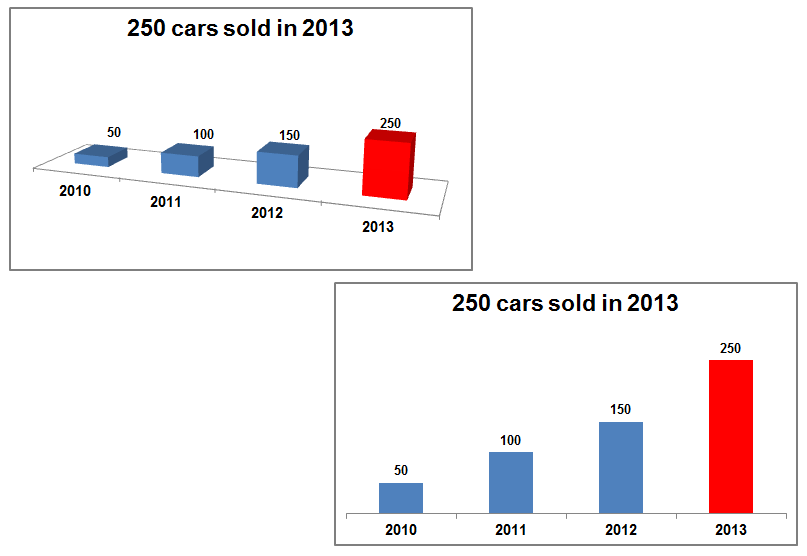
The 2-D chart is easier to see and quicker to understand. Stick to 2-D always.
Step - 17 Picture is superior to text. Slides with pictures get more attention than slides with text. They are remembered better as well. We have discussed this while discussing John Medina's book Brain Rules.
Stop using bullet points. When you look at your slide which has nothing but text, ask yourself: "How can I remove the text and replace it with an image?"
Using pictures also adds to the emotional appeal. Talking about poverty and actually seeing a photo of a poor man are two different things. Presentations have more in common with cinema and cartoons than written reports. You need to present the way your audience understands and remembers better. Go visual.
Step - 18 Better utilization of empty space on your slide. Empty space is the blank space on the slide. Most people try to fill everything on the slide. This approach is flawed. Having a lot of empty space makes the slide more elegant and powerful. It gives the text and images more power. Here is an example from one of my earlier post.
The print advertisement on the left catches your attention more than the one on the right. Large amounts of white space around any text or image increases its impact. Yet we keep making slides which are full of text and images and hardly have any empty space (white space).
Step - 19 Follow the C.R.A.P principle of design. Garr Reynolds recommends we use these four principles of design. Contrast, Repetition, Alignment, and Proximity. Contrast in a design makes it attractive. It also tells the reader what is important. Repetition means repeating common design elements across slides. This is the common design theme which runs across all the slides. Alignment is about how the various elements on a slide are aligned to each other. Proximity between elements is good for audience understanding. If two elements on a slide are placed together, it means they are related. If two elements are placed far away, it means they are not related. Our objective is to place related elements close to each other.
To read more about these four principles you can read my old posts. Contrast. Repetition. Alignment. Proximity. You can also download this free e-book which is a collection of all the principles.
Delivering Your Presentation
Step - 20 Be totally immersed in the moment. When you present, do not think about the past or the future. Do not worry about success or failure. Be present in the moment. Dedicate yourself to your presentation.
During preparation, our guiding principle was simplicity, clarity, and brevity. During design, we were concerned with simplicity and clarity. However, during delivery we will try to be natural. Be yourself and deliver your presentation.
Step - 21 Practice makes perfect. The message Garr gives is this: There are no short-cuts to presentation success. We saw the same being said by Carmine Gallo in the book 'The Presentation Secrets of Steve Jobs.' You need to practice your presentation many many times. Only then can you be comfortable when you finally present. Mock interviews and mock tests prepare you for the actual test. The same is the case with presentations.
Step - 22 Do not hold back. Let your passion for your subject show. If you are enthusiastic about your topic, do not hold yourself back. Remember what we agreed to Steps 2 & 3. We will challenge how presentations are made today and we will take the risk and do it the new way. Be natural and let people know how passionate you are about your topic.
Step - 23 Keep the audience hungry for more. Do not try to say everything there is on the topic. One presentation can only cover part of the topic. Moreover, your audience does not care as much about your topic as you do. Try to finish early, as no one likes a long presentation.
Step - 24 Do not stand behind a lectern (podium). Do not create any walls between you and your audience. Get a wireless presenter and move around while presenting. This way you will be more comfortable and closer to the audience. You will also be more in the limelight. Remember that the audience has come to listen to you and not to see your slides. You are the main attraction.
Step - 25 Mastering presentations is a journey. Give as many presentations as you can. Improve yourself by reading books and blogs on presentations. Spend time and hone your presentations skills.
Best of luck.
Thanks Vivek! This is the type of very clear step-by-step process that I love.
ReplyDeleteIf possible, I'd emphasize the importance of seeing through the eyes of the audience even more. Once a presenter makes this shift in perspective, each one of your 25 steps will make perfect sense.
@TJgoan
@TJ Goan
ReplyDeleteTrue. I guess the moment we think like our audience, the presentation improves significantly. However, it is not easy to do. What ways you suggest we go about doing it?
There is one way I can think of. If we are not able to put ourselves in audience's shoes easily, we can get a layman (a friend or colleague) and ask him/her to review the presentation. The questions that friend will ask will truly be beneficial.
You're right, it isn't easy and it is a step that is easy to dismiss it as unnecessary.
ReplyDeleteBefore I do anything I start with some role playing. I make an earnest effort to imagine what it is that my target (maybe a specific audience member) is likely to be thinking when they walk in the door. What questions, doubts, and concerns will they have before they sit down? What challenges are they worried about?
Sometimes I do this on my own, but similar to your suggestion, it can really help to have someone (anyone not deeply familiar with the topic will do) do through this role playing with you. While it is helpful to have them review a presentation after you are done, I find I can save a lot of work by getting into the audience's shoes as early as possible. A subtle change in perspective regarding what the audience will truly value can change everything.
cheers
TJ
Thanks for this resource! I plan to share this with my students; however, if possible, I'd appreciate it being given one final proofread. I saw several small typographical issues. I want my students to see this as the credible source it is! Here are just two of a few that I found:
ReplyDelete1st paragraph: "The interpretation is ofcourse mine." (need space b/w "of" and "course")
Step 2: "...you need to accept that something is wrong the way most presentations are made today." (I think the word "with" is missing between "wrong" and "the")
Thanks!
Thanks SH. I have made these and many more corrections in the copy.
Delete25 steps do not comprise simplicity, clarity and brevity, ten steps do. Pictures are indeed great, you should have used more. Overall your advice is on point but your design and delivery misses the very points you're making ;-)
ReplyDeleteThe tips are really a useful one but are can you say some important tips for classroom presentations because many of the tips cannot be used in class.
ReplyDelete