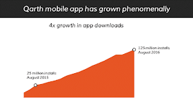
This slide is quite good in itself. But the chart is small and does not make all that impact. A bolder version of the same looks like this (see below). Stretch the chart across the slide (from the left to the right) so that it covers the entire slide and bleeds off the edge giving it a much bigger feel. More confident and visually more powerful and attention grabbing.
We decided to go bolder and the modified slide is the one you can see below. In this slide the elements get more importance and derive more power from their size and the way they look and feel. More confident, more attention grabbing. When you use small text, it indirectly implies you are not confident and you might be hiding something.
Going bold entails cutting down on words, making the font bigger and using lots of white space. It also ensures the most important messages hog the limelight and less important messages are deleted. The resulting benefit is a professional looking slide which makes you come across as more confident and dependable.
Here is the last example for today. The following slide is also a real slide made by a client of ours. This slide is not very impressive and makes a bad impression.
The bolder version (below) states the main message clearly. White fonts on big black background offer good contrast. The image adds characters but has been blurred so that it does not dominate the chart in foreground. The chart itself has been made bigger and made as a horizontal bar graph.
Conclusion: If you want to come across as more confident and dependable, make slides that are bolder. You could be making a B2B sales presentation or an investor presentation or talking at an international CXO conference, you need to come across as confident and dependable.


Thanks for the blog ! In your opinion which would be the ideal slide design, font size, font type and image size for preparing a formal ppt using Microsoft PowerPoint?
ReplyDeleteHi Preethi. There is no one font size or type which is ideal. Even in the same presentation font sizes may vary.
DeleteAs a thumb rule, for a presentation delivered in a conference room, never go below font 30. Header font can be 40. If your deck will be read on a laptop, the font size can be 24 and 36 respectively.
Images look good when you use it full screen. So download high resolution images. While searching on Google, go to Search Tools and Choose size Large. A resolution of 1920 x 1280 would be great. 1280 x 840 would also be good enough.
Images are also used as icons. For large icons 512 x 512 would be nice. Smaller sizes are fine if you are placing small icons.
Font types are many. Try using Google fonts. There are completely free to use. Check out this link: https://fonts.google.com/. To start with, try Montserrat for header and Open Sans for Body. Use sans-serif fonts for presentations (read on a screen) and serif fonts for word documents (printed and read).