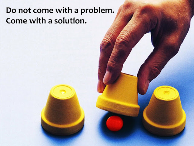
14 Charting Tips: Tip #14 What next? A trip to Quito?
This is the final post in the series, 14 Tips to Present Awesome Charts.
 In the last two weeks you have learned 13 tips on how to make your charts awesome. How to make charts that will help you achieve your overall presentation objectives. Should I expect that you will remember all the 13 tips and apply them every time you make a chart?
In my dreams.
How about a mnemonic?
Behold the 13 letters in order of their posts; N, T, T, K, D, L, L, A, S, C, A, H, A.
I am out of here!
So, what do you do with the 13 Tips?
After reading the 13 tips, you now need to understand the bigger picture; the process of making a good chart. You also need to know which ones are crucial and which ones can be taken lightly.
The Bigger Picture
Get out of the 13 tips and take a few steps back. Even better, take an airplane and rise above the crowd. What do you see?

This is the bigger picture. The process which you follow while making a good chart. This is a 4 step process:
Step 1. What is your key message?
Step 2: Is chart a right medium to express it? If yes, go to step 3.
Step 3: Which type of chart should you use?
Step 4: How should your chart look and feel? How is your chart designed?
The process starts with the point you are trying to prove. The role of design is to present the key message is a manner most understandable and palatable to the audience.
We have thus shrunk the 13 tips into 4 broad areas. Remember these four in this order: Key message, need for a chart, chart type and chart design.
Your Trip to Quito
Where do most people live in the world? On the equator, above it or below? The answer is above the equator (India, China, US all are above zero degrees latitude). How about the world of charts? In this world 90% people live at the extremes (north and south pole).

North Pole Presenters: They worry only about the 'Chart Core'. These people spend more time on the first three areas of making a chart: key message, need for a chart and chart type. They totally neglect chart design. This neglect comes from ignorance as well as lack of care.
South Pole Presenters: These guys get lost in small details and forget the overall picture. They spend more time on chart design. Trying hundred kinds of line colors, markers, shadows, gradient. You can throw them off balance if you ask, "What is the point you are making?" Amidst all this design they forgot the message.
What is the best place to be in this world of charts? Before we figure that out, I want to ask you where do you find yourself and where do you want to be? Think about it for a while. Do you really bother about chart design or you are too engrossed in it and spend disproportionate time designing your chart?
Quito, the dream destination
Quito is the best place to be in the world of charts. Have you heard of Quito? It is the capital city of Ecuador and it is the only major city which lies on equator. The word Ecuador itself means equator in Spanish. You see the small black dot on the east coast of South America. That's where Quito is.
Quito, bang on the equator, is the place to be for all of us. While making charts, the chart core (key message, chart need and chart type) is as important as chart design. Give them equal importance and spend equal time on both the aspects. A balance between both these poles will result in an awesome chart. A few degrees here or there is just not good enough.
What does it take to go to Quito?
Quito is far for most people. The journey is long and treacherous. You need a lot of determination to get there. You also need to make a road map which will systematically take you to Quito. Here are some cues which will help you reach there:
1. Extra Effort: The next time you are going to make a chart, spend some extra time thinking about the four areas (key message, chart need, chart type and chart design).
2. Develop Basic Charting Skills: Develop your basics through practice. Know how to play with excel charts. If you get stuck refrain from calling your colleague. Solve it with help from your inbuilt software and from Google search.
3. Learn from Others: Download and watch investor presentations of large multinational companies from their website. Visit slideshare and check out the most voted presentations in your area of interest. Every time you see a chart, stop and ask why do you like or hate it?
Seek help and feedback from others. After a presentation, you can always ask your colleagues on how they liked the charts. Were they able to understand it easily or was something missing? People will always share candidly. You just need to ask.
4. Take Interest and Discuss: Follow a presentation blog like All About Presentations which writes about charts regularly. Start a conversation to try and understand what is being said and why.
Best of luck on your journey to Quito. Be rest assured that that you are not alone. You will always find a co-traveler in me. Ask your friends and colleagues to also join in the fun.


Hi Vivek,
ReplyDeletesorry that I only had now to read the charts pages. Wow, looks like a lot of work that you have put in here! Quite a lot of material, thanks!
Thank you for sharing the infos and your ideas and let's keep fighting the bad presentations out there!
Cheers,
Oliver
(ReThink Presentations)
Thanks Oliver for dropping by.
ReplyDeleteI am happy you liked it.