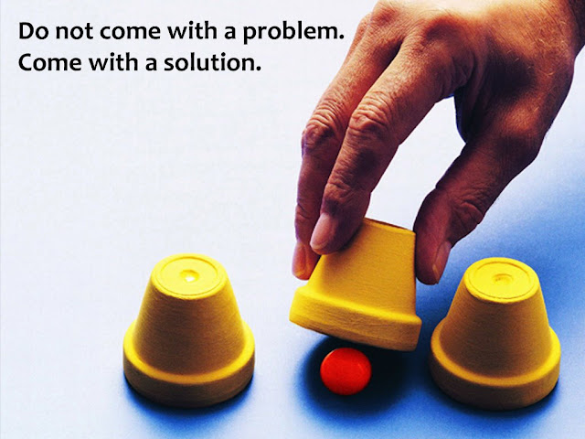
Design Basics Part 5: The Contrast Principle
This is the fifth post in the series 'Design Basics' where we are discussing how to make our slides look good. Read the first post of the series here. This series is based on Robin Williams' book 'The Non-Designer's Design Book'.
Design Principle #4 of 4: Contrast
What does it mean?
Contrast means difference. The difference between two elements on the slide. The difference can be of colour, size, font type, bold and not bold, vertical and horizontal text, etc. A simple example of contrast is the headline. See the image below.
 The two headline texts are in bold and they are bigger in font size. This is the contrast here. It makes it easy for us to read the text.
What is the Contrast Principle?
Contrast adds visual interest in the design and makes it interesting. In order to be effective, the contrast HAS TO BE strong. Example, font 18 and 20 is not a strong contrast. A strong contrast would be 18 and 30. Contrast also helps organise a document, so readers can skim through the material.
 In the image above which slide looks better? Which is more catchy? The one on the right and the reason is 'contrast'. A strong contrast gets attention. If the highlight colour is made light grey the contrast will become poor and lose it power.
The contrast principle states that we should find one important thing on the slide and highlight it.If there are two important things, bring them together physically and highlight them as one element (unit).
Our eyes always get drawn to contrast. This is a natural tendency. Hence, we should decide the most important point on a slide and use contrast to draw attention.
How to apply this principle?
Look at the ads below. Where does your eye fall first? Is it the most important message?
 The contrast is poor. Whenever there is so much text in a design, you need a strong contrast to focus the eyes on the main point. There are many elements which get our attention and nothing stands out well. The eye movement is haphazard here.
Contrast this to another text-heavy ad which we saw earlier as well.

The eye movements are well planned here. After we have looked at the product, our eyes move to the brand name (because of its larger bolder font), then to the header text (larger font size and blue colour) and then to the bunch of text above Neutrogena. This contrast helps readers navigate better. It also focuses the readers on the brand name.
Remember to have strong contrast on your slide. This will enhance the visual appeal of the slide and make 'eye navigation' easier.
To read about the third principle Repetition click here.
Design Principle #4 of 4: Contrast
What does it mean?
Contrast means difference. The difference between two elements on the slide. The difference can be of colour, size, font type, bold and not bold, vertical and horizontal text, etc. A simple example of contrast is the headline. See the image below.
 The two headline texts are in bold and they are bigger in font size. This is the contrast here. It makes it easy for us to read the text.
 What is the Contrast Principle?
Contrast adds visual interest in the design and makes it interesting. In order to be effective, the contrast HAS TO BE strong. Example, font 18 and 20 is not a strong contrast. A strong contrast would be 18 and 30. Contrast also helps organise a document, so readers can skim through the material.
 In the image above which slide looks better? Which is more catchy? The one on the right and the reason is 'contrast'. A strong contrast gets attention. If the highlight colour is made light grey the contrast will become poor and lose it power.
The contrast principle states that we should find one important thing on the slide and highlight it.If there are two important things, bring them together physically and highlight them as one element (unit).
Our eyes always get drawn to contrast. This is a natural tendency. Hence, we should decide the most important point on a slide and use contrast to draw attention.
How to apply this principle?
Look at the ads below. Where does your eye fall first? Is it the most important message?
 The contrast is poor. Whenever there is so much text in a design, you need a strong contrast to focus the eyes on the main point. There are many elements which get our attention and nothing stands out well. The eye movement is haphazard here.
Contrast this to another text-heavy ad which we saw earlier as well.

The eye movements are well planned here. After we have looked at the product, our eyes move to the brand name (because of its larger bolder font), then to the header text (larger font size and blue colour) and then to the bunch of text above Neutrogena. This contrast helps readers navigate better. It also focuses the readers on the brand name.
Remember to have strong contrast on your slide. This will enhance the visual appeal of the slide and make 'eye navigation' easier.
To read about the third principle Repetition click here.


Comments
Post a Comment