Jul 30, 2009

What do you hate the most in a Presentation?

All the time we think from the point of view of a presenter. I should do this and I should not do this. But remember that other than being a presenter you are also an audience. Why not learn from others' mistakes? So the question I have for you today is:

"What do you hate most in a presentation?"


Think as an audience. Try to remember the last presentation you saw. What did you dislike most? The amount of text on the slides, font size, template, sleepy voice, spelling mistakes, lack of passion, etc. etc. To reply leave a comment on the blog or mail to vivek [at] jazz factory [dot] in.

Interesting answers will find a mention on the blog.

Jul 28, 2009

#4 Charts Champion: When Legends Fail

Many a times we take the liberty of putting in too much data on our charts. We overestimate the capability of the tool (charts) and also overestimate the intellectual & visual capabilities of our audience.

Look at these two charts which I happened to see in the recent past. I have kept the chart similar to the original one I saw but I have changed the context for reasons of confidentiality. Chart 1 is trying to depict how sales of 9 products have moved over the past six months.


Chart 2 depicts which product of a company contributes to how much percentage of net profits.

What is wrong with these Charts?

Chart 1 is full of clutter. It has no values mentioned anywhere and it is very confusing. More than all this, one cannot even figure out which line denotes which product. An Orange is very similar to a Brown when seen from a distance.

Chart 2 is also asking too much of the audience. What aesthetic value does one derive in presenting a chart like this? Why should I get confused when I want to know what percentage of profits come from Product P?

After I see these kinds of charts only two things come to my mind.

One, that the presenter has not spent enough time wondering how people will comprehend the information. And Two, whether the presenter is at all interested in clarity. Many a times, people do want to conceal and confuse. In which case, these kind of charts serve the purpose well.

The point I am trying to make from these charts is that, you are close to the data and you are well versed with what you are presenting. But think for a moment about the audience who will see this data for the first time. How will you make them understand?

I want to leave you with a small task. Spend a minute each and modify these charts to make them more user-friendly. What changes would you make to these charts so that any person seeing it for the first time can easily comprehend the information without taking much time?

What elements should a 'good chart' have?

Jul 25, 2009

#3 Charts Champion: Try Out Various Options

Assume you are working in a market research firm. You are going to give an important presentation. The question you need to answer is: "Why do people work?"

Is it the money? Career? or, is it just for fun?

To know the answer, you have gone around and asked 100 respondents in four cities (Hyderabad, Kolkata, Delhi and Chennai). The statistics you got are something like this:


How do you present this to your client so that it answers the research question in a crystal clear manner?

Think for a while before reading on...


The simplest way to present this data is by putting it in a
'Table'. Exactly like the image above. After putting up the slide you can talk about things like; "People in Delhi work for Fun while Chennai for Career. However the people in Kolkata are split between Career and Money, etc etc..."

Most of us do this and move on. How do you know this is the best way to present this data? Can you think of other ways to present. Remember, you should present an information and not just raw data. The table is mere raw data.

Let us try
'Bar Graphs'. The slide will now look something like this:


Great! This way the information is presented better and it is very easy for the audience to 'see' what you have to explain if you just put the entire table there. When you put this slide, the audience can easily see that people in Delhi clearly work for Fun while people in Chennai choose Career.

Ok,
can we try something else? How about a consultant's favorite; 'Radar'

Complicated!
It becomes complex to juggle between the legend and the chart. Red is career and it is more in Chennai. But how much percentage? I have not plotted data values above. If I do then the clutter would be huge.

Conclusion:
1. Try out two or three ways to present a data. Do not just settle with whatever is easy or whatever comes to mind first.

2. Always choose a simpler graph (eg. bar graph) over a complex one (eg. radar).


I strongly recommend not to go for fancy charts and complicate your message.
Your objective is to simplify and not to confuse. If a chart needs too much of explanation, it is not a good chart. In our example, using a Bar Graph makes more sense.

What do you think?
Can you still use a Radar in this case and present the data in a better fashion?
I will wait for your response...

Jul 24, 2009

What bothers you most before a presentation?

What is the one thing that bothers you most, just before you are about to deliver a presentation? It's on top of your mind and it bugs you. Think about the last time you were about to present. What was worrying you the most?

This is my question to anyone who is reading this post. Share your answer through email (vivek at jazz factory.in) or by leaving a comment here. I will try eliminating that worry forever. That's my promise.

Jul 23, 2009

Presenting to the Media: 3 Important Lessons

Press Conferences are one place where presentations have a big role to play. Large companies regularly go in front of the media (press and TV) so that they get free PR (publicity). They organize Press Conferences in the best of hotels in town. Press Conferences are also a time when the top management gets exposed to the media and that makes it a high risk situation. You know how 'bad press' can affect a company. That's why all large organizations have PR agencies to help them 'handle' media well.

PR agencies also help prepare the 'Press Kit' which is given to media persons. The kit includes a Press Brief (a printed document containing all information you want to share), Gifts, a copy of the PowerPoint presentation
.

Preparing a presentation for the media is slightly different from a normal presentation. First, you need to be very careful with facts and figures. Second, the presentation has to be very short and simple.

Extra careful with Facts & Figures
Data mismatch (or any other gaps) in the presentation is going to be noticed very easily by the media. The outcome: your management will be asked to explain that in the Q&A session. So ensure the future growth plan figures, the size of the next project being commissioned, etc are right at every place they come in the presentation. Different pieces of data across the presentation when related to each other should look in tandem and not as if they come from two different companies. Do a thorough check before you go for printing the press release. DO NOT prepare the press brief at the last minute, then you are bound to make these mistakes.

Short & Simple
No audience wants to be bored with a long presentation. This is especially true of media. Everyone hates a presentation which goes round and round. A presentation which talks about the obvious or about unnecessary things. Information which is readily available as a print out (in the Press Kit) need not be detailed in the presentation.

Whatever you want to share with the media is already in the press brief. So why are you making the presentation? For example, your company is launching a new brand. The press brief (the print out) is with each member of the media. They can read that and write an article on your launch. Then why present?

You present to generate interest in the product launch. You present to make them understand clearly whats written in the brief. You will get more footage (and hence more free publicity) if the media likes your story. In order for them to like it, you need to present it in a way they understand and get attracted.

Do remember these three lessons:

1. Check your facts before you present
2. Keep it short and simple
3. Make your story interesting

Jul 21, 2009

The Floating Header Syndrome

Does your 'header text' float in the air or it has a stable base. I see many presentations which do not have any base to their headers. See for yourself which of the following looks better.

This one:
or, the one below:
It is the second one. It looks much better and gives a kind of stability to the slide. Otherwise the whole slide will keep hanging.

If this was such a simple choice then why do so many people suffer from what I call 'The Floating Header Syndrome?'
I have seen quite a few seasoned presenters going for a floating header. It's time they changed.

What's your style when you present?

Jul 18, 2009

Change your 'Outlook' towards Presentations

Two days back I attended an important presentation. It was a presentation from one of our agency guys. The presentation was in full swing when suddenly an Outlook mail alert popped up. It was very conspicuous and distracted me from whatever he was presenting. For those five ten seconds, the presenter had lost me. I was forced to focus on something else.

Though not a big blunder, there is a small lesson here for all of us.

When you are making a very important presentation, why is it that your internet is on? Do you care more about the mails that might come while you present or you are more bothered about the presentation you are making.

Such mistakes are never planned but only forces the audiences to wonder whether they are more important or the Outlook? The same applies to presenter's mobile phone being on when he himself is talking. Suddenly it rings and the presenter apologizes. "Sorry, I forgot to switch it off." (Did you forget or you are just not bothered?)

Think about it.

Jul 16, 2009

The Legend of Subodh Ranjan Saha: Mnemonics which last a lifetime

This post is especially written for Teachers and Trainers. When you share a lot of information in a speech / talk or a presentation and the audience is required to remember it, Mnemonics play a crucial part. All of us have grown up with them and yet how many of us realize the power of Mnemonics. I have personally been a fan of Mnemonics since my school days. For every crucial concept where I needed to remember lists, I had a Mnemonic.

You might still be wondering what a
title I have for this post. What is the 'Legend of Subodh Ranjan Saha?' Well, this post is dedicated to my Accountancy teacher who took my tuition during my Class XI, XII and Graduation years. His name is S K Jha and he gave me one of the most interesting mnemonics in school.

When I was in Class XI he told me one day; "In Balance Sheets, all the items have to come one after the other. You cannot have Unsecured Loan before Secured Loans. You have to write Investments only after Fixed Assets."

"So how do you remember the order?" I asked. What he said in return has stuck on to me for the last 12 years and will stay on forever:


Subodh Ranjan Saha Under Calcutta Corporation
.
Few Indian Citizens Love Miss Eishwarya (spell it with an E and not an A).


The letters in capital of the Mnemonic are the ones you find on the image above. Under liabilities, S will stand for Share Capital and then R for Reserves and Surplus and so on.

BODMAS

This is perhaps the most famous Mnemonics of all times. The order of Operations is what BODMAS is all about. When you get a problem like the one in the image below, you know how to solve it.
Bracket - Order - Divide - Multiply - Addition - Subtraction

SUCCESs

Chip and Dan Heath, the champions of stickiness, in their book Made to Stick have shared the secret of what makes a message sticky and how we can make our messages sticky. To ensure we remember the six secrets of stickiness, they have very rightly helped us with a mnemonic; SUCCESs.


S - Simple

U - Unexpected

C - Concrete

C - Credible

E - Emotional

S - Story


The last small s is just to complete the word.


Corporate Mnemonics

If you happen to chance upon a company website, you might discover some more Mnemonics.


The
Mnemonic 'THINK CONSUMER TO BE BIG' gets expanded to form Marico's set of corporate values.

What's Our Net Take Away
?
Whenever you give a presentation where you want the audience to memorize a tricky list of things or a very important concept, help them with a Mnemonic. You can also make the audience think of a Mnemonic on the spot. I have done that many a times. This will not only ensure they understand what you present but also remember it for a long time to come. Create your own Subodh Ranjan Saha and get etched in someone's memory forever.

Jul 15, 2009

6 months of AAP

Today on the invitation by GRIET, a prestigious college in Hyderabad, I addressed a group of 50 MBA 1st year students. I talked on Consumer Behaviour for around a hour and a half. My presentation went well and I had a nice interactive session with young students. I would share with you my experience in a few days. But today's post is for something special.

My blog completed six months yesterday.

I started blogging to share my views on presentations. I also wanted to learn more about presentations.

It has been a great journey for me so far. I have learned a lot and am sure you are also enjoying the blog. Thanks to every reader and to everyone who commented and critiqued the blog. Special thanks to my better half (who is the backbone of my blog).

Jul 10, 2009

Adjusting Images in PowerPoint

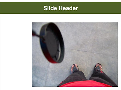
I use a lot of images in my presentations. They add a great look and feel to my presentation and enhance the understanding of the message. But imagine a case where you insert an image and it looks like this:
Aesthetically this is not a good slide because the image has left gaps on the background. The slide can be improved a lot.

So what do we do?

Some people will stretch the images making it disproportionate while some will align it in the center of the slide leaving equal space on both the sides. But these are suboptimal solutions. There is a better way of presenting the image.


Cropping!

What stops you from playing around with the image, without changing its aspect ratio. Aspect ratio is the ratio between the width and the height of an image. If the image has 20 cm width and 10 cm height then the ratio is 2:1. If you double the image height you should double the width by two times as well, to ensure the image does not look bad.
So, the way you should adjust the above image is to follow the following steps in cropping:

1. Select the image


2. Place it on the bottom right corner of the slide

3. Stretch it (keeping the aspect ratio same) so that it comes very close to the top place holder (in green)

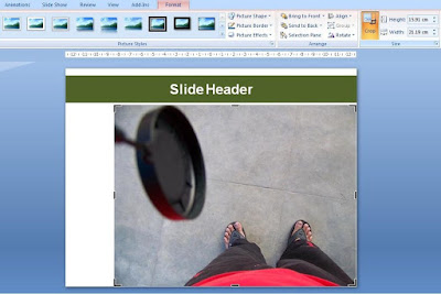
4. Under 'Picture Tools Format Tab' choose Crop. You will see the edges of the image will get highlighted.

5. Because the gap on the side is more (there is no gap on the top), you need to cut (crop) some part of the image from the top or bottom so what we can fit the image well within the slide from end to end without leaving any gap.

6. Cut the image slightly from top and bottom.


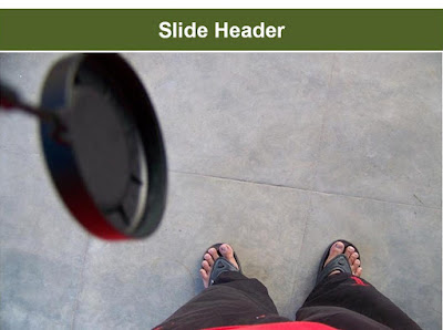
7. Stretch the new image and fit to slide. You might have to do Step 5 one or two more times to get to a perfect fit. Do not worry. The process is completely reversible. If you cropped 1cm from the right, later if you want you can increase 1cm and get that portion back. You will not loose out that part forever.

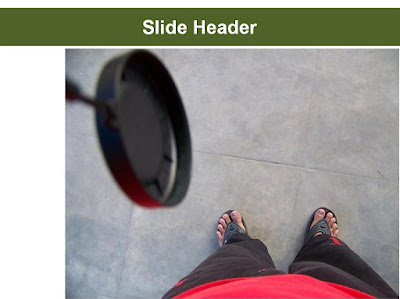
The final image looks aesthetically better and has the same aspect ratio. With minor cropping, the look and feel of the slide is now much better.

In Part 2 of this post, I will give an example of a slide which has both text and images on the slide and how cropping will help you get the right look and feel for the slide. In the meanwhile, if you have any clarification on today's technique, leave a comment.

Jul 9, 2009

How to align objects in your Presentation?

Misalignment is a common problem in presentations. Many a times, objects are not aligned properly because we try to do it manually. But there is a way to achieve perfect alignment in MS PowerPoint 2007. Imagine the following image is your slide. There are three objects on the slide. Here it is objects, but these shapes can also be text boxes.

How do you perfectly align them?
Do not take the pain of manually trying to bring all of them in one line with or without the help of grid lines. Follow the instructions below:

1. Select all the three objects.
2. Go to Home Tab -> Align
3. Go to Align again

4. Choose from the range of options based on your need.

If you want to align all of them to left, then Choose Align Left. However be careful. If you choose align left, all the objects will be aligned keeping the left most object fixed. The left most object will not be moved. Similarly, when you align right, the right most object will not be moving.

If you want all the objects to be aligned with their ride side touching the slide border, first take one of them to the extreme right. Place it properly. Then select all three objects and choose align right.


If you align them vertically or horizontally, they will get evenly distributed across the slide. To understand how 'Align' works, put three objects on a slide and try out the different combinations.

This functionality helps me a lot when I want to align images/text to the center or the middle. I enter an image in PowerPoint and then Choose Align Middle and Align Center. The image gets placed exactly in the middle of the page.

It is important to align your presentations, because it increases the visual appeal of your presentation. Try these options out and you will do a better job with your next presentation.

Jul 7, 2009

How to present one bullet point at a time?

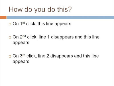
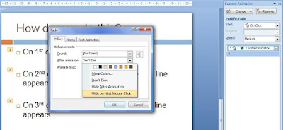
A few years back my superior at office was making a slide. He had 5 sentences (as bullet points) and he wanted to present them one at a time. He wanted to achieve what's explained in the following slide: This is not a normal animation which people use, but this can be of immense use in cases where you want to present points in a sequence. Presenting one bullet at a time ensuring full audience attention on the presented point. It is especially helpful when you have many bullet points and you don't want to show all of them on the slide. This is how you do it.

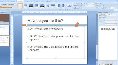
Step-1

Click on the placeholder (denoted by arrow) -> Go to Animations tab -> Choose Custom Animation Step-2
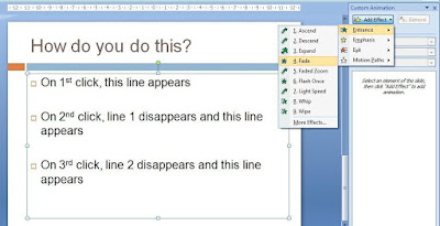
Add Effect -> Entrance -> Fade
This effect will ensure every bullet point will enter with a 'fade' effect. You can choose any other Entrance Effect you desire. Step-3
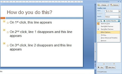
Under Custom Animation on the right, select Effect Options. Step-4
Under Effects Tab -> After Animation -> Choose Hide on Next Mouse Click
Your animation is ready! Try this out and use it when you want 100% audience attention on one of your bullet points.

What if you don't use bullet points? Bullet points have already become the most despised thing about presentations today. What if you just have 3 text boxes? How do you animate them in a similar manner? Click and the first text box appears. Click again and it disappears and the next text box appears.

Try solving this exercise and let me know how you did it? Unable to solve, shoot me a mail or leave a comment on the blog.

Jul 4, 2009

Can you pass the Twitter Test?

Twitter is the 'in thing' now-a-days. Every body is joining the bandwagon. In Twitter you post (or tweet) short messages to people following you. Obama's use of twitter during his Presidential Campaign has already become a marketing case study. How he kept in touch with his voters on the go.

The most interesting thing about Twitter is its word limit restriction. 140 characters, that's it. It forces the user to condense the message, come to the core and reduce excess flab.


Why suddenly Twitter on a presentation blog?
In presentations, we are advised to 'talk less and talk sense'. Come straight to the point and don't beat about the bush. If you apply what you do on Twitter to your presentations, you can improve yourself as a presenter.

The Twitter Test
Imagine you are giving a presentation. Your audience is following you on twitter and instead of talking you need to tweet whatever you have to say. You can only tweet once for each slide. How will you fare in this exam? Can your presentation pass this twitter test?

Just the thought might make you wonder, Oh God! How on earth can I say all the things in 140 characters or less. In reality you are not needed to. But if you do know how to then you are in a good position to do well.

While you are preparing the slides, think about the core message for each slide. What is it that you are going to say. Write it down in 140 characters or less. It will be tough initially. You wont be able to squeeze in everything. Once you start eliminating, the non-core items will get thrown out and what will remain will provide you immense amount of clarity about your own work.

Put your next presentation through the Twitter test and tell me how did it feel? How did it help you present better?

Jul 2, 2009

Make good use of Motion Paths in PowerPoint

Motion Path is a powerful animation technique in MS PowerPoint. If deployed effectively it can work wonders for you. Know when to use them and it will bring a lot of value to your presentation. For the uninitiated, Motion Path is an animation feature (Animation -> Custom Animation -> Add Effect -> Motion Paths) which allows you to move objects/text/shapes across the slide. You can move objects in any direction you want to. You can also draw a custom path and make things move.
If you are a regular reader of my blog you know that I have recruited 24 interns and they are working on a project. They have been divided into 4 teams namely Victory, Superstar, Nawabs and Prince. Every week I review their performance and I present to them, among other things, their cumulative team scores.

While preparing one of my review presentations, I noticed that the Prince team had done really well and came up from the last position to the second position. So after showing them the score charts I wanted highlight this very point. So what did I do?


I could have just put up the slide and told them "Look how the prince have come up so fast, from the last position to
second place." But, this is what everyone does and I wanted to do something different. I wanted to bring this fact (of Prince coming up so fast) to life. So I relied on Motion Paths.
Step - 1
I drew an arrow and animated it 'Entrance + Fade (On Click)' and placed it where the Prince line chart started


Step - 2

I selected the arrow -> Add Effects -> Motion
Paths -> Diagonal Up Right

Step - 3

I adjusted the path to suit my exact direction of movement (just below the Price chart). Then I animated it 'On Click' and set the speed to slow.

Step - 4

Put another arrow at the last stage of Prince, where they are at the No. 2 position. Animated it 'Entrance Fade (On Click)'.

All of it in just two minutes!


I presented it thus:

After putting up the chart I said "Let us look at how Team Prince has been doing over the past few days". (1st Click - You see the arrow appearing. Indicating that Prince were at last place). They were at the bottom at the initial stages. (2nd Click - The arrow starts to move underneath the Prince line chart) Look how they continued to be in the last place as the week progressed. Last all the time. And now... (3rd Click - Another arrow appears where the chart is ending). They are No. 2. Pumped Up Prince indeed."


This is a better way of presenting this kind of information. It brings your data to life and brings immense amount of clarity and drama to your presentation. There is however a word of caution. Motion Path is animation. And you should know when and how to use it. Use animation sparingly and use it to highlight something very important.

Have you used motion paths ever? Can you think of a situation where you could have used this technique in your last presentation?

Jul 1, 2009

Best of the Month: Jun '09

June was an interesting month. I gave one major presentation every week in June. And all of them were to the same audience (and it was a large audience). Hence most of the posts drew their inspiration from these experiences; preparing and giving these long presentations.

My favorite posts from June are the following.

Tidbits which connect with the audience: How small pieces of information about the audience or the venue can make a big difference. They help you add humor and connect better with the audience. This post is based on my presentation in a city MBA college.

Dramatize your presentations: Based on three back to back presentations, this post takes you through my real journey of creating dramatic moments at the start of every presentation. What made them dramatic and how you can make your presentation dramatic as well.

Are audiences sweet-toothed?: 1 day, 4 hours and 40 chocolates. A small idea which went a long way and ensured I had 100% attention of my audience for a four hour long presentation. Try it out. It is smart, innovative, economical and effective.

Subscribe!

If you wish to subscribe to AAP, you can do so by email or RSS Feed.

I would like to listen to you. If you have any queries, comments, ideas or experiences to share write to me at vivek [at] jazz factory [dot] in. Take care!