 What is chart aesthetics?
Aesthetics mainly deals with beauty and taste. In our context, chart aesthetics would mean the overall look and feel of a chart. For an audience to understand and read a chart, they need to like it first. It does not mean that a chart has to be a piece of art. It simply means the chart has to 'fit' in the slide and should not look out of place. It has to be such that your audience can easily read and remember the chart.
Why bother about chart aesthetics?
After all you are a serious presenter. It is a presentation in your college or office. And here I am teaching you aesthetics. So why should you bother? Let me show you four formal charts. Assume that you made these four charts. Would you be happy with this?
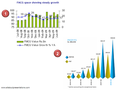 Chart #1: Do you think your audience would like to read this chart?
Chart #2: Do you think your audience will be able to easily read the chart (and understand)?
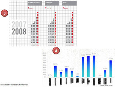
Chart #3: Will you ever be able to prove your point when you present a chart like this? If you cannot, how will you meet your overall presentation objective?
Chart #4: Do you think people would even like to read such a chart? What will they think about you after you have presented this chart?
Well as far as the charts go, they are from annual reports and presentations of FMCG major Dabur, Info Media Pvt Ltd (promoters of Naukri.com), BILT (makers of Matrix Office Stationery) and another FMCG major Emami respectively. You are human and hence you will make bad charts many a times. This is why you need to understand chart aesthetics.
How to enhance the appeal of your chart in 10 easy steps?
Aesthetics is a vast subject and leaving it at a theoretical level will not be good. Here is a technique you can use to dramatically enhance the aesthetic appeal of your chart in 60 seconds.
Technique: After you have made your chart, go through these 10 steps (in any order). Follow all the steps and within 60 seconds you will have a dramatically improved chart.
Step 1: Remove all the grid lines (major and minor).
Step 2: Adjust the size of your chart to balance it with other elements on the slide.
Step 3: Check for the font size and font color of axis, chart title and data labels. If you have re-sized your chart, you must re-adjust the font size.
Step 4: Maintain good contrast between colors of the slide, chart area, plot area and the bars/lines (more on it here). Aim for better visibility.
Step 5: Make the line graph thicker to enhance visibility and appeal.
Step 6: Change the location of your legend. This will free a lot of space (more on it here).
Step 7: Delete some data labels which you don't need, without causing a loss of information. This reduces a lot of clutter (more on this here)
Step 8: Club your axis title with your chart title. Instead of writing In '000 tons above y-axis you can always make the title as; Sales (in '000 tons). This will free some more (valuable) real estate. More on this here.
Step 9: Make the axis lines thicker. This gives a good frame of reference to the eyes to view the chart.
Step 10: Convert your three dimensional chart to a two dimensional one (3D to 2D). Why? Because the extra 'D' spells disaster.
Let us use these 10 steps on the 1st chart. Here is the chart once again for your reference:
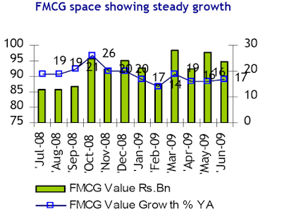
Chart Makeover Steps
Step 1: Skip. The chart does not have any grid lines.
Step 2: Skip. Not applicable, as we are dealing with the chart in isolation here.
Step 3: The font sizes are bigger than needed. Reduce them to something better.
Step 4: Color scheme
Bar Colors - Change the color of bar outline from black to dark green. So many bars with black outlines makes the chart look cluttered.
Line Colors - I have converted the line to reddish brown (as it gives better contrast). Right click on line graph -> Format Data Series -> Line Color
Step 5: Make the line graph thicker. Right Click -> Format Data Series and choose width 3. Also change the markers to diamond. Format Data Series -> Marker Options -> Built in (diamond) size 8 -> Marker Fill automatic.
Step 6: Legend on the bottom is fine. Having it on top will clutter the chart and having it on sides will narrow down the plot area.
Step 7: Remove all the data labels. When your bar graph does not have labels, why do you want to label the line graph? You key message is that FMCG industry is growing steadily. The trend is important and not individual values.
Step 8: There are no axis titles in the original chart. You should add axis titles because there are two axis and you have removed the labels for line graph. You must add axis titles (Value Rs. Bn and Value Growth) to make the chart easy to read.
Step 9: Make the axis thicker. By default they are always thin. Right click on axis -> Format Axis -> Line Color Black -> Line Style -> Width 3.5
Step 10: Skip. This graph is two dimensional.
Not all steps will apply to your chart. Use what applies but more importantly treat them as guidelines and do not follow blindly. We did not follow Step 8 above because the chart demanded it. Here is you new chart after the makeover.
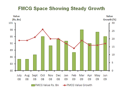 If I were presenting this, I would go one step further. There are no data labels and we have two axis. How do you know what is being measured on which axis? One measure we took to solve this problem was in Step 8 where we added Axis Titles (Value Rs. Bn and Value Growth).
What more can you do?
Change the color of primary axis (left) to dark green and secondary axis (right) to reddish brown. Ensure your axis is thick enough to make these colors noticeable. When you read this chart, visual cue will compliment text well. Here is your final chart:
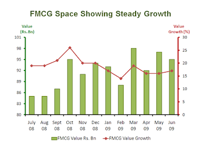 Notice that font colors of Axis Titles have also been color coded. Primary Axis Title is green and the Secondary Axis Title is reddish brown.
Your chart will be read only if it appeals to the eye. You don't need a piece of art. But that does not mean that your chart totally ignores basic design principles. Every presenter is a designer and it's time you stood up and took notice.
No comments :
Post a Comment