 Today we will talk about chart axis. To be specific, we will discuss the following:
1. What is an axis?
2. What should you know about an axis?
3. What more can you do with an axis?
4. When and how should you use secondary axis?
1. What is an axis?
An axis in a chart or graph is the line along which we measure our variables. It is nothing but a scale (or a ruler). Go back to your class 6-7 where you read about Y-axis and X-axis. In the following chart, we are measuring your height up the Y-axis and your age along the X-axis.
Example 1 Your height over time
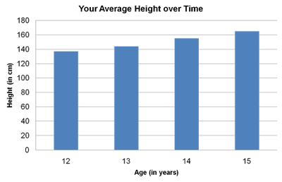 The first data point; at age 12 your height is just under 140cms, at age 13 it is just above 140. The axis tells you that age and height are being measured. Age is being measured along x-axis (horizontal axis) in years. Height is being measured up the y-axis (vertical axis) in cm. The axis also lets you read the measurements. If you need more accuracy, you need to label the data.
2. What should you know about an axis?
First, you should know what is the purpose of an axis. To be able to use something, you should know what it can and cannot do. An axis tells you what is being measured and also lets you read the values (approximately). As an audience, you should always check out the axis before looking at the bar or line graph.
Second, because the axis tells you how to read the chart, you have to label the axis. The way I have done it in the chart above. Label the axis by doing two things:
1. State what is being measured, and
2. Mention the units of measurement.
This is however theory. Practically you should only ensure that these two pieces of information are there in a chart. But I advise you not to put this information always in your axis. Look at these two examples:
Example 2 Sales of Company X from 2005 to 2008
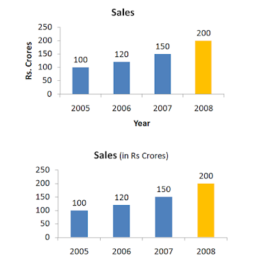 The chart on top follows the theory but the chart on the bottom does not. If you are presenting, which one of these should you prefer? My answer: The one at the bottom. The lesser you write on the chart, the more space you save. And all this happens without loss of information. You do not need to mention Rs. crore and year with the axis. Treat space on a chart as precious real estate.
3. What more can you do with the axis?
You can actually do a lot of stuff with your axis. To find out what all, left click to select the axis and then right click and choose Format Axis.
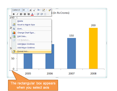 There are many options in front of you like Axis Options, Number, Fill, Line Color, Line Style. We will understand the main ones with help of an example:
Example 3 Sales of Company X from 2005 to 2008
 3a. Line Color & Styles
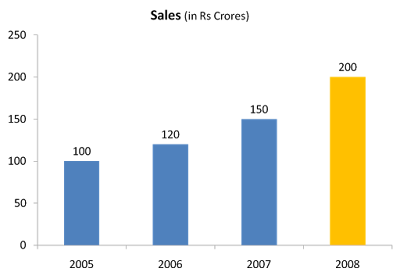
Choose vertical y-axis -> Format Axis -> Line Color. Solid Black. Then Line Style -> Width 4
Again, choose horizontal x-axis -> Format Axis -> Line Color. Solid Black. Line Style -> Width 4. You chart now looks better than before.
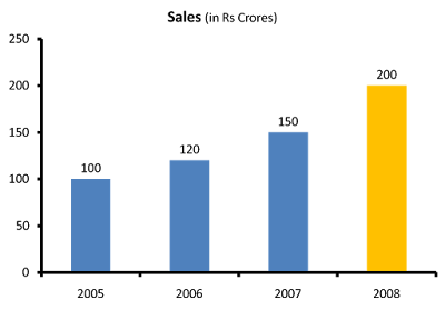 3b. Axis Options
Choose the vertical y-axis -> Format Axis -> Axis Options -> Change the 'Minimum' from Auto to Fixed and enter 80. See what happens.
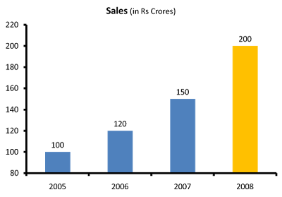 The y-axis now starts counting from 80. The growth in sales now looks far better than it looked when the axis started from zero. Which one is better? Companies in their annual reports do play this trick very often. See this example from Hindustan Unilever's presentation:
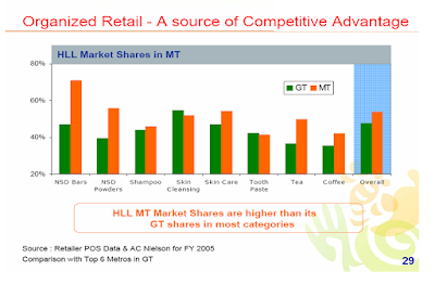 Is it wrong? I would say, No. No in the case of this particular chart. Because of two reasons:
i. The objective of the chart is to show that company's market share in Modern Trade (MT) is more than General Trade (GT). If the axis starts at zero, the difference between bars will not be so clear. Starting at 20 makes the difference more pronounced.
ii. The company is not cheating here. They have labeled the axis and one can see it starts from 20.
How can it be misused?
You can misuse it by starting from non-zero and not telling your audience about it. Many presenters delete the axis, and label their bar graphs. They keep the audience in the dark.
What should you do?
Do not delete your axis. Tell your audience in case your axis does not start from zero. What HUL should have done is to add a * and mention that the scale starts from 20.
4. When and how should you use secondary axis?
I had given you a problem in my second post. I will restate the problem now and solve it also. This is the raw data you have for a fictitious company SpaceTel.
Example 4 Financial Highlights of SpaceTel

How will you make the chart?
Using the table (framework) we made in the second post on How to choose a chart, you decide to use bar chart. Here is your chart.
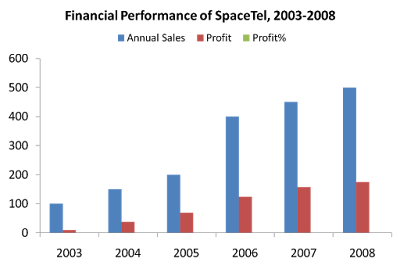 What is wrong?
The software looks at all the values and tries to fix a scale (axis) which includes the maximum value of 500. Hence, it has taken the scale up to 600. By doing this, the profit percentage data which is maximum 35% (=0.35) becomes invisible. How do you solve this problem?
You need a different axis in the same chart. That 'other' axis is called 'secondary axis'. On this we measure the profit percentage.
Adding a secondary axis
Step-1 Choose the data series 'profit percentage' by clicking next to the profit bar in red.
Step-2 Right click -> Format Data Series (MS PowerPoint 2007)
Step-3 Under Series Options -> Choose Secondary Axis -> Close
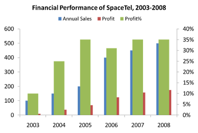 Are you in deeper trouble now?
No. Click on the data series again (one click on any green bar will select all bars). Right click and select 'Change Series Chart Type'. Choose a Line Graph. Click Ok. Your chart is ready.
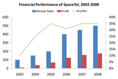 You can add data labels and do what ever else you need. Don't forget to add your key message as well.
To quickly summarize what we learned today about axis:
1. Axis is a scale which tells you what is being measured and its unit of measurement.
2. These two pieces of information have to be present in the chart, though they need not be labeled with the axis. You can mention it with the chart title.
3. Your axis need not start from zero. In case it does not, share this with the audience.
4. When you are measuring variables (like sales, profits) whose values are different from each other or the gap between maximum and minimum value is too big, then add a secondary axis.
No comments :
Post a Comment