My experience teaches me that presentations that are dramatic do well. Before I share with you why, let me define what I mean by drama.
Drama would mean creating some curiosity or suspense or humor. Something like a play or a movie. Ideally at the start and only in presentations which are not formal. You cannot dramatize a quarterly review presentation. Can you?
This month I gave 3 presentations to a group of 24 interns (if you have been following my blog you would already know I recruited these MBA interns and am getting some work done from them for my company). These 3 presentations were for the weekly review of their performance, collecting feedback and motivating them. Formal situation but required humor and there was a strong need to connect with the interns. To motivate as well as to make them comfortable.
The presentations were well received. The measure of success being the active audience participation and the fact that no one dozed off! (the review presentation used to be post market working when people were pretty tired).
There was something I did in every presentation. I gave every presentation a dramatic start.
Presentation 1. Image of Mahatma Gandhi's 3 monkeys
Presentation 2. Image of Sri Yantra with 4 numbers written on the four edges
Presentation 3. A scatter plot (with only dots and no x & y axes)
Every presentation started with an image. And this image used to be there from the start. While the students were entering the hall, were settling down. It was there staring at their face, making them think about it, discuss with each other trying to figure it out.
Day 1. They did not even know what it all was. Seeing the three monkeys they just laughed. But when I started my presentation, I talked about the 3 monkeys, asked them what they were doing on my slides. The 3 monkeys are supposed to 'see no evil, hear no evil and say no evil'. I asked them not be like the famous monkeys and to actually speak out everything in the 'feedback' session.
Day 2 was when they came across the Sri Yantra. Hardly any one knew what it was. The numbers at the edges made them make a lot of guesses but none were right. The numbers represented there were indicators of how the best and the worst students were doing in the project. Best and worst students and two parameters of evaluation. Hence the 4 numbers.
Day 3. A seasoned audience knew something would be on the slides again. They put their best fight to explain what it was. One came close and won a chocolate from me as well. But none could guess. Then I completed the chart, added the axes, put labels and went on to explain that the 24 dots resembled their performance on a 3rd evaluation parameter of the project.
These presentations taught me an important lesson. The importance of dramatizing a presentation and that too right at the start.
Honestly the first day was lucky for me. I put the image because I wanted to tell them not to keep their mouths closed and tell me how they were doing, what problems they were facing. It worked. And post that, I used an image in the next two presentations.
The reason it clicked was that every image was related to the theme of the day. Something that I wanted to discuss and something that was very important.
Day 1: Do not keep your mouths closed and speak out.
Day 2: Improve your numbers. Increase your performance.
Day 3: In chasing numbers do not lose sight of productivity (quality).
Obviously the choice of image matters and I did choose good images. But what matters more is the connect. The images gave me a platform to create enough drama at the start. Got the audience involved and all ears. And then I drove the point into their minds.
If you want to give a dramatic start to your presentation, try this out. First choose whats the most important thing you want to focus on. What's the so called theme of the day. Then choose a good image which creates enough curiosity. It should not be so obvious that you kill the suspense. Then add a bit of drama in your voice and body language and pull it off!
You will feel a lot better about life. Trust me.
Wish you luck!
Jun 30, 2009
Jun 27, 2009
Open and edit a .ppsx in MS PowerPoint
Recently a friend of mine was struggling to open a .ppsx file in MS PowerPoint. He wanted to edit some slides of the presentation but the sender of the file had sent a .ppsx instead of a .pptx.
If you have never opened a .ppsx (PowerPoint Show) file in MS PowerPoint 2007 then you might like to read on.
The solution is pretty simple. Open MS PowerPoint and then Go to Open --> Choose the .ppsx file. But in his case this was not working for some strange reason. So we solved the problem thus:
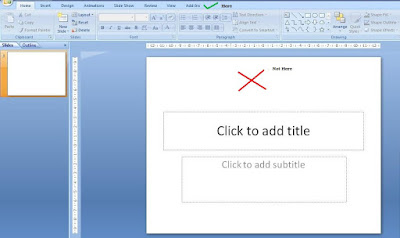 Step-1
Open MS PowerPoint
Step-2
Go to the windows folder where the file has been saved and drag the .ppsx file inside MS PowerPoint
Step-3
Drop it on the top (not on the slide)
Any faster way than this, drop in a comment.
Jun 26, 2009
Which side of the screen do you stand?
When you stand and present which side of the screen do you prefer? Is right, right or is left right? You must have heard people recommending where one should stand. My simple suggestion to you would be: "Do not stand at one place, keep moving."
Follow these three things in all your presentations:
Stand where you are comfortable,
Stand so that you do not come in between the projector and the screen, and
Keep moving once in a while, especially to the absolute back row.
What happens when you move?
The focus shifts to you. As humans we focus on things that move. On a slide, the eyes will go first to that object which is moving/changing. So by moving some bit, you get the audience to look at you and not at the screen. I remember I asked a colleague at work to give a talk for 2 minutes and he stood almost at one corner where no one could see him. And he stood like a statue. The result, no one listened to him. Remember you are more important than the slides. So get yourself into the limelight.
Secondly, when you move you connect more with the audience, especially if the gathering is large. When I present to an audience of 25 or more, I ensure I move around, keep my hands on their shoulders or shake hands, look straight into their eyes, ask a question. I also move towards people to answer something they have asked. I have found that it helps.
You may not require much movement across the room if your gathering is small. In that case a good eye contact becomes the primary tool of audience connect.
Jun 24, 2009
Highlighting a point impromptu in a presentation
 You are presenting the Balance Sheet of the company. This is how your slide looks like.
You are making a point about how your Current Assets are just 80 (assume $mn). You feel it is very low and want to draw the attention of the audience towards that particular figure on the slide. You had not thought of it while making your slides. But now you feel you should draw the focus towards it. What do you do?
Most people do the following:
1. They go towards the slide and point this number using their fingers, or
2. They use a wavering laser pointer to point it out, or
3. They do nothing. Just say, 'Gentlemen focus on the how small our Current Assets have become. Just 80!'
Which one do you use when you have to highlight a point on the slides? Think about it before you read on.
In case, you had thought of it before then you could have used animated boxes/circles/arrows to appear over/near the figure of $80mn. But how do do the same thing impromptu?
You can use the feature called 'Pointer Options'.
 Step-1
While you are on the slide in Slide show mode, right click on the slide with your mouse pointer.
Step-2
Choose Pointer Options
Step-3
Choose from Ball Point Pen, Felt Tip Pen or Highlighter
Step-4
Suppose you choose the Felt Tip Pen. Now, on the slide encircle the figure 80 using left click (the way you normally draw figures in PowerPoint or use MS Paint).
Step-5
After the slide show is over, you can choose to discard or save the figure you have just drawn.
 When to use this method
1. When you have to highlight a point impromptu (you had not prepared for it earlier).
2. When the audience is unable to focus on the number (out of a cluttered table for example).
Try using this technique in your next presentation and you will definitely find it useful.
Jun 23, 2009
Poll: How template savvy are you?
Most of us use templates for our presentations. Some people like to just use a standard one (already in-built in PowerPoint) whereas some take the pains of finding new templates online. Some even design their own templates.
I have put up a poll on the blog (look to your left) trying to find your template using behavior. Do take out 5 seconds and participate. I will share the results after the poll is over.
I have put up a poll on the blog (look to your left) trying to find your template using behavior. Do take out 5 seconds and participate. I will share the results after the poll is over.
Jun 20, 2009
Yes I am talking to you
I started this blog in January this year and it has been quite a journey for me. Sort of extended my love for presentations to the blogosphere. Have written about a host of topics and there are many more to come. I believe in practical stuff and hence always try to relate everything I say to a real life incident.
Over the last five and a half months, have seen quite a decent number of readers on the blog. And so today this post is directed at you. Yes, YOU who is reading this post right now!
If you are reading my blog and have been visiting quite often, one thing is clear, that you are interested in presentations. But what more? I would like you to talk to me. Tell me what you like and what are you looking for. What brings you here and what keeps you with me. I want to talk to you, my invisible co-passenger in this journey called 'allaboutpresentations.'
Write to me at vivek [at] jazz factory [dot] in or comment on this post.
Jun 16, 2009
#2 Be a Charts Champion with Pointy Haired Dilbert
Pointy Haired Dilbert (PHD) is a blog which helps you with Charts and Excel tips. Though you can create charts directly in PowerPoint, many people do create charts in Excel and knowing how to use Excel is always a good skill for a presenter.
 This blog basically helps you become better at charts. For example, see this link: Create a Dynamic Chart in Excel in 2 minutes: A decent trick which is very easy to create. Also see this or this post; Making Dynamic Charts using Data Filters or this; Compare one value with a set of values. The blog also has a Chart Doctor series wherein you can submit your actual chart (which might not be so good) and they will work on it and make improvements.
There is more. Do you want to create Venn Diagrams for presentations? You can learn how to do that here.
This was my second post in the series: 'Be a Charts Champion'. If you know of any good resource on Charts and Graphs, leave a comment. And yes, remember to check the Pointy Haired Dilbert out!
Jun 13, 2009
Tidbits which Connect with the Audience
In my June 11 post titled 'Early bird catches the worm' I talked about the benefits of reaching early to the venue before a presentation. There I talked about collecting interesting tidbits of information and using it in your presentation.
In this post I will write more about what are these 'tidbits of information' and how collecting them will help you connect with the audience better.
Around a month back I went to a MBA college to recruit some summer interns. While the projector was being set up by the staff of the college I kept looking around the place, the students, the classroom, the play ground outside the window and I made a note of one thing I saw. It was the motto of the college; "Why What How." Written in large fonts on the play ground.
During my presentation I was discussing the summer project and I was telling them about the projects' objectives. I wanted to know 'why something was happening, what should we do about it and how.' To say this, I used their motto and said "We want to know three things... Why What How..." and then went on to explain about the summer project.
Immediately I got their attention and the next moment they were all smiles. This small tweak in my presentation (I could have said it without using the three words of the motto) made a difference and reached out to the audience.
It pays to put that extra effort in knowing more about the audience, in being aware of your surroundings and picking up tidbits of information to show that you care. To show that you are interested. Remember, someone rightly said 'the way to be interesting is to be interested.'
Jun 12, 2009
It's contest time folks
If you are passionate about making presentations and you think you have something special in you its great news. There are three presentation contests currently on.
SlideBoom Presentation Contest 2009
Create a Spark PowerPoint Contest
Fuze - Tell a story in 30 slides (or less!) Contest
The deadlines for these contests are June 21, June 26 and June 15 respectively.
 There are some great prizes to be won (Fuze is offering $5,000 to the winner) apart from the popularity and the satisfaction. So don't hold yourself back. Send an entry and cross your fingers.
A small tip from my side for contestants. Choose a topic which you are passionate and knowledgeable about. Remember to read all the contest rules. Best of luck!
Jun 11, 2009
Early bird catches the worm
You are going to make a sales pitch or you are making the final presentation after a month long market research. The stakes are high. How your presentation goes matters to your company and to your career. You are well prepared and ready with a good presentation. What do you do next?
You arrive late at the venue and get off to a bad start!
Yes. That's whats been happening with many people who make presentations. Being a part of corporate India I get to see many presentations. From prospective business partners, creative and media agencies to market research firms, and the like.
What's common to all these presentations is that most of the presenters either reach the venue 5 minutes before or just in time. That's detrimental. If you want to present at 2pm, you need to be at the venue at least by 1.30pm.
Reaching early has multiple advantages:
1. You reduce your nervousness by settling down at the place. You get to familiarize with the venue.
2. You can set up the projector and do a dry run once just to thwart any technical snag during the presentation.
3. You can build a rapport with the audience by having a small chat with the stakeholders who will form part of the audience.
4. You can get some important pieces of information about the company/location where you are making the presentation. You can refer to these tidbits of information when you want to add humor.
So the next time you are going to present, make sure you reach at least half an hour early. That will go a long way in reducing your nervousness and make you feel confident and start on a good wicket.
Have you seen people making a mess of their presentations by arriving late? How often do you yourself reach 30 minute before? Leave a comment.
Jun 9, 2009
TED Talks: The Pinnacle of Presentations
I was exposed to TED talks quite a while back and since then I have shared it with many people. If you like making presentations and you like watching great presentations, TED is the place to be. TED stands for Technology, Entertainment & Design. It is an annual conference where experts from various field come and present their ideas. The videos are available online. Anyone can freely download hundreds of high quality audio/video files. The video files are also available with subtitles.
The list of speakers is amazing. Seth Godin, Al Gore, Bill Gates, Malcolm Gladwell and many more speakers who might not be popular in media but are experts in their respective fields.
TED talks are not always slideshows. Some are just speeches and some are with slides. Presentations at TED in whatever form are awe-inspiring, informative, jaw dropping and makes me wonder why are they available for free. If you have not seen a TED talk then you must visit the site.
Listen to this talk by Hans Rosling and you will know what TED is all about:
To know more about TED read here and here.
Listen to TED and share it with others. Do share with me how you liked it? Which TED talk is your favorite?
Jun 6, 2009
#1 Be a Charts Champion with Juice Analytics
'Be a Charts Champion' is a series where we will discuss better ways to present charts and graphs. In the first post of this series, I would like to share with you an interesting link which a reader Rishi Behal shared with me a day back.
Juice Analytics: Charts Chooser
This is a website which helps you in multiple ways:
1. It helps you decide on what kind of chart you should use. You might wish to present a comparison or a distribution. It might be a relationship between variables of just a simple trend. The categories on which Juice Analytics has charts are:
2. Once you decide on a chart type Juice Analytics provides you a ready made excel sheet. You can download the excel sheet which lets you feed in your data and generate the chart automatically. This feature is especially helpful when you don't want to waste time creating a chart. Or you don't know how to create one. Eg. You might want to use a waterfall chart but you don't know how to create one. With Juice Analytics, you can simply download the excel, feed in your data and copy the graph to your PowerPoint.
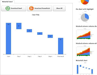 In total there are 17 chart types available. Try it out the next time you want to save time creating a chart. In case you know of more such links do share them with me.
Juice Analytics: Charts Chooser
This is a website which helps you in multiple ways:
1. It helps you decide on what kind of chart you should use. You might wish to present a comparison or a distribution. It might be a relationship between variables of just a simple trend. The categories on which Juice Analytics has charts are:
- Comparison
- Distribution
- Compositor
- Trend
- Relationship
- Table
2. Once you decide on a chart type Juice Analytics provides you a ready made excel sheet. You can download the excel sheet which lets you feed in your data and generate the chart automatically. This feature is especially helpful when you don't want to waste time creating a chart. Or you don't know how to create one. Eg. You might want to use a waterfall chart but you don't know how to create one. With Juice Analytics, you can simply download the excel, feed in your data and copy the graph to your PowerPoint.
 In total there are 17 chart types available. Try it out the next time you want to save time creating a chart. In case you know of more such links do share them with me.
Jun 5, 2009
Poll: What is you favorite font type for presentations?
I have put up a poll on the blog (you can find it on the top left side). Participate and find out which font is being liked by more people for making presentations.
If you have any interesting 'poll idea' shoot them to me at vivek [at] jazz factory [dot] in.
If you have any interesting 'poll idea' shoot them to me at vivek [at] jazz factory [dot] in.
Jun 4, 2009
Are audiences sweet-toothed?
 If you are giving a presentation to teach a group of people or you are a trainer for executives/managers this post is of great relevance to you. Even if you are none of the two, you should keep your eyes & ears open to what I am going to say next.
 Audiences are sweet-toothed. Offer them chocolates and keep them hooked on.
It's true!
I made a presentation earlier this week to a large audience of 40. Most of them were first year interns who had come to my organization for a summer project. To make the presentation interactive and to avoid anyone sleeping off especially post lunch I went with a bag full of chocolates. Over the four hour animated & lively presentation I managed to get their complete attention through regular (and generous) doses of chocolates. For every great question asked by the audience, there was a chocolate. For every right answer to my questions, there was a chocolate. All in all I distributed some 40 chocolates in just 4 hours!
Was it the chocolate that did the trick?
Well both yes and no. People do like chocolates but more than that they like appreciation. Don't think its only the students who love appreciation, its also the executives and managers irrespective of their age. We all love appreciation. But instead of only verbal appreciation, I decided to give them a small token in the form of a chocolate. It costed peanuts but did a great job of keeping the audience hooked on to every question I asked and to every word I said.
It made the presentation really and truly interactive. But more than that it made the presentation fun and made it memorable. Something my audience had never seen or heard before.
If you are going to present to a group of students or executives where the purpose is training/teaching or something related to that, try giving chocolates as tokens of appreciation. I bet it'll work wonders for you!
Do you remember sitting through any memorable and interactive presentation? Think for a second and tell me what made it memorable? What made it interactive? Leave a comment.
Jun 2, 2009
Best of the Month: May '09
Last month has been a satisfactory month for me. I started the month with a snapshot of all the major blogs on presentations in the world. Then I went on to write on some of the topics which are very close to my heart.
May 9: How to plan well for your presentation?
May 12: What presenters can learn from print advertisements?
May 16: Role of images in your presentations?
I read Presentation Zen very recently and wrote a review as well on the blog. Its a book you must read if you want to learn about presentations. All in all May was a month with lots of content which would have certainly helped you a lot.
The most popular posts of May were:
How many slides for a 30 minute presentation?
How to use images in PowerPoint?
Use the Input-Output method to plan your presentations
The most read posts till date on the blog are:
Sponsorship Proposals: 10 ideas that will get you cash
7 habits of Dr. Stephen Covey
Sponsorship Proposals Checklist
I would be most happy to hear from you. Share with me your experiences of making presentations. Your great moments and what made them great.
Subscribe to:
Comments
(
Atom
)