What do you do when you need images for your presentation?
You rush to Google Images, type in the keyword and download the image. What is wrong with this method is that you really do not check the copyright status of the image. You might end up using an image you are not authorised to. In case it is an internal presentation in your company or campus you can be safe but if you upload the presentation online you can really get into some trouble.
With the increasing use of images in presentations, one needs to have a few websites to fall back on when in need of images. These links will work as an image bank where you can access free images of good quality without worrying about copyright violations.
The websites I am talking about are the following:
1. Free Digital Photos
2. Free Range Stock
3. Flickr
Free Digital Photos asks for an acknowledgment (link back to the photographer's profile page) when you use their images. Free Range Stock does not even ask that while Flickr does ask for acknowledgment. As a matter of practice, you should always check the terms of use before downloading images (as the terms might change from time to time).
I came across this excellent 3 minute TED talk when I attended TEDxHi-TechCity in January 2010. It was played there in one of the short breaks. In this short presentation Richard St. John shares his insights collected over a long time. The presentation is crisp, full of humor, has sensible visuals and great content. A must watch for all.
The two things I really liked about this presentation are:
1. Visual Slide Design
The slide design is really nice. When you are presenting in just 3 minutes you cannot have much text for audience to read on the slide. Hence Richard has the main point in bold (red font) with an image which quickly helps us visualise the spirit of the point. For love he has a red heart, for money a bag full of cash with a $ sign on it.
Then there is a small quote below in BIG fonts. He reads this quote from the slide (which is a bad thing normally). This however was needed because it would have been tough for Richard to memorize so many quotes.
2. Humor
When he talks about Push and shows a vehicle with Mom written over it, that really make people laugh. Another instance when he expands the abbreviation CRAP as Criticism, Rejection, Assholes & Pressure. These are not improvisations on the spurt of the moment. Richard's humor is planned. Humor in your presentation has to be planned and executed well.
The only thing that was a bit weird was that Richard did not use a wireless presenter to deliver the presentation even more smoothly. It forces him to look at his laptop and change slides every now and then.
As you are aware I am writing articles for a website 24Point0.com. You can check out my latest article on '5 steps towards becoming a better presenter' by clicking here. Here I am talking about the following 5 steps:
Step 1: Become better at MS PowerPoint
Step 2: Know what MS PowerPoint cannot do
Step 3: Get serious about your presentation
Step 4: Practice. Practice. Practice.
Step 5: Seek regular feedback
These tips are not very radical (except the last point which I strongly advocate) but as they say, "God lies in execution".
A colleague at my office was compiling our blood group data for HR purposes. This led my team to stumble upon an interesting piece of data on Wikipedia.
Do you know what percentage of people in the world belong to which blood group? We figured out that O+ is the most popular blood group in India (and in most other countries). One out of every 3 Indian is O+ and so is 4 out of every 10 US citizen. Only 8.5% of US citizens were B+ whereas a whopping 30.9% of Indians were B+. Here is a sample data I picked from Wikipedia. (These numbers are percentages which add upto 100. So 36.5% Indians are O+ and 22.1% are A+)
 How would you visualise this data? If you have to present this data how will you do that in a manner which provides most meaningful information?
 Dear readers
I recently wrote an article for the popular Indian business newspaper LiveMint. You can click here to read the article. It is called '5 ways to make your (power) point. It contains 5 simple tips on how to use PowerPoint more effectively in order to make better presentations. Your comments are welcome on the LiveMint website or on this blog.
Yesterday a colleague of mine came to me with a problem. He had an image (a photo taken from a digital camera) which was 3.52 MB in size. He wanted to make it under 1 MB because he had to email the images to a senior colleague.
I used an old trick which I have always found useful. If you want to email images or use it in presentations, you can easily reduce the image size by using this trick. It goes like this.
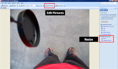
Step-1 Open the folder where the image is stored. Right click on the image file, choose 'Open with Microsoft Office Picture Manager'. This software comes free with MS Office.
Step-2 On the Formatting tool bar above, click on Edit Pictures.
Step-3 Under 'Change picture size', click on Resize.
 Step-4 Under 'Size setting summary' you can see the original size (in pixels) of the image. Now type a number in 'Percentage of original width x height'. Press OK.
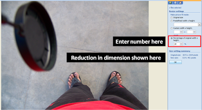 My colleague entered 20, and the software reduced the image pixels to 20% of the original dimension (example from 1000 pixels width to 200 pixels in width). Using this method, we were able to reduce the file size of the image to 212 KB (a reduction of 94%). From 3.52 MB to 212 KB in 5 seconds!
And this reduction in file size did not affect the picture quality much. If you have very high resolution images, a reduction of 50% to 60% will make the file less bulky and easy to email. Even if you use it in your presentations, the image quality will not suffer.
As I understand, this is just one way of reducing the file size of an image. Do you know of any more ways? If you do, please share it with all of us here.Thank you.
Case #1 You have a confidential presentation on your desktop and you don't want anyone else to see that presentation. How do you password protect your presentation such that no one else can open the presentation? Only people who know the password can open the presentation.
Case #2 You are a sales manager and you are sending a presentation to a client. You want the presentation to be 'read only', which means that the recipient can only view the presentation but not modify it. How do you do that?
We will first figure out how to address Case #1.
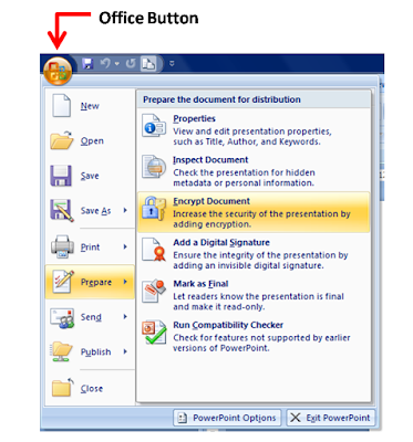
Password Protect the Presentation File in MS PowerPoint 2007
Click on the Office Button -> Go to 'Prepare' -> Encrypt Document. After you click on it, you can enter the password and press ok. Then you will be asked to re-type the password.
 Whenever, someone tries to open the presentation, he/she will be asked to enter the password as well. Once they enter the correct password, they are allowed to open and edit the presentation (which includes changing the password or removing the password).
To remove the password, you can go to Encrypt Document and delete the password and press ok.
Make a Presentation Read-Only in MS PowerPoint 2007
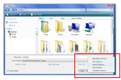
Click on the Office Button -> Save As -> Tools -> General Options. To make the presentation read-only, enter the password ONLY in the first box which reads 'Password to open'.
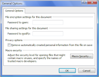 If you send this presentation to someone, they will be asked to enter the password, to open and view the presentation. On entering the correct password they will be allowed to view the presentation but they will not be allowed to modify anything.If you wish to have another password which allows people to modify the presentation, then also enter a password in the second box which reads 'Password to modify'. If you do not wish to create this password, leave the space blank.Think of situations when you need to password protect your presentation? How have you been protecting your presentations in the past?
February has been a hectic month for me professionally. That's why the month saw a lower number of posts. I got to attend my first TEDx in Hyderabad on January 31 and I shared my learnings from the various speakers in my Feb 10th post. This post was also the most read post of the month. This month saw two guest posts, highest for the blog till date. This post by a trainer Joel Xavier is worth reading. He shares his experience of conducting a 3 day training session. At the end the month, I shared an interesting tip on how to create a presentation which runs in a continuous loop. Check it out here.


 2. Search by type


