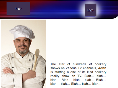
After having looked at maps, let us look at a slide which uses a photograph with some text. We all use photos in our slides accompanied with text. Here is a slide which came to me from a TV channel. I had shared this as a slide improvement example in the presentations workshop I conducted three months back.
This slide talks about the anchor of a new TV show. For confidentiality reasons, I have replaced the original image with a different one.
A pretty normal slide. Has an image and some text about the image. Can this be made better? Let us give it a shot. Remember, the first post in which we used maps. We did two important things with the map. First, made it bigger and second let it merge with the background. We will try the same here.
When the image becomes bigger, it always looks better. Always try to use as large an image as possible. With just the image becoming bigger, the slide has improved in its design appeal. Now try the 'merge the image with the background' trick.
Wow! You see that. The background of the chef merging with the white background makes it even better. To achieve this merger, I had to select the chef's image, go to effects and alter the brightness to make the chef's immediate background as white as possible. The ideal solution it to choose an image whose background is completely white.
To recap today's lesson:
1. To improve a slide which has one image - enlarge the image to the maximum possible.
2. Ensure the immediate background of the image merges with the slide background colour.
Image source: africa
Mar 23, 2012
Subscribe to:
Post Comments
(
Atom
)


Terrible design, mate. Get yourself a graphic designer/adviser and maybe you'll be allowed to "teach" how to redesign slides.
ReplyDeleteWhat I have tried to show is the 'concept' of how to improve your slides by enlarging the photo and merging it with the background.
ReplyDeleteThe base template is not my creation and changing the base template was not the objective of the post.