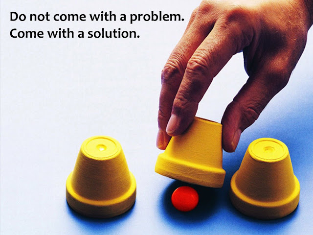
What TED knows that you don't? 6 guidelines for Keynote Speakers
As a keynote speaker, you want to deliver a powerful talk. TED is a platform where some of the best talks take place. Would you like to know what guidelines TED shares with its organizers?

Talking without slides will ensure everyone in the audience will look only at you. There will be no distractions. You will be the focal point and this will help you connect better with your audience.
Here's what TED tells its organizers - "...if you don’t think your speaker needs slides, don’t let them use slides. Explain to them that their talk is strong enough without them."
Use high resolution images which do not pixellate on screen. Avoid images with watermarks. The best images are either shot or bought from stock image websites or procured for free from sites like pixabay. TED guideline encourages speakers to "keep graphs visually clear, even if the content is complex." Avoid gridlines and any redundant stuff. Read more tips about how to graphs your graphs and charts here.
TED discourages too much information on one slide. If you are saying two things on a slide, break that slide down into 2 slides. Now you've got one message per slide. This is much easier for the audience to digest.
Ensure the text is legible to someone sitting at the back. When you are not sure about the size of the venue, go for a very large font. TED recommends a font size of 42 or more. That's because TED talks always have hundreds of people in the audience.
Before an event, find out the screen dimension and change your slides accordingly. The default screen size in MS PowerPoint 2013 is 16:9 (widescreen). The default in earlier versions was 4:3. There are many organizer who still use the more squarish 4:3 format. Find out what the screen ratios are and change your slides accordingly.
Read the TED guideline
To hire a designer for your next keynote presentation, you can contact us

1. Slides are optional
A lot of keynote speakers never use slides. While preparing your keynote presentation, think about this. Is your talk powerful on its own? Do you really need slides? Will the slides really make your talk more powerful?Talking without slides will ensure everyone in the audience will look only at you. There will be no distractions. You will be the focal point and this will help you connect better with your audience.
Here's what TED tells its organizers - "...if you don’t think your speaker needs slides, don’t let them use slides. Explain to them that their talk is strong enough without them."
2. Use image rich slides
Keynote speakers can increase their impact if they use images. One large image is much more powerful than a collage of images. One large image with a few words is better than a long paragraph of text.Use high resolution images which do not pixellate on screen. Avoid images with watermarks. The best images are either shot or bought from stock image websites or procured for free from sites like pixabay. TED guideline encourages speakers to "keep graphs visually clear, even if the content is complex." Avoid gridlines and any redundant stuff. Read more tips about how to graphs your graphs and charts here.
3. Text on slides - Lesser and bigger
Good keynote speakers have very less text on each slide. A slide is simply an aid to make a point more powerfully. So having a large image with few words is ideal. Sometimes you might not even have an image. This will shift all the focus to whatever text is present on the slide.TED discourages too much information on one slide. If you are saying two things on a slide, break that slide down into 2 slides. Now you've got one message per slide. This is much easier for the audience to digest.
Ensure the text is legible to someone sitting at the back. When you are not sure about the size of the venue, go for a very large font. TED recommends a font size of 42 or more. That's because TED talks always have hundreds of people in the audience.
4. Simple slide backgrounds
Good keynote speakers use simple slide backgrounds. Complicated looking backgrounds and templates distract your audience from your message. A simple black or white background with a bar for header is all you might need. So do not waste your time looking for templates online :) If you do search online, choose minimalistic templates.5. Suitable screen dimensions
As a keynote speaker you will deliver the same talk at many places. While you have the same slides, your organizers might use very different screen dimensions. This will impact your presentation and produce a bad experience for your audience.Before an event, find out the screen dimension and change your slides accordingly. The default screen size in MS PowerPoint 2013 is 16:9 (widescreen). The default in earlier versions was 4:3. There are many organizer who still use the more squarish 4:3 format. Find out what the screen ratios are and change your slides accordingly.
6. Get professional help - Hire a designer
If you do not have the time for designing awesome presentations, you must hire a professional designer and get him / her to convert you ideas into slides. There are professional agencies which jazz up your existing slides for a small fee.Read the TED guideline
To hire a designer for your next keynote presentation, you can contact us


Comments
Post a Comment