What is white space? How can you use it to design better slides?
White space in graphic design is the empty space where there is no text or any graphic element. White space is not necessarily white. It is just empty space. Look at Google Pixel's print ad below:

There is a lot of empty space in this print ad. This is typical of Google and many other companies. They are known for elegant and simple design. Google's homepage is a great example of good design. There is so much white space there.

Compare this with the next print ad, where you will find very little of... white space. Now compare the two pieces of design and decide which one is more pleasing to the eye and attracts your attention. Whirlpool has cluttered its ad because they are trying to say too many things.
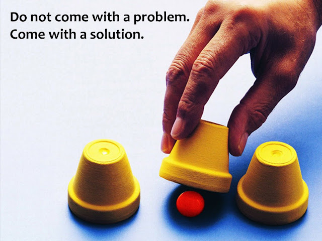
 A lot of white space makes your design attractive, easy to read and powerful. Because of so much vacant space, the audience is drawn to what is there; the text, the images and other graphic elements.

On this slide, we find clutter. There is hardly any white space left. Too many elements are fighting for our attention and we do not even want to look at it for more than a few seconds, let alone read everything on it. Now look at one more slide which also has lots of text (sometimes it is unavoidable in a presentation, especially the ones which you email):
 Why is the feel different? The background is light grey and the numbered boxes are slightly darker. The text is written on empty boxes. The feel would be totally killed if the text would be written on a different background. Let us see how would that look.
 Giving a background to each rectangle, in a slide with so much text, is a bad idea. Make the background of the rectangle transparent and let it merge into the empty space, creating a continuous feel. Here are some examples of slides with more white space (empty space):
 In this slide, there is less text and lot of white space. The eyes of the audience focus clearly on the three icons in the slide. Or, take the next slide. The black colour of the image becomes the background and you simply have one line on it. There's lots of empty space which will help us get the audience attention to the one line that matters.
 Conclusion
While designing slides, take note of how much white space are you leaving. White space is the breathing space for the audience. The more white space your slide has, the better it looks and the more it appeals to the audience. The power of the text and graphic elements come from the vacant real estate all around it.
What makes a design look good? [Design Basics Part 1]
Design Basics Part 6: More Tips & Conclusion
How to appear more confident as a presenter? Design bold slides

There is a lot of empty space in this print ad. This is typical of Google and many other companies. They are known for elegant and simple design. Google's homepage is a great example of good design. There is so much white space there.

Compare this with the next print ad, where you will find very little of... white space. Now compare the two pieces of design and decide which one is more pleasing to the eye and attracts your attention. Whirlpool has cluttered its ad because they are trying to say too many things.

How to use white space to design better slides?
When you make slides, ensure there is a lot of white space on your slide. If there is too much content and you cannot avoid it, split the slide into two slides. Let us take an example. I have chosen a random slide from the internet.
On this slide, we find clutter. There is hardly any white space left. Too many elements are fighting for our attention and we do not even want to look at it for more than a few seconds, let alone read everything on it. Now look at one more slide which also has lots of text (sometimes it is unavoidable in a presentation, especially the ones which you email):


While designing slides, take note of how much white space are you leaving. White space is the breathing space for the audience. The more white space your slide has, the better it looks and the more it appeals to the audience. The power of the text and graphic elements come from the vacant real estate all around it.
Want to read more on slide design?
Here are few links you should check out:What makes a design look good? [Design Basics Part 1]
Design Basics Part 6: More Tips & Conclusion
How to appear more confident as a presenter? Design bold slides


Comments
Post a Comment