Last week I wrote a guest post on Slide Rocket Blog. It is called 'Presenting to Top Management'. In this post I have shared 5 things which you should do when presenting to your Top Management.
1. Present the conclusion at the start
2. Time is money, so be short
3. Use back up slides to present additional information
4. You don't need to 'show' you have worked hard
5. Give a handout
This post has become popular on Slide Rocket blog. Do check it out.
Jul 26, 2010
Jul 23, 2010
Do not use for the next 5 hours?

This note was stuck on the door of a washroom. What do you do when you see such a note?
I saw the note and pondered how can someone write like this. This is what Chip & Dan Heath call the 'Curse of Knowledge'. He knew when he was writing it and to him it was obvious. "It is noon now and by 5 the washroom should be ready to use." But what about us?
Think of the notes you write in your office or on the fridge (refrigerator) or laptop or door. Reach out to them and see if we could have done it a bit better.
I happen to write notes for my newspaper and milk vendor (who come and door deliver these stuff in the early mornings). The note on the door at this very moment reads "No milk from July 5 to July 24". Wonder if I would have written "No milk for the next 20 days".
Jul 21, 2010
How to change colour of Hyperlink?
This post germinated out of a question asked by an anonymous reader a few days back. Thank you for the question Anonymous.
Once we create a hyperlink, the colour of the font changes to blue (with an underline). This tells the viewer that it is a hyperlink and he needs to click it. But this hyperlink creates a lot of problems.
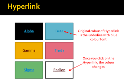 Have a look at the slide above. If you have shapes or smartart on which you write text and create a hyperlink, your contrast can go for a toss. Look at the font on the green or the blue shape. Once you click on the link, the colour changes and remains that way after that.
But there is a solution to this. We can choose what colour the hyperlink should have and what colour a clicked hyperlink should have. This is how:
In PowerPoint 2007
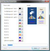 Go to Design Tab -> Colours -> Create New Theme Colours -> Hyperlink & Followed Hyperlink -> Choose the colours of your choice
In PowerPoint 2003
What it does is that it changes the hyperlink colour and followed hyperlink colour to a new colour of your choice.
Once we create a hyperlink, the colour of the font changes to blue (with an underline). This tells the viewer that it is a hyperlink and he needs to click it. But this hyperlink creates a lot of problems.
 Have a look at the slide above. If you have shapes or smartart on which you write text and create a hyperlink, your contrast can go for a toss. Look at the font on the green or the blue shape. Once you click on the link, the colour changes and remains that way after that.
But there is a solution to this. We can choose what colour the hyperlink should have and what colour a clicked hyperlink should have. This is how:
In PowerPoint 2007
 Go to Design Tab -> Colours -> Create New Theme Colours -> Hyperlink & Followed Hyperlink -> Choose the colours of your choice
In PowerPoint 2003
Go to Format -> Slide Design -> Colour Schemes -> Edit Colour Schemes -> Custom tab -> Under Scheme Colours -> Accent & Hyperlink -> Change colour. Accent & Followed Hyperlink -> Change colour.
What it does is that it changes the hyperlink colour and followed hyperlink colour to a new colour of your choice.
Jul 19, 2010
Book Review: Everyone Communicates Few Connect
 This is a book review of the new book by John C Maxwell 'Everyone Communicates Few Connect'. John C. Maxwell is an internationally respected leadership expert, speaker, and author of many best sellers. You can read his thoughts on his blog JohnMaxwellOnLeadership.com.
'Everyone Communicates Few Connect' makes a strong case that communication is not complete unless you have connected with your audience. Your audience can be one or many but you need to connect with them in order to achieve your objectives.
The book is made up of two parts; Connecting Principles (Part I) & Connecting Practices (Part II). In the paragraphs below I would like to share snippets on what the book talks about.
Connecting Principles
Why Connect with others?
John first talks in detail about why we need to connect with our audience. Why is it so important? What happens if we do not connect? He shares lot of personal stories to illustrate his point. Be it a group or one-on-one, be it work or home we need to connect to make the most of our skills. Connecting can make or break you.
It's about them
When it comes to connecting, you cannot be self-focused. In order to connect, you have to start focusing and worrying about others. You can only connect if you know about them, care about them and think about them. John shares a very beautiful point here. He says that people ask themselves three questions when they deal with anyone.
Do you care for me? Can you help me? Can I trust you?
If we understand these questions and if we care, help and are trust worthy we will have no problems in connecting with others.
Actions speak louder than words
We cannot say something and do the other and yet expect people to be with us. We have to live what we say. John stresses that we need to connect with people at 4 levels; connect visually, intellectually, emotionally & verbally.
What you sow, so shall you reap
To connect with people requires effort. They will get what you put in. John also shares what he calls the 'Four Unpardonable Sins of a Communicator - unprepared, uncommitted, uninteresting or uncomfortable'. He relates the first three sins to the energy a communicator is willing to put in.
Connecting is a skill we can learn
John is of the point of view that the ability to connect is just another skill and can be learnt. There is no such thing as a born connector. This book is basically an effort to show how one can connect better.
Connecting Practices
Part II is where the book delves into further detail of how one can connect with the audience. John urges us to find common grounds, keep our message simple, create our communication into an interesting experience for listeners, inspire people & live what we communicate. I would not get into the details of each chapter.
 Good things about the book
The book has something to offer to every communicator, presenter and business leader. The book has a clear focus 'Connect better with your audience' and it has been written in a very simple manner. It is jargon free and easy to read for all. You may be an executive or a CEO but you will find the book easy to understand.
What could have been better
The book attempts to explain 'everything' in detail. It makes a conscious effort that 'everyone' who reads the book should understand what's being said. That's why it becomes a bit slow. If you have got the point by the time you are half way through the paragraph, the other half might seem slow and repetitious. The reader should pace the book to get the most out of it.
Jul 17, 2010
and the winners are...
I am happy to share that the reader survey received a great response. Thanks to each and everyone who took out time to answer those 10 questions. I will use the feedback to get more meaningful and relevant content for you.
As promised, I have randomly chosen 3 winners from all the entries. The winners will get a free copy of the new book 'Everyone Communicates Few Connect' by John C. Maxwell (Amazon $17.15 Hard Cover). These 3 lucky winners are:
1. Rohit Prakash
2. Sandeep Nayani &
3. Sam Wesley
Congratulations to the winners. Your books are already in transit.
Jul 16, 2010
Which colour jersey does your font wear?
The Football world cup just ended. Being from Bengal, a soccer crazy state in India, I have always been fond of Football. Its part of the culture and comes automatically.
But this post is not about my passion for the game. While watching one of the matches I was wondering about the Jersey colours of the teams. The jersey colours, as you are aware, are chosen so that players and viewers can easily differentiate between the two sides. Hence Spain is blue and the Netherlands Orange. Image if Spain was Red & the Netherlands Orange, would you be able to figure out easily which team had the ball?
If we use the same logic when we choose font and background colour, it would be great. By background colour I mean the colour against which the font will be read. It is not necessarily the slide background colour.
The next time you have to choose the font colour, ask yourself this question: "If the background and font were two countries playing football, will I be able to differentiate the font against this background colour from the back of the room where I am presenting? Are these teams wearing the right colour jerseys?"
 I am sort of rigid when it comes to choosing font colours. My font colours are either black or white. I never choose any other colour. But I do play around a bit with background colours.
 If you want to know which colours go together and which do not, you should consult the Colour Wheel (source) or a Colour Star (source).
The colours opposite to each other are called complimentary colours and provide the best contrast. These are the colours one should ideally choose for font and background colours for best visibility by the audience.
Colours which are together are called Analogous. Eg. Red, Orange & Yellow. They cannot be used as font and background colours.
Prefer dark colours for fonts and light colours for backgrounds. This will give you better contrast and hence better readability. The ultimate objective for us is to make the slide look good without making it hard for the audience to read it.
I make my fonts wear black or white jerseys. Which colour jersey does your font wear?
Jul 14, 2010
7 Reasons why people sleep during corporate training sessions
Recently I attended a 90 minute training in my office. Though no one slept (including yours truly) many came to the edge. It reminded of the numerous times I have seen people sleeping off in such corporate training sessions.
There is something which the trainer does wrong. In this post we will understand why this happens and how corporate trainers (be it IT or HR or others) can make sure people are awake while they present.
There is something which the trainer does wrong. In this post we will understand why this happens and how corporate trainers (be it IT or HR or others) can make sure people are awake while they present.
Reason #1 Dark rooms
The environment has a role to play. If you keep most of the lights off, then be prepared to see people dozing off. I have realised over many years that keeping lights on makes sure less people sleep off. The dark room and the cozy air conditioning make a great case to sleep. I am already yawning just by the thought of it :-)
Reason #2 Too technical
If you are training sales & marketing people to use the latest IT system then you have a challenge ahead of you. When you conduct training sessions on technical matters, make sure you prepare that extra bit hard to ensure you carry every one with you. The moment someone misses out on what you just said, they loose interest. Loss of interest puts them off and they are off to sleep.
To make a presentation less technical talk to a few participants before you make the presentation. Not only should you understand their need, you must also know what they already know, what they want to know and how they will use your information. Then make the presentation and run it through a 'layman'. If your layman, who does not know what you know, can understand the presentation, they you have a useful non-technical presentation which anyone can understand.
Reason #3 Talk to the slides
If you are sitting and looking at your laptop while presenting then your audience cannot be with you. Get up, move around (use a wireless presenter to change slides). Establish eye contact with people. Make sure they know you are talking to them. You are helping them. Move around, touch people, go close, interact. The presentation I last attended suffered from this very problem. The presenters (there were two of them) sat down at one place and kept looking at the laptop while presenting. They kept looking at the laptop and we kept looking at the slides.
It would be great if you ask questions to participants regularly. This will tell you if they are understanding, this will keep them awake. You can try what I once tried during a training presentation. I gave away chocolates to people who answered my questions. It helped me and should help you as well.
Reason #4 Never ending saga
If your audience does not know how long is the training session, they might lose you midway. When we don't know how far is the destination, we always feel it is too far. So what we can do is to share, at the start, how long the presentation is going to be. Do not share the number of slides you have. Share how many minutes will your session will last. That will help the audience.
One more suggestion. Do not be slow and bore people. Move at a brisk pace. If you are constantly interacting with your audience, you will get to know (or will be told) to slow down a bit. It is better to be a bit fast than to be slow.
Reason #5 Merry go round
Repeating something very important is acceptable. But repeating small things too many times is not. It makes people switch off ("I do not want to know how to log in and log off two times. I already know it. So let me check my mail or look around here and there"). Do not repeat stuff in a presentation unless participants ask or you get to know from their body language that the last point you made was unclear to the audience.
Reason #6 Passion & Compassion
You might be an IT expert who loves the software. You know everything about it. But understand that your audience might not share the same passion for the subject. Hence you need to be passionate but also be compassionate. Realise that your audience has come to learn something from you and your job is to help them. Do not go overboard. Tell them how much they need to know. For more, some of them can always approach you later.
Reason #7 Voice modulation
I slept through many classes in my college days. But there was one professor who made me doze off in 90% of his classes. What was different between him and all others? Voice modulation.
He used to talk for 1 hour in the same tone. No up, no down. Like a dead man's heart beat. No excitement in the voice at all. If you talk the same way, most of your participants will doze off as well.
A last piece of advice for trainers.
To make sure no one sleeps make sure your content is interesting. Only being helpful is not enough. When we are interested we are awake. When things get boring we switch off (and doze off). We will not always do what is good for us. As a trainer you have to 'train us in a manner which is interesting to us'.
Jul 11, 2010
PowerPoint Tip: 4 ways to go directly to another slide
These PowerPoint shortcuts work in slideshow mode (when you are presenting your PPT in full screen).
Go directly to a particular slide: Type the slide number and press enter. If you want to go to Slide 5 directly, type 5 and press enter. This works when you know the slide number. But most of the times you will not remember the slide number. Hence use the next tip.
Go directly to a slide (when you don't remember the slide number): Right click on the slide and choose 'Go to Slide'. You can now choose the slide you want to go to from the list. You can view the headers of each slide here.
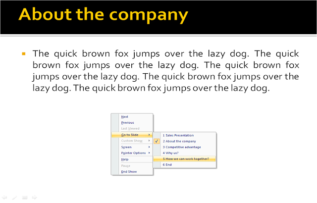 Go directly to the last slide: Press 'End' on the keyboard.
Go directly to the first slide: Press 'Home' on the keyboard.
How to use FONTS to design better presentations? [Design secret #2]
Design secret #3 - Everything about Text Alignment in a presentation
Go directly to a particular slide: Type the slide number and press enter. If you want to go to Slide 5 directly, type 5 and press enter. This works when you know the slide number. But most of the times you will not remember the slide number. Hence use the next tip.
Go directly to a slide (when you don't remember the slide number): Right click on the slide and choose 'Go to Slide'. You can now choose the slide you want to go to from the list. You can view the headers of each slide here.
 Go directly to the last slide: Press 'End' on the keyboard.
Go directly to the first slide: Press 'Home' on the keyboard.
What to read next?
5 Tips to use Colours in presentations [Design secret #1]How to use FONTS to design better presentations? [Design secret #2]
Design secret #3 - Everything about Text Alignment in a presentation
Jul 8, 2010
How to present Excel tables in PowerPoint and make them look good?
There are 2 Methods to copy a table made in MS Excel onto MS PowerPoint.
#1 Select the table in Excel -> Copy -> Paste on the slide
What you get is a table. You can edit this table; change values etc. but it will not remember formulas of excel.
#2 Select the table in Excel -> Copy -> Paste Special as Picture (Enhanced Metafile)
The excel table becomes an image on the slide. You can expand/contract the image but you cannot edit any information. This way you can make your tables to be non-editable by others. How to do Paste Special?
Copy an object -> Under Home Tab (on your extreme left) -> Paste -> Paste Special. Shortcut: Alt + E + S + V (in 2007)
How do you make your excel tables look great on a slide?
The best way to make your excel tables look great is to make them look great on excel first. After you have made the table, go ahead and colour the cells. You can make the header dark and the other cells white or some other light background.
Now, copy it onto the slide.
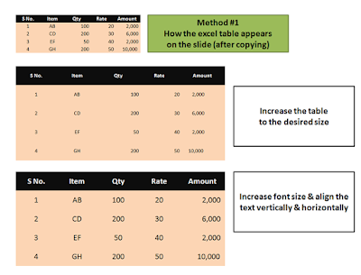
If you are using method #1 above, then your excel table will come as a small object on the slide. The moment you expand it the table looks odd. The fonts size remains small and the alignment goes haywire. The solution to this is:
If you are using method #2 then you cannot modify anything in the table (because you have converted the table into an image). Once you have copied the table as 'Picture (Enhanced Metafile)' all you can do are two things:
What are the ways you use to show excel tables in your presentation? Leave your comments.
Read more:
Why have I suggested you copy the image as PNG? Read this article to find out.
Difference between JPEG, GIF, PNG and BMP? Part 1 of 2
#1 Select the table in Excel -> Copy -> Paste on the slide
What you get is a table. You can edit this table; change values etc. but it will not remember formulas of excel.
#2 Select the table in Excel -> Copy -> Paste Special as Picture (Enhanced Metafile)
The excel table becomes an image on the slide. You can expand/contract the image but you cannot edit any information. This way you can make your tables to be non-editable by others.
 How to do Paste Special?
Copy an object -> Under Home Tab (on your extreme left) -> Paste -> Paste Special. Shortcut: Alt + E + S + V (in 2007)
How do you make your excel tables look great on a slide?
The best way to make your excel tables look great is to make them look great on excel first. After you have made the table, go ahead and colour the cells. You can make the header dark and the other cells white or some other light background.
Now, copy it onto the slide.
If you are using method #1 above, then your excel table will come as a small object on the slide. The moment you expand it the table looks odd. The fonts size remains small and the alignment goes haywire. The solution to this is:
- First decide on the size of the table. Make the table as big as you want.
- Select all the cells (click inside one cell and then drag mouse to select all) and increase the font size (Size 20 should be good for small tables)
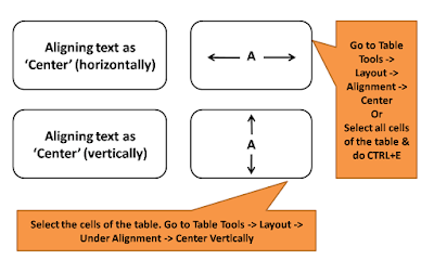
- Select the table -> Align all text as 'Center' (You can align by going to Home Tab -> Paragraph or by going to Table Tools -> Layout -> Alignment)
- Select the table -> Center text vertically
- You go for an alignment which suits your table. Not every table or every column needs to be aligned vertically & horizontally (like the Amounts column in the table below is right aligned because that is the customary way of doing it).


If you are using method #2 then you cannot modify anything in the table (because you have converted the table into an image). Once you have copied the table as 'Picture (Enhanced Metafile)' all you can do are two things:
- Increase/decrease image size (table size), and
- Make the fonts more clear & legible by copying the image & pasting special as 'Picture (PNG)'. To do this first copy the image, then delete the original image, then Paste Special As PNG (shortcut in PowerPoint 2007 is Alt+E+S+V).
What are the ways you use to show excel tables in your presentation? Leave your comments.
Read more:
Why have I suggested you copy the image as PNG? Read this article to find out.
Difference between JPEG, GIF, PNG and BMP? Part 1 of 2
Jul 5, 2010
Book Review: Made to Stick
 My Recommendation: Must Buy
Made to Stick is a best-selling book by 'Chip & Dan Heath'. This book is for everyone who wants to communicate better in a manner that the audience understands and remembers their message. This book is a must read for people in Marketing, Advertising, Teaching & Public Speaking. It is an outcome of decades of research by the two Heath brothers and it is their first book.
Objective of the book: The authors say: "We wrote this book to help you make your ideas stick. By "stick" we mean that your ideas are understood and remembered, and have a lasting impact - they change your audience's opinions or behavior."
Yes, we all want to make others understand what we are saying. We all want to make our messages sticky. Companies want their advertisements to be remembered. CEOs want their speeches to be remembered and acted upon by the employees. But how?
This book shares 6 principles which you can easily use to make your message 'sticky'. These 6 principles are:
Simplicity
Unexpectedness
Concreteness
Credibility
Emotions
Stories
The authors argue, and pretty successfully, that an idea which has some or all of these 6 characteristics will be more sticky; will be remembered more. The message needs to be:
Simple - If you say 3 things, you say nothing. We cannot remember so many things so strip the message to its core.
Unexpected - When something unexpected happends our attention level goes up. We listen to every word that is being said and hence end up remembering it better.
Concrete - Abstract ideas are hard to remember and act upon.
Credible - If your message is not credible, how can it be taken seriously and remembered? Add that element of credibility to your message and more people will do what you say.
Emotions - To make people act on your message you need to make them to care. Emotions make people care, not numbers and logic.
Stories - Credibility makes people believe you, emotions make people care but to make people act you need to tell a story. Stories inspire, stories entertain. Construct a story to add punch to your messages.
In short, this is how the 6 principles work.
Make people pay attention (unexpectedness) -> make it easy to understand and remember (concreteness)-> make people agree / believe (credibility) -> make them care (emotions) -> get them to act on your message (stories)
This book is not just theory. It is full of real examples of messages which have stuck, messages which people remember and which have changed people's behaviour. It is easy to read and easy to apply.
Jul 3, 2010
Survey closes July 4 11.59pm (IST)
You just have 2 more days to go.
Participate in this survey which has just 10 questions. Fill it in 45 seconds and your name will get entered for a contest. Out of all the entries 3 winners will be randomly selected. I will send a free copy of the book 'Everyone Communicates Few Connect' by John C. Maxwell to all the 3 winners.
Click here to take the survey.
Remember to give your name & email id at the end.
Jul 2, 2010
What is wrong with Aircel's 'Save Our Tigers' initiative?
I saw a TV ad today. It talked about how our planet was dying slowly. It closed with the statement; "We should save our planet."
This advertisement strikes a chord with all of us. We all know that our planet needs to be saved. We all 'seem to care'. Yet, this ad is a massive failure. Because it does not make even 1% of us to act. We see, we feel bad and we forget. Because we don't know what we need to do. We are too busy with our lives. We are not being told what specific action we can take to save our planet. There is no call for action in this ad.
This brings me to Aircel's Save Our Tigers initiative. This initiative is now a few months old and has created a lot of awareness. Aircel is a telecom service provider in India which is running a campaign across India where they are appealing Indians to save Tigers (our national animal).
Aircel started the campaign with a bang. They came up with the catchline 'Just 1411 left'. It shocked many when they realised that a country of more than a billion has just 1411 Tigers. They used this message across TV, Billboards (Hoardings), Newspapers and other media. A good piece of communication. By being specific they made us care. Imagine if Aircel would have said 'Save our Tigers' instead of saying 'Just 1411 left'. When you hear, 'Save our Tigers', you say "Yes, we should" and then you do nothing. By focussing on one number, they made the problem more realistic and specific and hence created a huge amount of awareness among the people.

Where Aircel will fail is in getting people to act.
What should people do to make sure the objective of the campaign is met (Tigers are saved)? Their website encourages people to do 6 things:
The campaign has left a lot to the initiative of the audience (the people). A lot of work has been passed on to the audience. This is the problem with this initiative.
The purpose of any presentation (communication) is to get people to act in a certain manner. A sales presentation wants the customer to buy. A sponsorship proposal presentation wants the corporate to sponsor the cause. The onus then is on the presenter (communicator) to make it easy for people to act, because if they don't the loss is purely of the presenter.
We must include a 'specific' call for action at the end of our presentation which will induce people to act. What do you think about this?
This advertisement strikes a chord with all of us. We all know that our planet needs to be saved. We all 'seem to care'. Yet, this ad is a massive failure. Because it does not make even 1% of us to act. We see, we feel bad and we forget. Because we don't know what we need to do. We are too busy with our lives. We are not being told what specific action we can take to save our planet. There is no call for action in this ad.
This brings me to Aircel's Save Our Tigers initiative. This initiative is now a few months old and has created a lot of awareness. Aircel is a telecom service provider in India which is running a campaign across India where they are appealing Indians to save Tigers (our national animal).
Aircel started the campaign with a bang. They came up with the catchline 'Just 1411 left'. It shocked many when they realised that a country of more than a billion has just 1411 Tigers. They used this message across TV, Billboards (Hoardings), Newspapers and other media. A good piece of communication. By being specific they made us care. Imagine if Aircel would have said 'Save our Tigers' instead of saying 'Just 1411 left'. When you hear, 'Save our Tigers', you say "Yes, we should" and then you do nothing. By focussing on one number, they made the problem more realistic and specific and hence created a huge amount of awareness among the people.

Where Aircel will fail is in getting people to act.
What should people do to make sure the objective of the campaign is met (Tigers are saved)? Their website encourages people to do 6 things:
- Spread the word on twitter, FB & YouTube
- Read latest news on Tigers
- Volunteer for an NGO, Preserve natural resources
- Speak Up (write to newspaper editors) to support the cause
- Read about Tiger facts & reserves
- Donate money to WWF-India
The campaign has left a lot to the initiative of the audience (the people). A lot of work has been passed on to the audience. This is the problem with this initiative.
The purpose of any presentation (communication) is to get people to act in a certain manner. A sales presentation wants the customer to buy. A sponsorship proposal presentation wants the corporate to sponsor the cause. The onus then is on the presenter (communicator) to make it easy for people to act, because if they don't the loss is purely of the presenter.
We must include a 'specific' call for action at the end of our presentation which will induce people to act. What do you think about this?
Subscribe to:
Comments
(
Atom
)