You are presenting the sales trend of Product A, B and C. You have a line chart. Instead of showing all the 3 lines at once, you want to click and show the line graph of A, then talk about it. Then you want to go to B and then C. How do we do this animation?
Here it is in a few simple steps (in PowerPoint 2010). The process is almost similar in 2007. In case you have any problems, leave a comment or send me an email.
Step-1 Create the line chart in PowerPoint or copy paste from Excel Step-2 Left click on the chart to select it. Under Animations Tab on top -> Go to Add Animation. Step-3 Go to More Entrance Effects -> Wipe. Wipe is a good effect. During final presentation, the lines will come from left to right smoothly.
Step-4 Under Animation Pane on your right -> Click on Chart -> Choose Effect Options from drop down. In PowerPoint 2007 choose this from 'Custom Animation' panel on your left.
Step-5 Under Effect Options window there are three tabs (Effect, Timing & Chart Animation). Under Effect Tab -> Choose direction from left. This will make the lines come from left to right in final slide show.
Under Chart Animation tab in the same window -> Choose Group Chart by series (This will make sure Product A, B and C will come one by one) -> Unselect the check box which reads 'Start animation by drawing the chart background'. If you keep it selected then the chart axis and grid lines also get animated. We're done!
Step-6 Changing the speed of animation. Under Animation Pane on the right. Click on chart and choose Timing from the drop down menu. Select Medium or Fast as you wish.
Imagine your friend meets you after a gap of 5 years. He asks you: "Where are you working Manoj? What does your company do?"
How will you answer that one question? Think about it. Better, write down in 2/3 sentences. What does your company 'exactly' do?
This question is faced by every organization every single day. We meet bankers, vendors, potential investors or government employees who want to know what we do in few simple sentences. This question needs to be answered at various places; corporate brochure, corporate PPT, corporate website and one-on-one meetings. People who land on the website should be able to easily figure out what your company does.
The issue at hand is: How to communicate what your company 'exactly' does in 1 minute? Communicate so clearly that everyone understands it without any difficulty.
Seems easy! Let's see.
Where do we start? Let's look at the Digital Marketing Companies in India. Let us see what they 'exactly' do. I am going to check out their websites for this information. [I am only sharing parts of their text. To read in detail visit their websites].
1. Webchutney
"Webchutney works with leading companies in India by developing award winning and memorable experiences for brands to connect, engage with and build sustained relationships with their consumers online... We work with them in areas of online advertising, website design, mobile marketing and social media...."
My take: The start was scary (usual MBA style) but they managed things at the end. I am clear as to what they 'exactly' do.
2. Hungama.com
"...it is a complete Digital Entertainment, Mobile services and Promo Marketing entity... Hungama is also the largest aggregator, developer, publisher and distributor of Bollywood & South Asian entertainment content in the world, having worldwide exclusive rights to over half a million music and video titles...."
My take: This is is not so clear to me. What all do they mean by mobile services? What on earth is a Promo Marketing entity? I am a marketing manager and yet I am hearing it for the first time.
3. contests2win.com
"Contests2Win is a leading player in the Indian Online Entertainment Space... On Contests2win.com users can play & create their own contest on any of our 7 Contesting Engines – Quizzes, Hangmans, Crosswords, Twisters, Polls, Face-Offs and Rate Me..."
My take: They need to be a bit more clear. Does online entertainment space only include playing these 7 contests? I need more clarity on this.
It seems that the 'curse of knowledge' is at work here. I understand my industry lingo and jargon does not mean everyone else does. Using high flying words also does not help bring clarity.
Before I close today, is it not wise to look within. When a new visitor lands on this blog there is a small note on the left which reads; 'What is this blog about?' This is the 'about us' of my blog so to say. The answer is: 'At all about presentations we discuss conceptualization, design and delivery of presentations.' I guess it captures the essence well. Does it not? If you find it even marginally confusing let me know. I guess its time for some self improvement :-)
I learned something new today and I am excited to share it with you. While I was making a logo in PowerPoint (using all kind of shapes and text), I wanted to zoom in and work with the various elements of the logo (shapes and text) more closely.
To zoom in there is a simple option; under view tab -> zoom (in PowerPoint 2007). From the options, we need to choose. Say we choose 200% or 300%. That's it.
But what happens is that the center of the slide gets zoomed in. So if my logo is on the extreme right side, I need to scroll to go there. This is a bit painful and can be easily avoided.
Just take your mouse over the logo and select all the shapes and text. Then go to zoom and choose 300%. Voila! Only the logo gets zoomed in. I found this quite useful. Hope you do too.
Dear friends. I would like to have some inputs from you. I want to know what you would like to read on my blog. All you need to do is to visit the website (click here) and vote. The survey (poll) is placed on the top-right side of the web page. All it will take is probably 5 seconds. Thanks in advance.
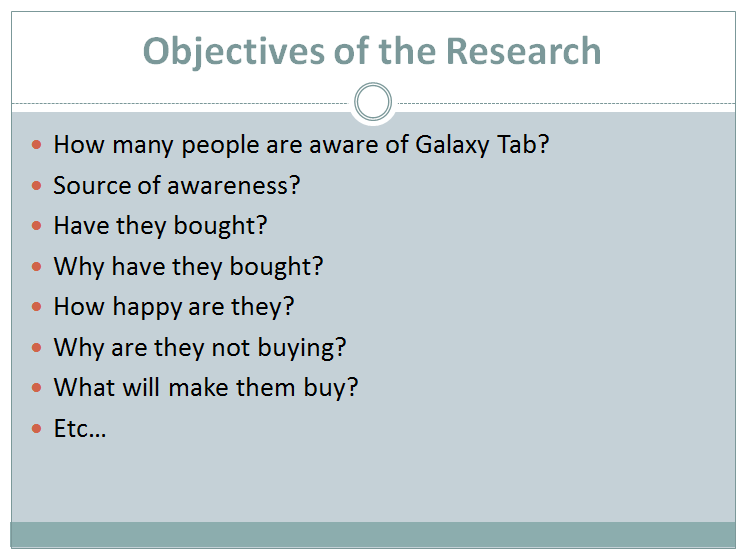
When you want to explaining something, images/graphics tend to do a better job than mere text. For example, Samsung wants to conduct a market research on how many people are aware of Samsung Galaxy Tab (the new tablet). How did they become aware (word of mouth / TV ad / Print ad / etc.)? How many people have bought? Why or why not? What do they think about it? etc. etc. etc. (and the list goes on)
Assume Samsung is explaining this to its research agency. It can do the standard way; which is to write it all down as bullet points. Something like this:
They give this list and ask the agency to go ahead and conduct the survey.
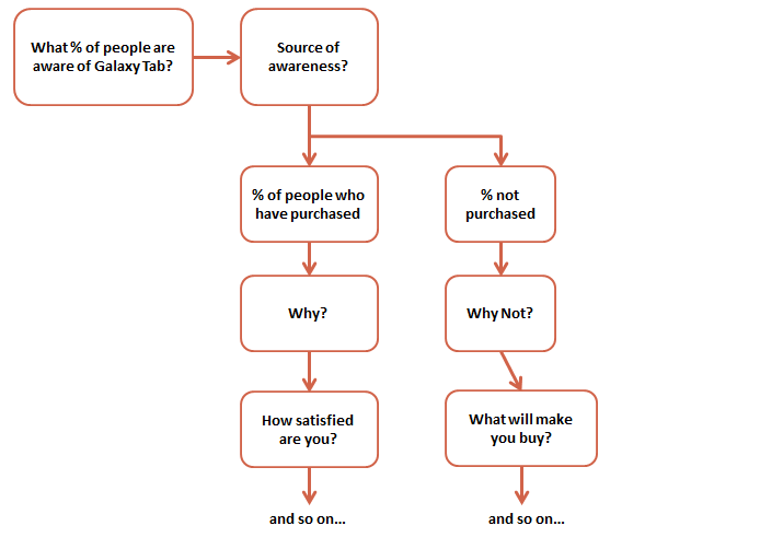
There is however another way, which brings clarity to their thinking and also helps the agency understand the work better. I am talking about converting text to graphics. Penning down your thoughts in the form of a flow chart. Something like this:
In my experience, this comes out a clear winner. Provides a lot of clarity to you and helps your audience understand the work faster and easier.
The first company I joined after MBA was Marico. Do you know why I joined Marico?
Because their campus placement presentation was awesome. That is the truth.
On campus, I did not know a great deal about the company. It was not one which hogged the limelight. They were coming to our college for the very first time. So there was no alumni (ex-student) from where we could gather much about the company.
When they came on campus for placement, they gave an excellent presentation. The best campus presentation our batch had ever seen. The presentation became the talk of the town. Everyone was blown away.
If I look back today, the presentation was spot on. The presenters knew what the students wanted and gave us that. Plus they delighted us. This is how:
1. They talked about the size of the company and compared it to some 'better' known companies on campus. We were all amazed that this company was as big as some other popular FMCG names and hence we should consider this 'new' company on campus.
2. The presentation was something special. The look and feel, the honesty, the style. It kind of separated Marico from the rest. We could sense these people were different. And I wanted to belong to this group.
3. They stressed on 'career growth'. They cited actual names of managers and showed how fast they had moved up in the organisation within a short span of time.
4. They talked about 'responsibility early'. This was great. You are given full freedom and you are made accountable for your job.
In summary, all I can say is: First, they introduced themselves well and placed themselves in the same league as other popular names on campus. This made us look at them seriously. Second, they stressed on something that mattered; career growth. Lastly, they presented in style; nice audio-visual designed by a professional agency. They had the right relevant content and it was packaged excellently well.
AAP has turned 2! It was born on Jan 14th 2009 and it is now 2 years old. On this awesome occasion all I want to say is THANK YOU to all you readers. It is all because of you. Love you!
The first person to get it right was Amey Kinnerkar again. Well done Amey! He replied on Facebook within hours of my posting the quiz. Riz Mathani also got it right but was later than Amey. Hence the book goes to Amey (who else). Congratulations buddy!
The correct answer in Amey's words:
"Start off with the basic slide. Put a button on it which says "I accept the invite". This could be a simple rectangle as well. Now click on this rectangle, to select it. In MS PPT 2007, in the Insert ribbon, there is a "Links" tab, with "Actions" in it. click that, and u get the setting where u can specify that for mouse over, move to next slide.
Then the next slide will have your button in the second place. Repeat for the effect :)
Nice way of getting people frustrated."
Riz Mathani has also explained it very well. Here is the answer"
"Create 4 slides. The first 3 should have the button on the different positions you want it to be. The last one does not have the button but the text "You have lost your chance".
Select the button on the first slide, and select the Action menu. The Action menu will be in different places depending on your version of the PPT. In older versions, you could just right click and get to it. I am using PPT 2007 and for this you go to the Insert menu and you will find Action under the Links tab. On the Action dialog, under Mouse Over, choose Hyperlink to Next Slide. Repeat this for the buttons on the second and third slide. Wallah (or Viola if you are outside India)! you have the mouse over animation you desired!"
I received a PPT just before the new year from a senior colleague of mine. It was an invitation to his grand new year party. The invite was to join him on a cruise to an exotic island in the Pacific. I knew something was fishy but I was amused. The visuals were so inviting.
In the end was a small button; "I accept the invite" (who will say No). The PPT asked me to click on the button if I wanted to join in. The moment I took my mouse over the button, it vanished. It moved to a new place on the screen. Again I chased it, it vanished again. The third time I chased it, it totaly vanished. Then the screen said, "You have lost your chance". I was so upset :-(
He had got it as a forward and in turn he was sending it to everyone in office. The PPT made me curious as to how the animation was done. How did the button vanish when I took the mouse over it?
Do you have the answer? If you do then leave a comment or send an email to vivek [at] allaboutpresentations [dot] com . I will share your answer (along with your name) with everyone here in a future post.
Bonus: If you are in India, you can win a surprise gift as well. Due to logistical reasons, I am unable to include readers outside India. The first correct entry from a reader residing in India gets a book.
Yesterday I talked about the stall my company is putting up in a large exhibition (consumer fair). Managing a stall in an exhibition is so much like presenting.
Here are the challenges of putting up a cooking oil stall in a consumer fair:
1. How do we get noticed? People are not there to see us.
2. Generate curiosity and interest and make people come in.
3. Once in, share information about the brand without overloading them with info and without boring them.
4. Convince them to buy the product (call to action).
If you are making a presentation, point 1 is ruled out. The audience sees you. But point 2, 3 and 4 are very pertinent.
#2 Are you able to generate curiosity about the subject/topic and make your audience want to know more? Are you able to make them see what you want them to see?
To do this, you need to stand out. We are making people curious by the design. Our stall front is attractive (or so it is supposed to be). If people like something they would like to check it out. That's the bottomline. We are also putting up banners/standies outside which appeal to the discount hunter. We are popularising our 'special offers'.
#3 Once you have the attention, make the most of it. The audience is listening to you. Now get your main message across without any nonsense. Be short and sweet. Remember, when you say many things you say nothing. People cannot remember so much. Say 1 thing and say it well. You have to sacrifice and make your message simple.
We too have tried to do the same inside the stall. We have a registration counter where we ask very few questions (this is for market research). After this there is a free health check up for all visitors. After which is the sales counter and our sales pitch is of just 1 sentence. The interiors are simple and just focus on the product image and the image of the brand ambassadors. Visually appetizing. If they just remember us after they have gone out, we would be happy.
#4 Call to action. Every presentation has an objective. Know why you are making the presentation and work hard to achieve it.
Our objectives are two; create awareness for our brand and generate sales (make people to try our new brand). We have clearly made the stall attractive so people come in. Once in, they will only get to see the brand name and nothing else. No unnecessary literature. For sales to happen we have planned exciting offers. Over and above that, we need to be flexible. So we will keep changing and trying new things until we hit the bulls eye. Until we have so much crowd that we are stocked out.
That is what we all need to do with our presentations. Keep trying, failing, learning and improving with every presentation we make. Keep your eye on the objective and keep aiming to hit the bulls eye.
'Less is more' is almost a cliche. But every time I come across a piece of communication, I get reminded of this phrase. The greedy side of you wants to say everything, but the smart side should try restraint. Look at any form of communication around you. Hoardings (Billboards), TV advertisements, Posters, Presentations; they are all one and the same.
You have so much to talk about. But your audience has less time. They get exposed to your message (eg. slide or hoarding) for a small amount of time. Their is so much communication clutter. So many messages, billboards, TV ads, SMS-es, emails.
How can you get your message across and make sure people remember it?
This is the biggest challenge for any communicator.
We faced the same challenge when designing our stall. Every year around this time a grand exhibition (fair) is organised. Over 27 lakh (2.7 million) people in the city of Hyderabad visit the fair. My company has a stall here. A small stall among hundreds and hundreds of stalls.
We could have talked at length about our product on the inner walls. How great it is? How it is better than others? What it does for you? What it contains? But we chose to be simple. Just large images of our brand ambassadors, the product image and the brand name (in English and vernacular).
We want a visually appealing stall which does not force visitors to start reading. No one is there to see our stall. They are there to eat, enjoy and have fun. We have to subtly invite them inside and make sure they remember us for a long time to come. So a simple design which is a feast to the eyes. That's our best bet.
Designing a stall and making a presentation are so so similar. I discovered it just now, as I started writing this post. More on the similarities in my next post. The stall is getting inaugurated tomorrow and we are still a long way to go.