11 Creative ways to compare two numbers
How do you compare two numbers in a presentation? You make a table or a simple bar graph? In this post, I will show you 11 creative ways to compare two numbers and present them in your slide. Let us assume we are comparing these two numbers.

 Read more: 14 Charting Tips: Tip #2 Which type of chart should you use?


 While comparing two numbers, stick to a visualization that solves your problem. You may use a simple bar chart or table. If it does not meet your need, try out these 11 creative ways to compare two numbers. It will add the much needed punch and kick to your slides.
Looking for more inspiration? I recommend these articles:
45 Ways to Communicate Two Quantities
How to Choose the Best Charts for Your Infographic
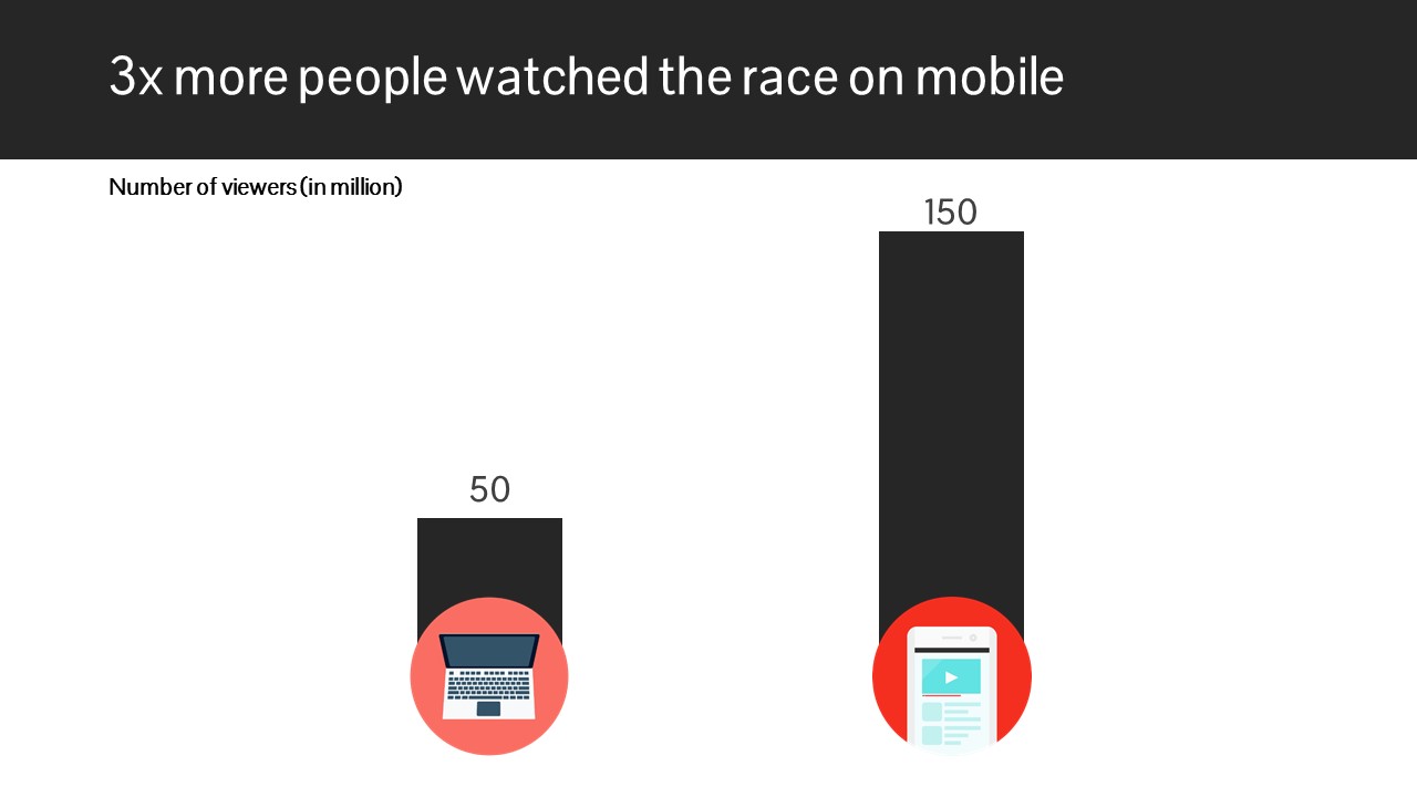
- 50 million people watched a Formula 1 race on their laptop
- 150 million people watched the same race on a mobile phone
Visualization 1: Text
The simplest way to compare two numbers is to put them along side each other. You can read 50 million on your left and 150 million on your right. The font size is different. This amplifies your message that mobile is more than laptop.

Visualization 2: Bar Graph
The best chart to compare two or more numbers is the vertical bar chart. It is not the most 'creative' visualization, but it is very easy for your audience to understand. The vertical difference in height communicates the message very quickly.

Visualization 3: Pictures
This is a very 'creative' way of communicating. The size of the mobile phone is bigger than the television. You can make this visualization mathematically accurate my measuring the area of the rectangle (screen size). If you wish to do that, then the area of the mobile screen would be 3 times the area of the laptop monitor.

Visualization 4: Circles
Very simple yet very elegant. Your audience will quickly understand the message. Label the circles and choose different colors. This will enhance understanding. The area of the blue circle is exactly 3 times more than the area of the black circle. You will need to do some maths here. You need to use this formula: Area of a circle = pi x radius x radius; where pi = 3.14159.

Visualization 5: Infographic
This style has become common in the last few years. The number of people (who watched the race) is 10 on the left. On the right, the number is 30. Hence it is 3 times more. This visualization is good because you can 'see' 3 times more people in front of you.

Visualization 6: Bar Graph 2
This is a variant of the simple bar graph. It is called '100% Stacked Column' in MS PowerPoint. In order to emphasize the height, we add the gray area as well. This bar graph puts more emphasis on how much more blue is over brown. The total of brown + gray = blue + gray = 200. To make this chart enter four numbers, 50 and 150 and 150 and 50. Each bar is 200 in total.

Visualization 7: Bar Graph 3
This bar graph sends the message across quickly. One does not need to read laptop and mobile. This is a simple bar graph with a more visual appeal. You can try making the color of the bar same as the color of the icons for more visual appeal.
Visualization 8: Bar Graph 4
This is the same '100% Stacked Column' as in point 6 above. But here we have compared both the numbers together. The brown bar = 50 and the blue bar = 100. Together the height = 150. This bar communicates that laptop is only 1/3rd of mobile. The focus is on comparison and less on absolute numbers. To create this chart, we enter only two numbers. 50 and 100. They total up to 150. Hence the total height of mobile is seen as 150. In point 6 above, we had to enter 4 values to make that graph. Here we enter only 2 values.

Visualization 9: Circle 2
This one is a variant of the circle we saw earlier. In this case, we place the smaller circle inside the larger circle. The point we are trying to drive home is... look how big the blue circle is versus the black one! The difference between the two circle is clearer in this example. In the circle above, the difference is not that easy to grasp.

Visualization 10: Infographic 2
In visualization 5 above, we had used faces. Here we use dots (circles) and we provide the entire universe as well. On our left, we have 100 small dots. 30 of those are brown. On our right, we again have 100 small dots. 90 of those are blue. The message is, blue is 3 times more than brown. The actual numbers are placed below the infographic. The audience is not expected to count the dots. It is a visual representation and it communicates that blue is a lot bigger than brown.

Visualization 11: Infographic 3
This one only differs from number 10 above in the way it has been labelled. Instead of putting the numbers below, you might want to place them in the middle. This will communicate the message quickly.

Looking for more inspiration? I recommend these articles:
45 Ways to Communicate Two Quantities
How to Choose the Best Charts for Your Infographic


ReplyDeleteThis is indeed very helpful, very nice!
ReplyDeleteThis is indeed very helpful, very nice!