Download the e-book by clicking here.
If you have any problems downloading it, email me and I will mail you the file. My email id: vivek [at] jazzfactory [dot] in.
 Why study the 14 Tips?
 In the last two weeks you have learned 13 tips on how to make your charts awesome. How to make charts that will help you achieve your overall presentation objectives. Should I expect that you will remember all the 13 tips and apply them every time you make a chart?

 What is chart aesthetics?
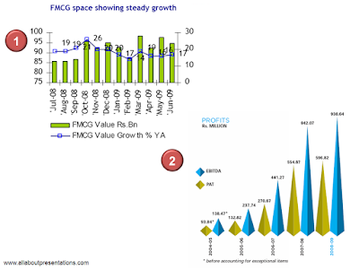 Chart #1: Do you think your audience would like to read this chart?
 If I were presenting this, I would go one step further. There are no data labels and we have two axis. How do you know what is being measured on which axis? One measure we took to solve this problem was in Step 8 where we added Axis Titles (Value Rs. Bn and Value Growth).
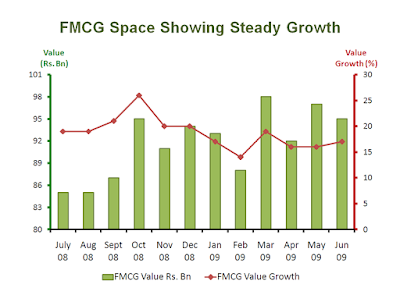 Notice that font colors of Axis Titles have also been color coded. Primary Axis Title is green and the Secondary Axis Title is reddish brown.
 What does it mean to highlight?
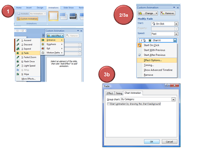
 We are now almost at the end of this 14 part series. In the last post I talked about an often neglected part of presenting charts; colors. Today, we will discuss about another area which presenters have underutilized; Chart Animations.
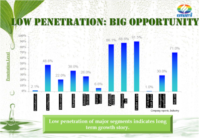
 "Life is polychromatic. Do not live it in monochrome."
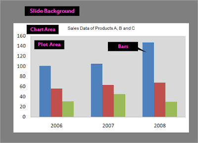
 Step 1: Choosing the slide background color
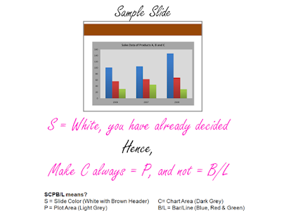
 First, choose from the 5 options on the left. To change the color of the bar select it by clicking on it and rigth click for 'Format Data Point'. You can now get all these types of options. Which one do you use normally? The default is always solid color.
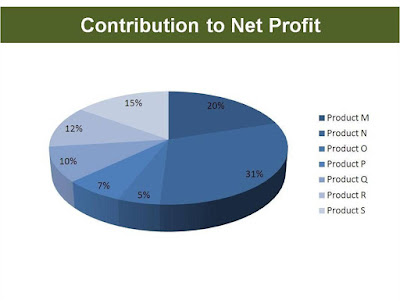 If color is the ingredient of your recipe then this pie chart is a recipe for disaster. A simple solution for this is to use labels (Product M, N) besides the percentage. Making the chart multicolor will not solve this problem.
 Your chart is made from raw data. But this raw data is not a fiction of your imagination. It has a source. A source from where you culled out the data for analysis and representation. We will today discuss about this most ignored element of a chart; source of data.


 Notice that the claim is; HUL is India's biggest FMCG company. A tall claim but everyone in the FMCG business knows it already. Moreover, it is coming from a credible source, the CEO himself. Yet the source is mentioned. To keep the skeptics quiet. The source is; for reach data 'Hansa Research's Guide to Indian Markets 2006'. If you wish to check the claim, you know where to go and ask for it.
 Today we will talk about chart axis. To be specific, we will discuss the following:
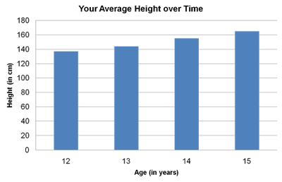 The first data point; at age 12 your height is just under 140cms, at age 13 it is just above 140. The axis tells you that age and height are being measured. Age is being measured along x-axis (horizontal axis) in years. Height is being measured up the y-axis (vertical axis) in cm. The axis also lets you read the measurements. If you need more accuracy, you need to label the data.
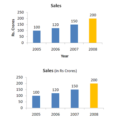 The chart on top follows the theory but the chart on the bottom does not. If you are presenting, which one of these should you prefer? My answer: The one at the bottom. The lesser you write on the chart, the more space you save. And all this happens without loss of information. You do not need to mention Rs. crore and year with the axis. Treat space on a chart as precious real estate.
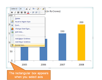 There are many options in front of you like Axis Options, Number, Fill, Line Color, Line Style. We will understand the main ones with help of an example:
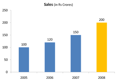 3a. Line Color & Styles
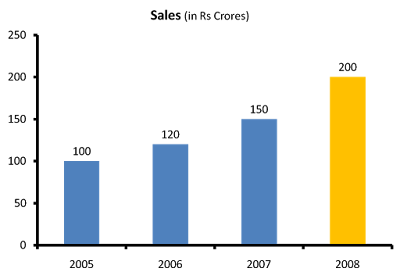 3b. Axis Options
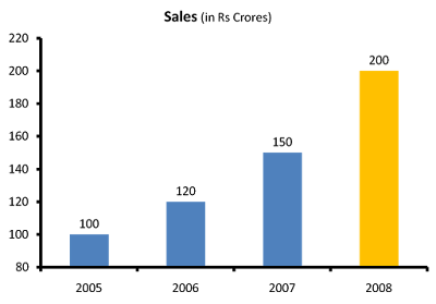 The y-axis now starts counting from 80. The growth in sales now looks far better than it looked when the axis started from zero. Which one is better? Companies in their annual reports do play this trick very often. See this example from Hindustan Unilever's presentation:
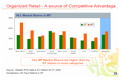 Is it wrong? I would say, No. No in the case of this particular chart. Because of two reasons:
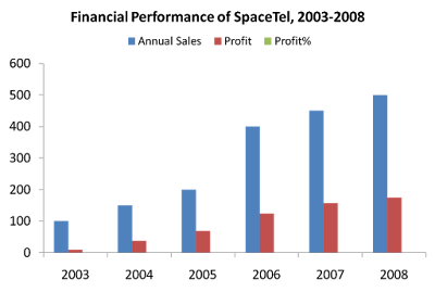 What is wrong?
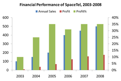 Are you in deeper trouble now?
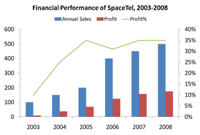 You can add data labels and do what ever else you need. Don't forget to add your key message as well.